How to get the color you want. Orange and Brown.
Used with skill, orange tones will make your work brighter and livelier.
Orange is often overlooked, confused and ineffectively used.
The various shades of orange available to us can be used as a contrast to a range of shades of blues and blues. For such use, you must be able to get a wide gamut of orange.
Since neither violet-red nor green-yellow reflects orange in sufficient quantity, in this case, too, we can expect only muted tones.
Lesson number 1
The artist knows how to get luscious, catchy hues by mixing yellow and red.
In this range yellow brings almost all of the orange to the combination.
The function of red is to neutralize yellowness to release orange.
Lesson number 2
How to get muted orange from primary colors.
By mixing
Cadmium Yellow (light) + Cadmium Red (Light) + Ultramarine Blue

We can get a wonderful shade Orange colored Mango ( Mango orang e).

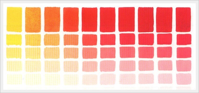
Tones and shades of color Mango Orange.
 |
Lesson number 3
Pumpkin color: shade of orange. It is believed that pumpkin color is most often chosen by people distinguished by an irrepressible desire for vigorous activity, energetic and decisive character. Pumpkin is deeper and more saturated, it has more red, so in order to achieve this shade, we mix a little more red with yellow, a drop of ocher and brown.

Lesson number 4
See what richness of shades is obtained when mixing
Cobalt Violet (hue) + Cadmium Yellow (light) + Ultramarine Blue

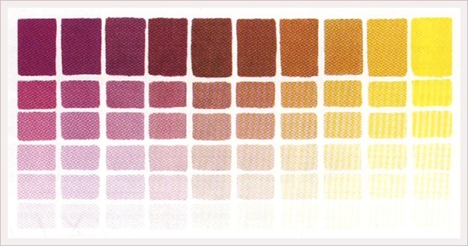
Here we see the shades purple ocher, orange and brown.
|
Lesson number 5.
When mixing Ultramarine Blue + Cadmium orange
The result is beautiful brown shades.
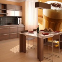
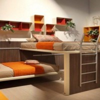
This color rarely leaves anyone indifferent: some love it, others hate it. Let's talk about how you can use it in apartment design without any unpleasant surprises. See ideas for the design of orange kitchens in the interior: photos of headsets and tips on how to choose wallpaper, a floor and an apron for facades in orange tones.
How does this color affect ...
... our mood
Orange is an optimistic and cheerful color. Use it if you want to get rid of apathy and blues: you are guaranteed a sunny mood, regardless of the weather outside the window. If you find it difficult to wake up in the morning, kitchen set with orange fronts is a great choice: you will feel refreshed.
The orange color triggers the recovery processes of the body, increases tone, and speeds up the pulse. Blood runs faster through the body, improves digestion and assimilation of nutrients and vitamins from food. Therefore, being in the orange kitchen is energizing and invigorating.
But be careful with the amount of color: its excess in the interior can put pressure on the psyche, cause aggression and irritation.
... perception of space
Like all warm colors, it visually brings objects closer, so in a small kitchen you should not paint the walls orange - visually it will seem smaller.
But the kitchen set with bright orange, tangerine or apricot facades in combination with white and against the background of neutral walls in small apartment looks very good.
Who is the orange kitchen for?
- Orange tones work well for small dark kitchens with a small window that faces north or west. They will always be sunny, warm and comfortable.
- it a good option if you often invite guests and consider yourself an extrovert.
Do NOT choose orange if you:
- You work in a bright office, communicate with people a lot, but at home you only want to relax and unwind.
- Spend a lot of time in the kitchen - cooking, eating, watching TV, reading and working on your laptop. Bright orange interior you will get bored quickly.
- Among the household members there are hypertensive patients or you have a hyperactive baby. Orange is calmer than red, but it still affects the pressure and excites the nervous system.
- The kitchen window faces south / east and is very sunny during the warmer months. This color raises the temperature of the interior and a design that is too “warm” will cause discomfort.
- Choosing a kitchen for a studio apartment. In a small combined space, neutral light facades look better.
- You dream of becoming slimmer. In the interior of the kitchen, orange is insidious: it improves digestion and metabolism, but increases appetite.
You will find a complete guide to colored kitchens on the dedicated page.
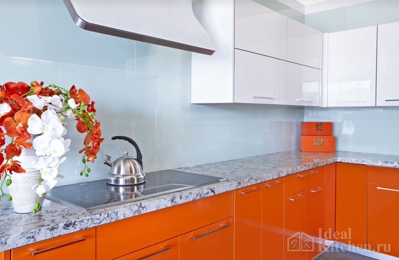
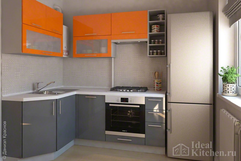
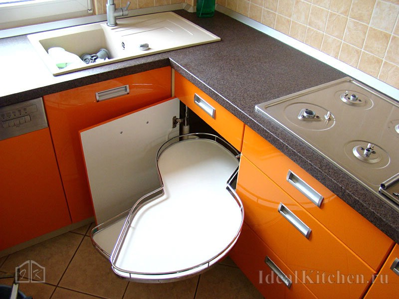
 Example glossy corner kitchen with neutral apron and calm trim
 Choosing a shade
Orange is obtained by mixing two warm colors- red and yellow. The main thing is to choose the shade that seems the most pleasant to you.
If juicy pure color confuses you, don't give up on the dream of a bright sunny kitchen. Choose a calmer shade - closer to yellow, red, peach and apricot.
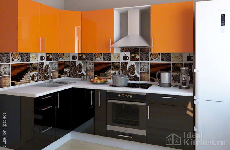
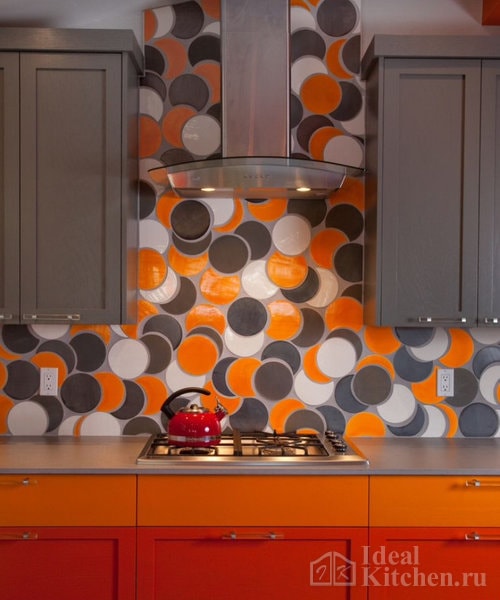
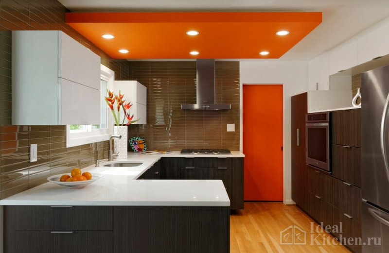
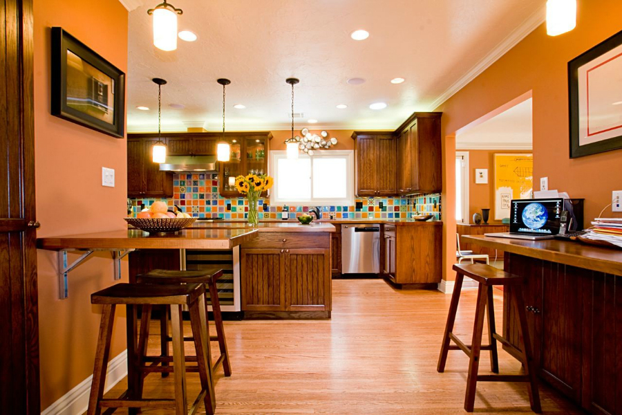
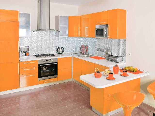
For modern cuisine (modern, minimalism, hi-tech), pure saturated shades are suitable - bright or red-orange, orange, tangerine, carrot, pumpkin, coral. Examples are in the photos below:
In a more traditional classic interior muted, diluted or dark tones are good: rusty brown, amber, ocher, red, terracotta. They are used in textiles, for wall decoration, apron, but not for facades.
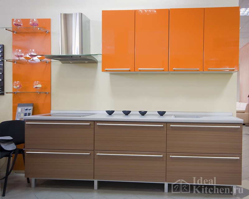
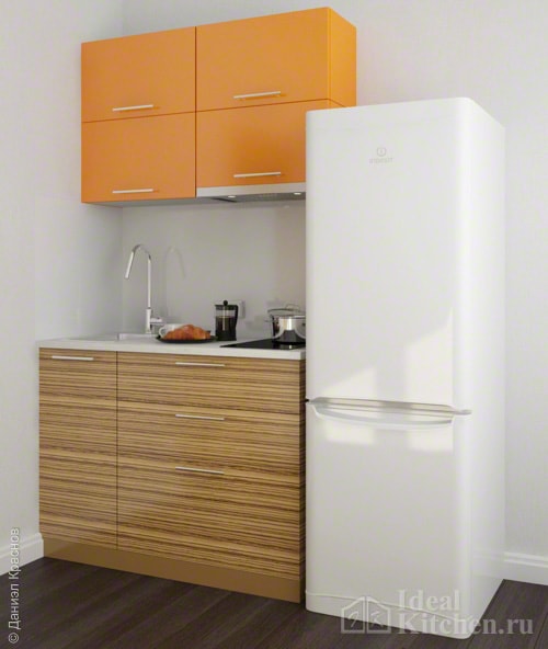
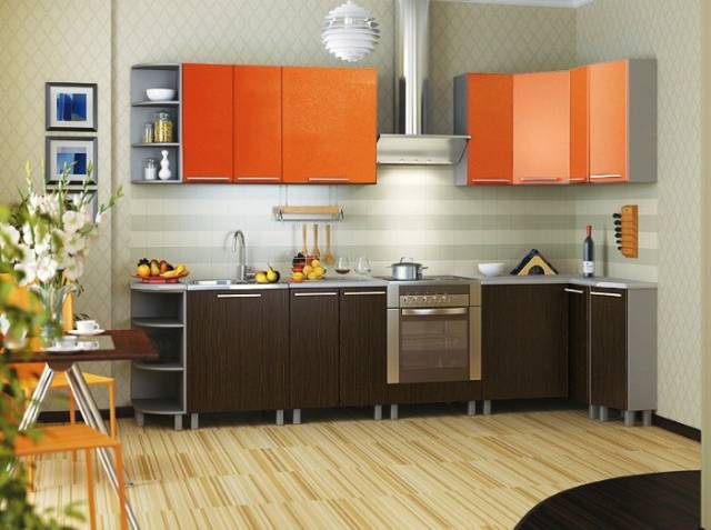
Orange kitchen set
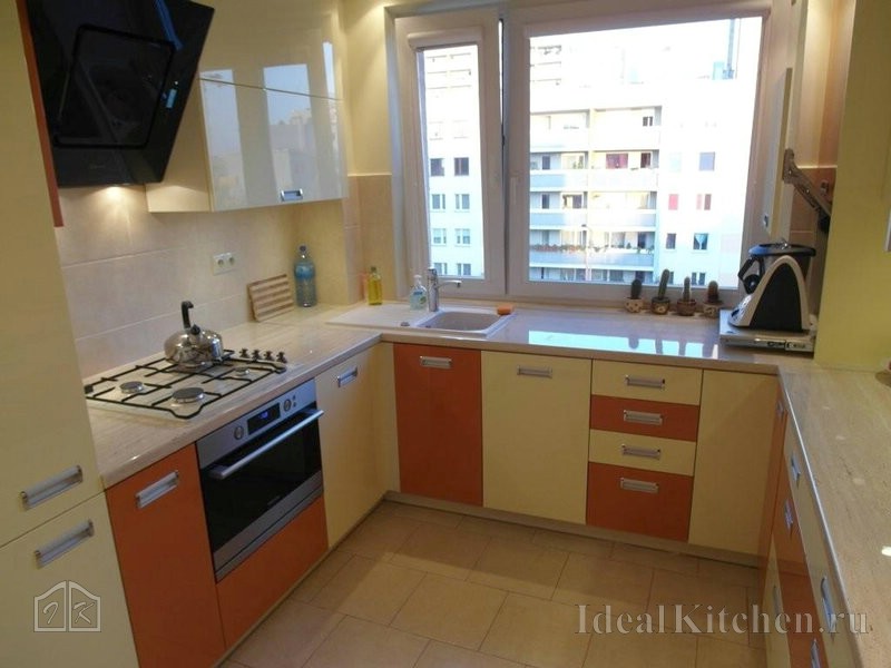
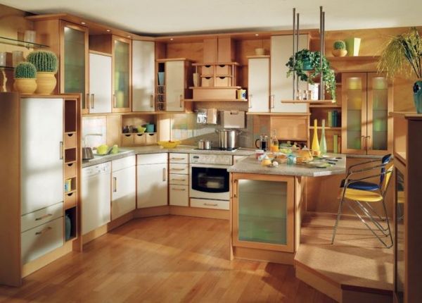
In the kitchen, this color is often used in the form of furniture - the most obvious solution when you want to add a lot of color to the interior and not overdo it. These are usually custom-made kitchens, but some manufacturers also offer ready-made economy-class headsets in orange or tangerine.
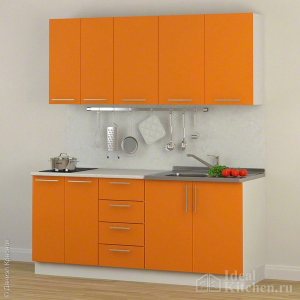
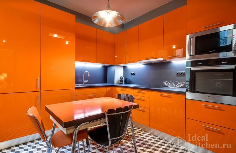
Most often, orange kitchens are glossy: MDF as a base, coating - high gloss enamel or acrylic, HPL plastic, PVC film.
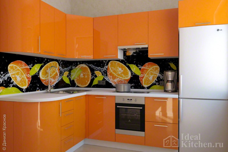
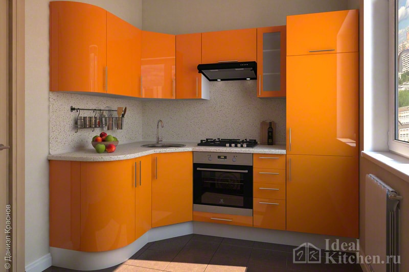
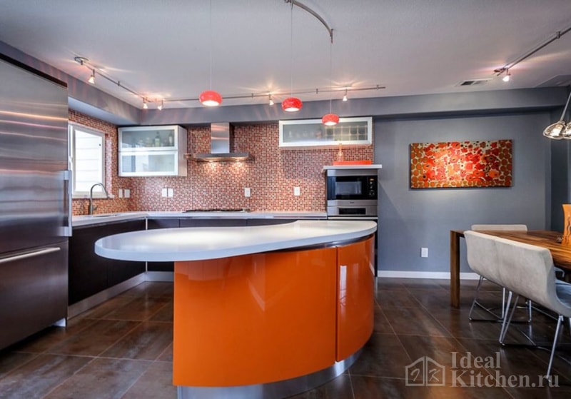
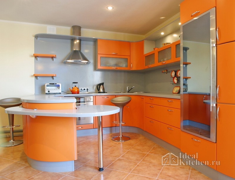
Headsets with radial rounded facades in a bright finish look especially advantageous and impressive:
To design orange kitchen was harmonious, stick simple rule: the brighter the furniture, the more laconic the facades and fittings. the main role in such an interior belongs to the color. The headset is the focal point, it will take all the attention to itself.
If you want to make a custom-made kitchen, we recommend watching our selection:
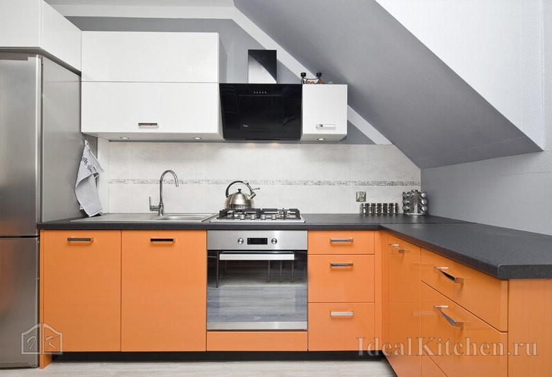
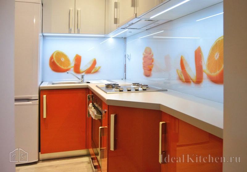
Photos of real kitchen projects in orange tones
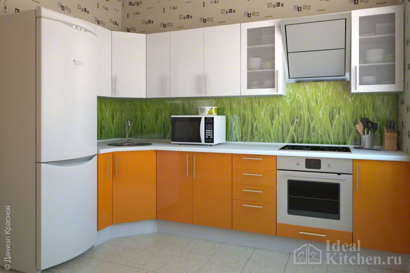
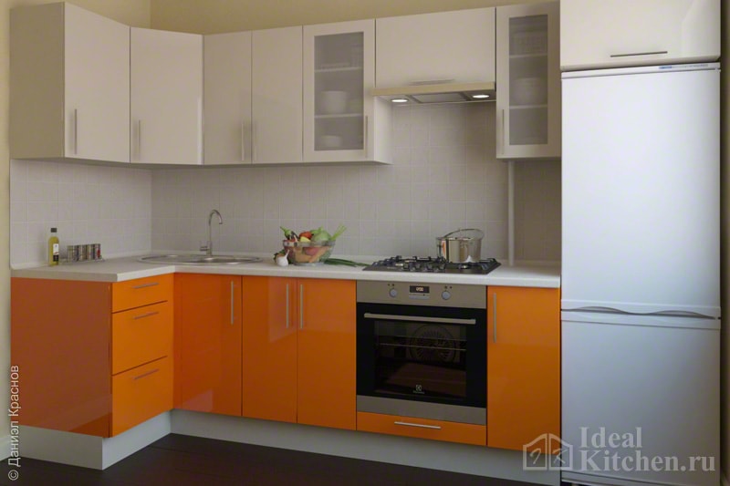
The kitchen set can be plain or have combined facades. Companions are white, brown, wenge, gray, etc. See which colors combine best with orange:
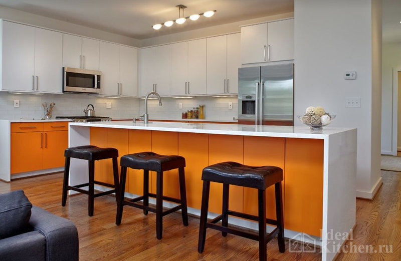
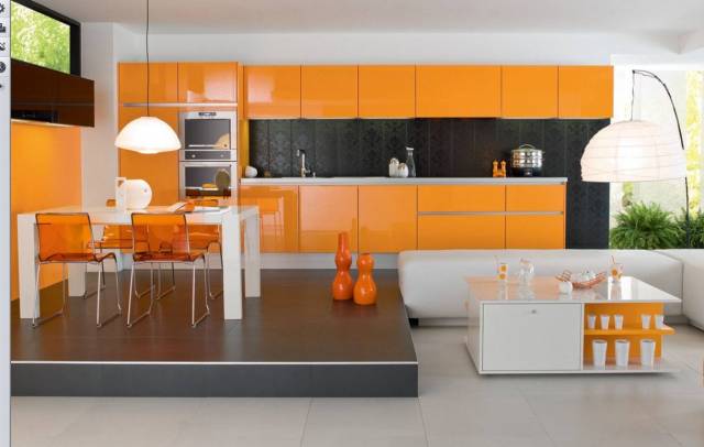
White
White and orange kitchen - versatile and a win-win... But keep in mind: whiteness makes any color brighter. You can use not pure white, but its unobtrusive shades - baked milk, ivory, eggshell, creamy. The contrast will be softer and the interior calmer. The apron and countertop should also be made light.
In the following selection, we have collected photos of white and orange kitchen sets:

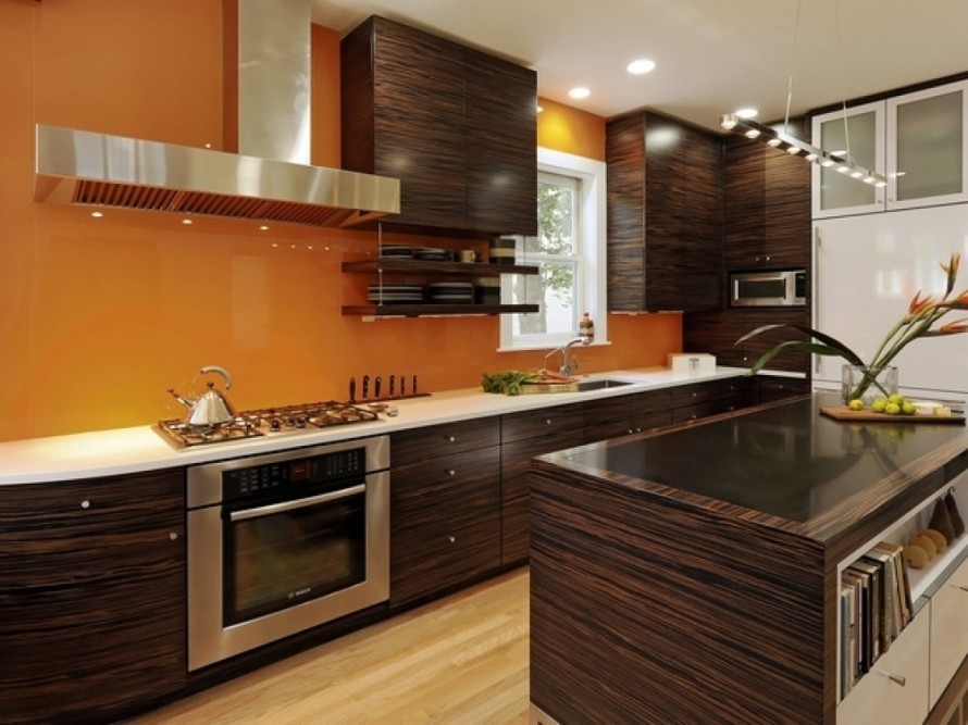
Brown and wenge
Bright, rich, harmonious combination. The table top can be beige, white, brown, black, light or dark wood. Light beige plastic or artificial acrylic stone with a small brown speck is good.
 Wenge bottom and orange top require a light apron
 ![]()
Zebrano
As in the case of wenge, for inexpensive kitchens they use imitation of zebrano - HPL plastic, PVC film or laminated chipboard; in more expensive models, natural veneer is used.
 Kitchenette made of HPL plastic on facades
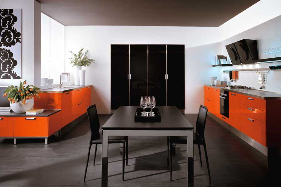
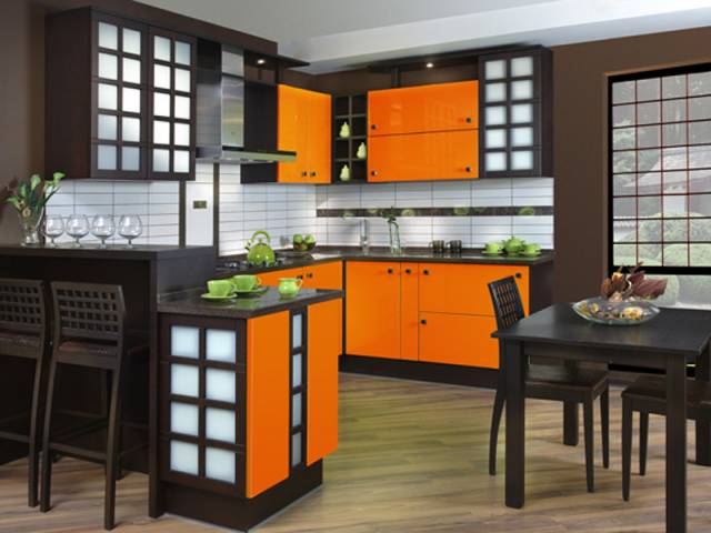
 Black
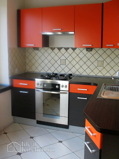
The duo is spectacular, but very obliging. Do not overdo it with black, otherwise the kitchen will look gloomy, unsettling and overly contrasting. Use it pointwise and balance with a light neutral background. Table top and apron black and orange kitchen can be black, gray, white, brown or light beige.
 Acrylic facades are characterized by intense color and strong glossy shine.
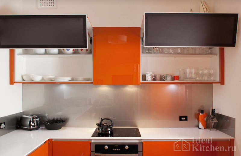
Use the following colors with caution: they will only make friends with orange if you choose the right shade.
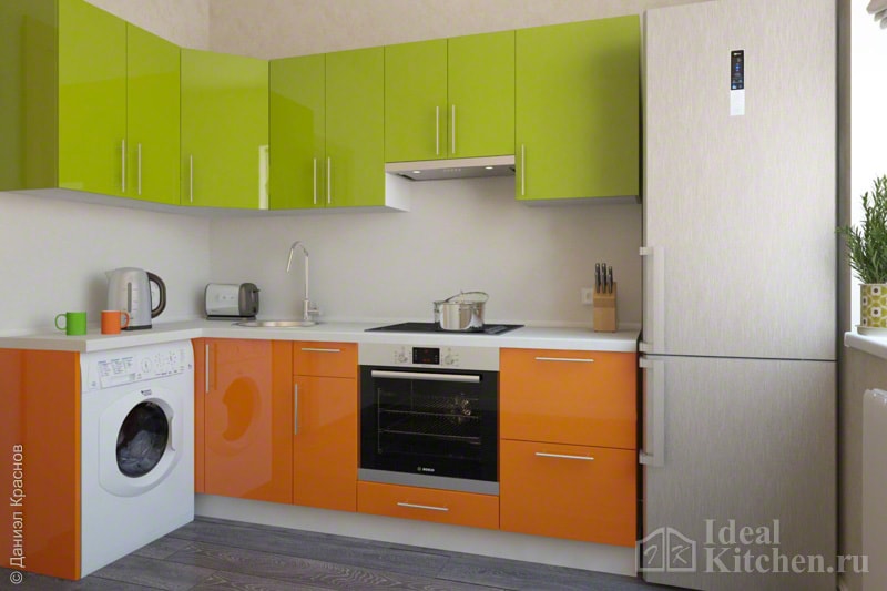
Green
A cheerful and summer combination. Choose clean green color or its warm shades like light green, green apple, lime. Leave walls and textiles neutral beige. The table top and apron can be made white, beige, brown or to match the upper or lower facades.
The photo shows an example of a green-orange kitchen with a plastic countertop:
Gray or metallic
Cool steel tones "cool" the orange, and it, in turn, revives grey colour and makes it more interesting. This combination is often used in minimalist, techno or hi-tech kitchens. In addition to facades, gray can be an apron, countertop, wallpaper, floor tiles or porcelain stoneware. Saturated shades of gray are especially good, such as graphite, dusty gray or wet asphalt.
Beige and cream
Mutes and soothes orange. Give preference to a cool light beige shade without a pronounced yellow undertone.
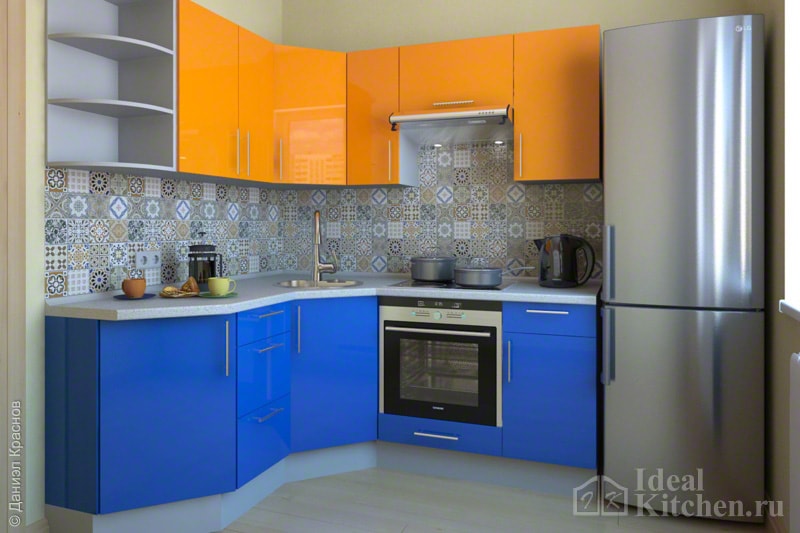
Blue
The duet with bright shades blue: azure turquoise, denim, cobalt, sapphire.
What wallpaper, floor and apron to choose
If you do not want to overload the interior of a small kitchen with an orange set, use a calm neutral background on the walls. White, creamy, vanilla, milky, sandy, beige, gray, brown are ideal.
 The combination of light and dark tones in the finish eliminates the monotony of the interior
 You can use some variations of green (delicate pistachio or olive) or pastel yellow as companions. These are the colors that are preferred for walls, floors and a backsplash.
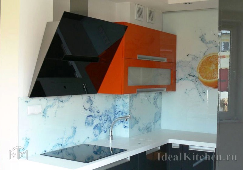
Bright glossy facades will perfectly complement. From the drawings, oranges, limes, fruits in water, abstraction on a white or black background are suitable. A glass apron with coffee, chocolate, green grass, and a black and white photo of a city at night will also fit well into the design of the kitchen.
If you want to "calm down" the interior, get a neutral wall panel under a light stone. Patchwork ceramic tiles, on the contrary, will add brightness and texture to the space.
Bright details and accents
We decided to give preference to neutral colors? Use accessories and textiles of orange, tangerine or pumpkin shades to "recharge". If you do not have enough heart for a large color spot, you can unobtrusively support the orange theme in the interior - with an apron in the work area, airy translucent curtains made of organza or net tulle, a lamp, chairs with fabric or leather upholstery, dishes.
For examples of orange accents in real kitchen and dining room interiors, see the photos below:
Walls
Apron
Ceiling
Curtains and decor
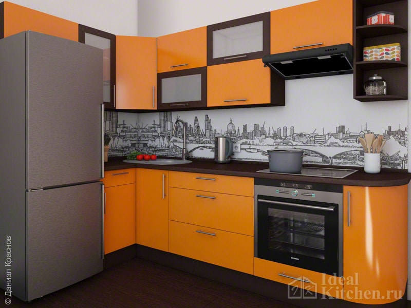
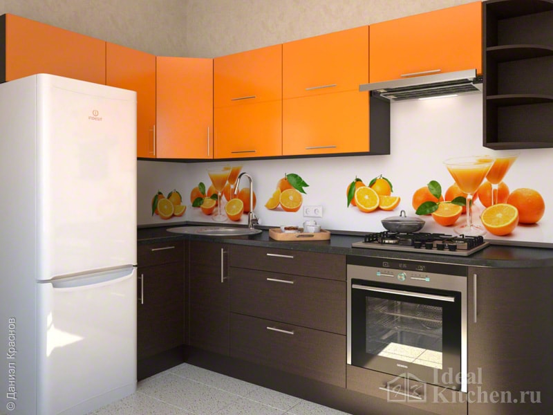
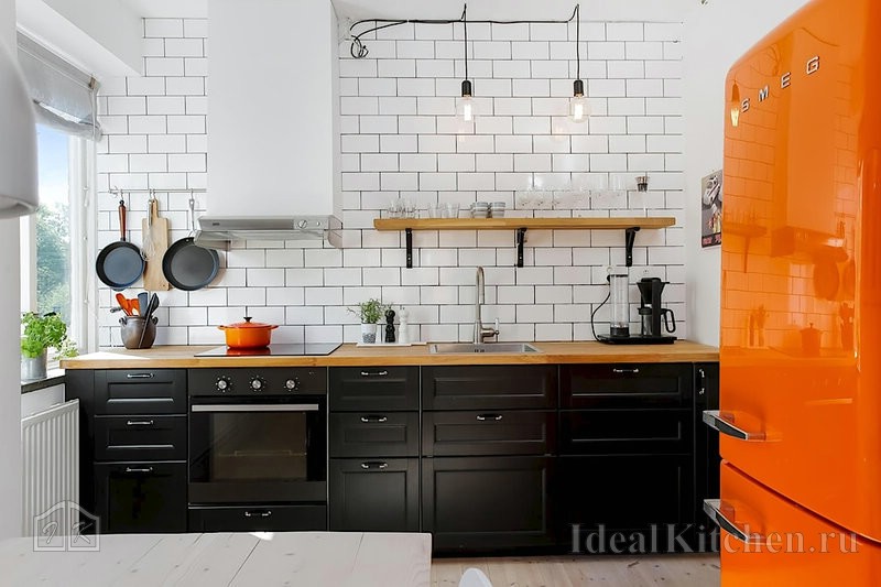
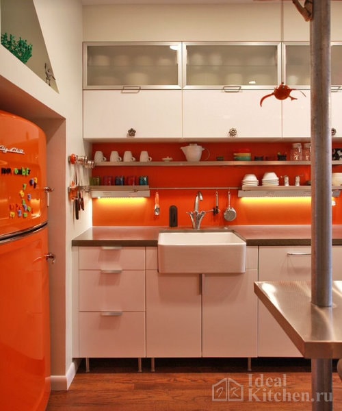
Fridge
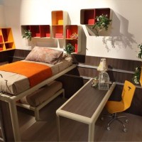
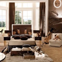
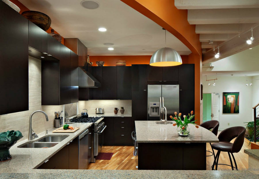
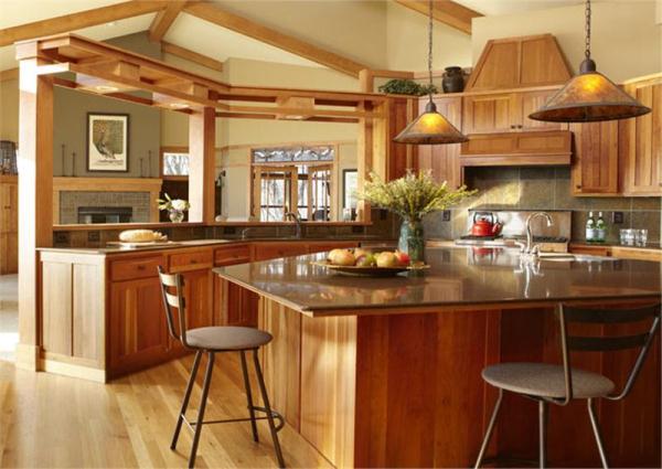
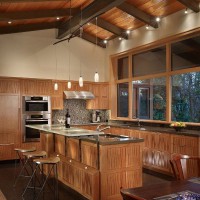
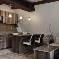
Kitchens in orange-brown color are a good balance of classic woody tones and bright sunny colors. Juicy orange is a warm tone of activity and positiveness, which will help create an atmosphere of hospitality and comfort in the room. Calm brown will add elegance and nobility to the kitchen, balance the emotionality of orange shades.
Advantages and disadvantages
Pros:
- Orange-brown colors are especially relevant in a room where there is a lack of natural light(north side). Such design solution will create the feeling of sun glare even on a rainy day.
- Kitchen design in orange-brown tones is a source of cheerfulness in the morning, high spirits in the evening.
- The variety of shades gives a huge choice of options for the color organization of the space. For active and determined people - energetic tangerine, pumpkin, carrot in combination with brown natural tones (nutty, wenge, beige and many others). For a more relaxed atmosphere, peach and honey are suitable, while brown will give a sense of security and stability.
- The orange-brown kitchen design compensates for the lack of natural warmth and light in north-facing rooms.
- Adjustment of space - visual approximation to the square shape of a narrow and long kitchen.
- The combination of orange and brown improves appetite, normalizes digestion, activates the brain, cheers and tones up.
Minuses:
- Finding the perfect balance of how to combine brown orange in a kitchen is not easy. Oversaturation with orange instead of a cheerful mood will give the effect of obsession, flashy colors, aggressiveness. Being in such a room will quickly tire. Passion for brown will make the interior dull and dark.
- Orange, peach, apricot bring objects closer visually, brown “eats up space”. Their combination can make a small kitchen even smaller.
- The design of orange-brown kitchens interferes with losing weight, as the appetite is aroused, the feeling of fullness comes with a delay.
How to add variety to your orange-brown kitchen
Combinations
- Light brown furniture and bright walls. Wooden calm facades will look great. A good option is to accentuate one wall with orange.
- Bright furniture set with brown walls. The smaller the kitchen area, the lighter the tone of the walls should be.
Apron
When decorating a kitchen orange and brown, you should not make it conspicuous in order to avoid clumsy.
Table top
It looks good if it contrasts with furniture. Set in light beige tone - wenge countertop. Country
Rustic notes, evoking memories of a calm and measured country life. Light rudeness, attrition is appropriate. Extensive use of texture natural wood... Gloss, chrome elements are out of place. The color palette is natural, without bright accents. Furniture in walnut, chestnut and other wood shades looks great in this interior. Orange patterns (ocher, terracotta) will decorate kitchen textiles.
Moroccan
The unity of man and nature. Application natural materials- wood, stone, brick. Distinctive feature — ceramic tile with ornaments. For an orange-brown kitchen, a photo is a good help in choosing the right pattern.
Minimalism
Motives of Japanese culture. Harmonious combination modern materials(plastic, glass, metal) with stone and wood. Strict forms. Lack of decorative elements, the minimum number of pieces of furniture. Maximum filling of space with light. Suitable colors are calm shades of brown and orange. Bright spots are used sparingly.
Orange is a sparkling, cheerful, sunny color. He inspires and makes life brighter.
An orange kitchen in the interior is not such a rare phenomenon. Moreover, according to surveys among women, cuisine in orange is in second place, after pink. Men are more wary of this color scheme. But in vain. If you choose the “right” orange and combine with it the colors that match the gamut, then the kitchen will look very, very nice.
The orange kitchen is more related to the hi-tech style than to the classics, therefore it is necessary to choose modern and fashionable furniture and accessories. Let it be better a glass table than a wooden one, better glossy cabinets, spotlights, plain roller blinds.
The wrong choice of colors will make your kitchen look messy, vulgar and ugly. Therefore, it is important to figure out what colors orange is in harmony with.
Important! Orange refers to a warm color scheme, therefore it is better to combine it with warm colors located in color palette nearby.
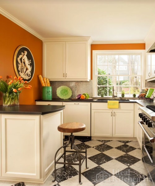
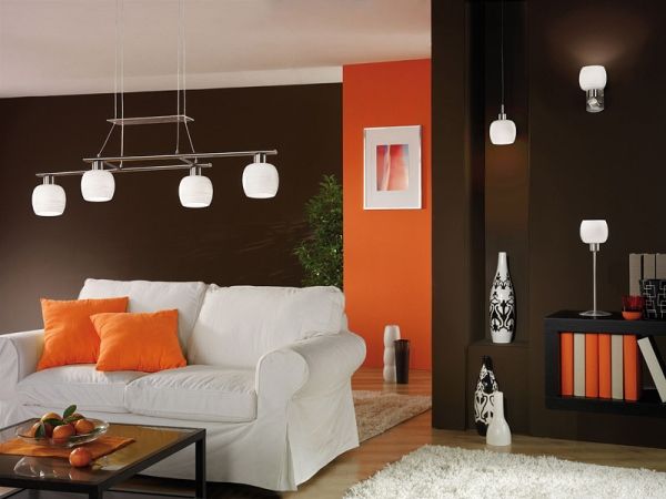
Let's start with the classics - white. Orange in combination with white looks great, although a little chilly. If you make all the walls white, then the orange furniture set will perfectly complement the kitchen design. But completely paint the walls in orange is not worth it, you do not need to abuse this saturated color. It is better to select one wall, for example, dining area, in orange, thus zoning the space.
Orange and brown are also a good combination. The main rule here is the predominance of brown over orange. For example, it will look very creative and unusual if you make an orange glossy floor, and the walls and furniture are brown in color (light is desirable).
The orange-black interior will give your kitchen elegance, exclusiveness and subtle charm. However, these two shades should be complemented with light or beige walls or floors. Let your kitchen set be black and orange.
Gray and orange are two opposite colors, but if proportions are correct, they will perfectly complement each other. There should be more gray shades. Orange is best used on accessories.
Advice! Try, combine colors, but remember, so that the kitchen does not lose its style due to the abundance of colors, it is best to use no more than three shades.
A kitchen made in orange requires a lot of light to play like the sun. It is better to organize spot lighting around the entire perimeter. If at the same time there is still a lot of natural light, then it will be generally wonderful.
Orange kitchen design requires a careful and focused approach. Try, create and you will definitely succeed.
Brown has a large number of different tones: light and rich: chocolate, wenge, coffee - they can often be found in the interior. Dark and light wood furniture, brown decorative items, accessories, flooring ...
This color is almost as versatile as white. Brown looks especially impressive in the details of the decor.
The interior, which is dominated by brown shades, differs in depth, it breathes with coziness and warmth.
If you use brown correctly, the decor will turn out to be very beautiful, juicy and deep, the main thing is not to overdo it with dark shades.
Brown can be used in the decor of any room. This color has a calming effect on the psyche. Interior in brown tones eliminates nervous tension, disposes to rest and tranquility.
Psychologists have noticed that brown is instinctively chosen by people prone to anxiety, so they seek reassurance. This is a conservative color that symbolizes consistency, which is why for classic style it fits perfectly.
Advantages
An interior in brown tones has many advantages: we will find out which color matches brown in the interior and consider the main advantages of using it:
Such a design versatile: brown suits all styles, both modern and classic.
![]()
Palette of brown, chocolate can be combined with a large number of shades, it combines colors into a single composition.
Decor in this color practical: Dirt on brown surfaces is almost invisible.
The color scheme of brown is quite varied: light caramel, coffee, sand - there is plenty to choose from. Brown tones look noble.
The palette has a beneficial effect on the emotional state, gives a feeling of confidence. This explains the fact that calm, clear-minded individuals prefer brown décor.
Design in brown tones helps the modern person to escape from problems and rush.
Combination with other shades
It is not recommended to use it in its pure form without dilution. The predominance of brown in a small area visually makes it even smaller and darker. To avoid this effect, you should complement it with lighter colors, for example, white. White refreshes brown, dilutes it. It is even better to complement this duet with bright colors, complement with cheerful colors.
Brown paired with beige looks good. These shades balance each other, and they both belong to the same color palette. The interior in brown-beige tones breathes with home warmth. This combination is perfect for bedrooms, living rooms, dining rooms, and bright curtains and accessories will complement the design picture and create a holistic interior.
 Interior in beige and brown tones photo
 For a nursery, this is not a very suitable combination: children like a more cheerful decor, but for the rest of the rooms it is what they need. In the nursery, brown can be used fragmentarily, combined with pink.
The brown-pink pair in the bedroom design adjusts to a romantic mood, gives the room tenderness and comfort.
The combination of rich brown shades looks harmonious, favorable for perception, charges with optimism. Brown and green are natural tones. Such a duet is associated with brown tree branches, on which the leaves turn green.
Lemon tones also complement brown well: this design relaxes, adjusts to rest after a working day, calms the nervous system.
If a yellow tone prevails in green, it stands out more when paired with chocolate. Lemon tones make the brown room brighter and improve the mood. This color scheme is most suitable for the kitchen and living room.
Chocolate in combination with shades of purple has gained particular popularity. But keep in mind that this couple has a strong psychological effect, so people who are emotionally unstable are better off avoiding such decor.
Chocolate tones reduce emotionality, in such an interior it is very comfortable, efficiency is minimized, therefore, a shade is needed that will give an emotional shake-up, and purple is not at all suitable for this.
Experts in the field of psychology believe that purple will further enhance this effect of brown, plunge into sadness and despondency. This combination is acceptable only in the bedroom, because purple enhances sensuality, creates a mysterious aura.
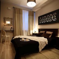
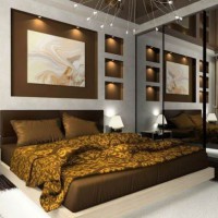
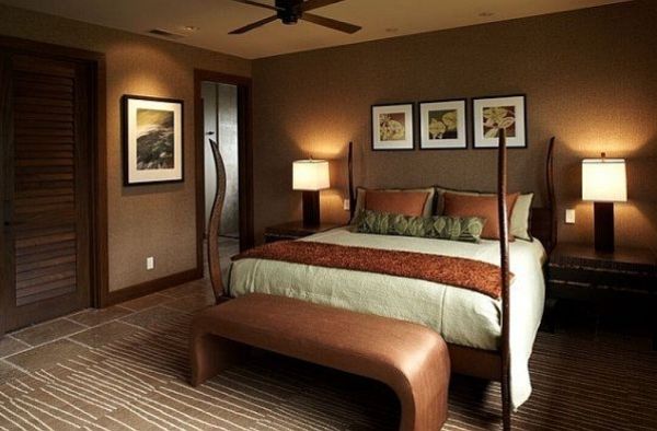
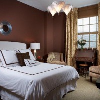
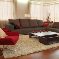
An excellent decor option is a combination of brown with orange and blue. Walls can be decorated with brown, and decorative elements can have blue and orange tones. Coolness blows from blue, and orange brings warmth and brightness to the interior.
If the decor combines brown with blue, the interior is laconic, the room seems spacious. The orange-brown decor is much warmer. This color scheme looks good in the bedroom.
There are only two colors that you shouldn't pair brown with - black and gray.
Room decoration
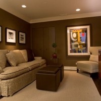
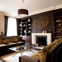
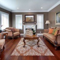
Living room
Living room interior in brown tones is always in fashion, it is a classic design. Correctly selected shades of brown, their combination with other tones will make the room stylish and give a sense of stability.
Brown evokes associations with soil, and earth is the basis of everything, including the family nest. Therefore, brown is the best suited for the design of a living room or hall.
The shades of coffee and sand create a comfortable atmosphere and give the interior elegance. The living room in brown tones is relaxing and inviting to rest. This finish is more suitable for living rooms with good natural light.
Natural wood furniture in such an interior looks solid and noble. Leather sofas They are distinguished by a special chic and look nobler than black ones. For brown furniture, you can pick up curtains in a slightly lighter tone. Furniture items of rich shades will be balanced by beige wall decoration.
It is better to use one of the lighter shades of brown as the main one. It is complemented with green, white, beige, orange, or blue.
The white and brown living room looks respectable: this decor is considered elite and comfortable for living.
The brown-orange combination is suitable for the interior of the living room in an oriental style or minimalism.
The interior of the living room in cinnamon color is a great option for the interior, not only in a classic, but also in a modern style.
Bright accessories - for example, pillows on sofas, paintings, figurines, vases - will dilute the dark decor.
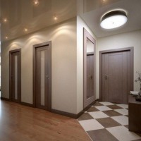
Kitchen
The atmosphere in the kitchen should be cozy, and brown will help you achieve this. Brown kitchen design has been popular for many years: this decor is relevant at all times.
Important! In the interior of the kitchen, designers recommend combining brown with beige, green, yellow, white, blue or orange tones.
For a kitchen with this interior color, it is most suitable wooden furniture... But the cost of furniture made from natural materials is quite high. Therefore, as an option, you can pick up furniture made of chipboard with MDF coating.
The plastic surfaces have a wood imitation and look very solid.
Dark wood furniture looks good against light-colored walls, and conversely, light-colored furniture is perfect for brown walls.
Furniture finishes can be monochrome or combine several colors, with a matte or glossy surface. Both strict laconic forms and carved surfaces are appropriate.
Laminate, parquet, brown tiles can be used as flooring.
Window openings are decorated with curtains with brown patterns, and the walls with brown wallpaper or plaster.
Milk-colored household appliances are in perfect harmony with the brown finish.
Advice. The lighting should be soft: use multiple light sources.
Tableware and a coffee-colored tablecloth will complete the design picture.
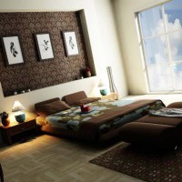
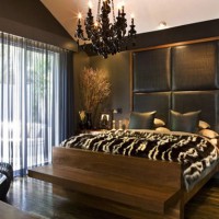
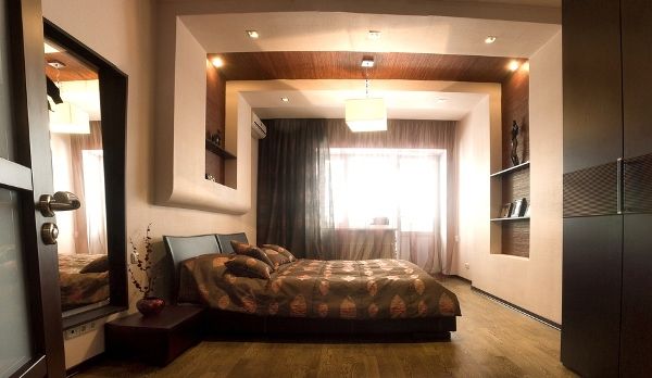
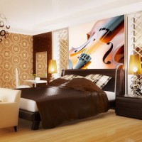
Bedroom
The brown scale of the bedroom interior helps to relax: such decor in chocolate shades soothes and instills pacification.
In design, you should give preference to light shades of brown. This color scheme will appeal to both young people and older people.
There are many options for decorating a bedroom in brown colors. The interior can be decorated in both classic and modern style.
Looks good against the background of light walls dark furniture... And for the walls covered with brown wallpaper, you should pick up pieces of furniture made of light wood species.
Important! Keep in mind that too much darker shades will visually diminish the room.
Lighting in a brown bedroom should be very good and preferably as natural as possible. Artificial sources It is recommended to place the light pointwise.
For small bedrooms, it is better to choose light shades of a brown palette.
In the interior of the bedroom, chocolate is combined with light green, beige, apricot and white shades.
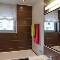
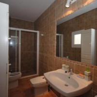
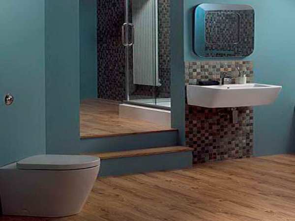
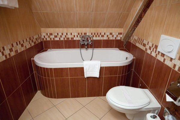
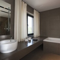
Bathroom
Bathroom in brown shades - good option decor: such an interior is non-marking, which is very practical, and in this color even a simple finish looks elegant and noble.
In a small bathroom, use light shades of brown. The decoration can be combined with brown and white colors... Accessories with rich color will add brightness to the room.
Advice. The design of the bathroom in a brown-beige color is popular. The upper part of the walls can be decorated in light colors, and the lower part in more saturated ones.
A bathroom with wood décor looks natural and simple.
It is good to use tiles with a brown pattern for bathroom design. The horizontal brown stripes on the tiles visually "push apart" the walls, and the vertical ones "stretch" the ceiling, thanks to which the room appears visually a little more spacious than it really is.
Brown tiles are also used as a floor covering, in this case it is recommended to make the ceiling light, having a glossy surface. A chic option is a tile that imitates wood or stone.
The combination of white fixtures and fittings with brown finish gives the room an elegance and coolness. These colors complement each other perfectly. Brown absorbs light and white reflects.
![]()
A few more tips:
- in order for the lighting to be good, the designers advise to make the illumination of the mirrors, the ceiling, place the lamps on the walls;
- the interior decoration of the bathroom in green-brown tones with wooden decor elements is typical for country;
- in a classic interior, blue or olive is paired with chocolate;
- use a shade of wenge with care so that the room does not seem gloomy;
- in bathroom decor, brown can also be complemented by blue, pink, orange and yellow shades.
Thus, Brown color can be safely used in the interiors of living rooms, kitchens, bathrooms and bedrooms.
Do not be afraid to combine it with other shades, experiment and you will create a beautiful decor that will look stylish and elegant.
Photo gallery
![]()