Color harmony is the consonance of colors, their compatibility, a beautiful ratio. Often, artists achieve harmony in their works, relying on intuition and an inner sense of color. This feeling grows in the process of constant work. However, harmony in color is based on certain laws. In order to understand these patterns, you need to use the spectral wheel or color wheel.
Three primary colors.
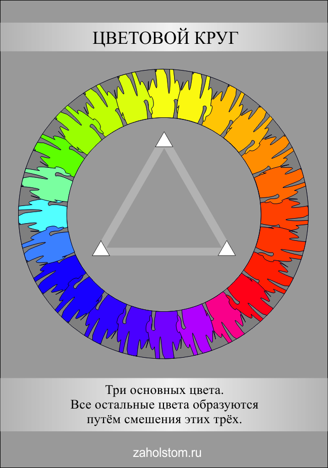
The color wheel is a scale of color shades located around a circle. These colors are arranged in a specific sequence - just like in a rainbow. Therefore, the color wheel for the artist is almost the same as the periodic table for the chemist. Among all the colors of this circle, there are three, which are called basic: yellow, red and blue. All a huge variety of other colors are formed by mixing these three (this is applicable for the light reflected from objects in the CMYK color model; if the light is emitted as on a monitor, then this is an RGB color model and here mixing occurs according to other laws, between green, red and blue) ... But in practice, it is not always possible to achieve the desired color sound, since paint pigments have certain limitations. For example, if you mix red (scarlet) and blue (azure), you get a dirty purple color. If red (kraplak) and blue (ultramarine), then pure purple... But this is not always enough, therefore, cobalt purple or purple kraplak are also produced. Its color is very intense and clear. Thus, despite the fact that in theory you can get all the colors from just three basic ones, in practice artists use a large number of colors. However, the main ones are blue, red and yellow. On the color wheel, their positions form an equilateral triangle. These colors cannot be obtained by mixing others.
Color saturation and brightness.
![]()
Any color has a number of characteristics. The main things for an artist are saturation and brightness. These are different concepts. Brightness refers to how much the selected color is illuminated. That is, any color can be lighter or darker with the same saturation (close to white or black). Saturation means the strength of the color, so to speak, its "richness". It can be different at the same color brightness (or illumination). The lower the saturation of the color, the more it approaches gray shades. This can be clearly seen in the given table of colors.
Harmony contrasting colors.
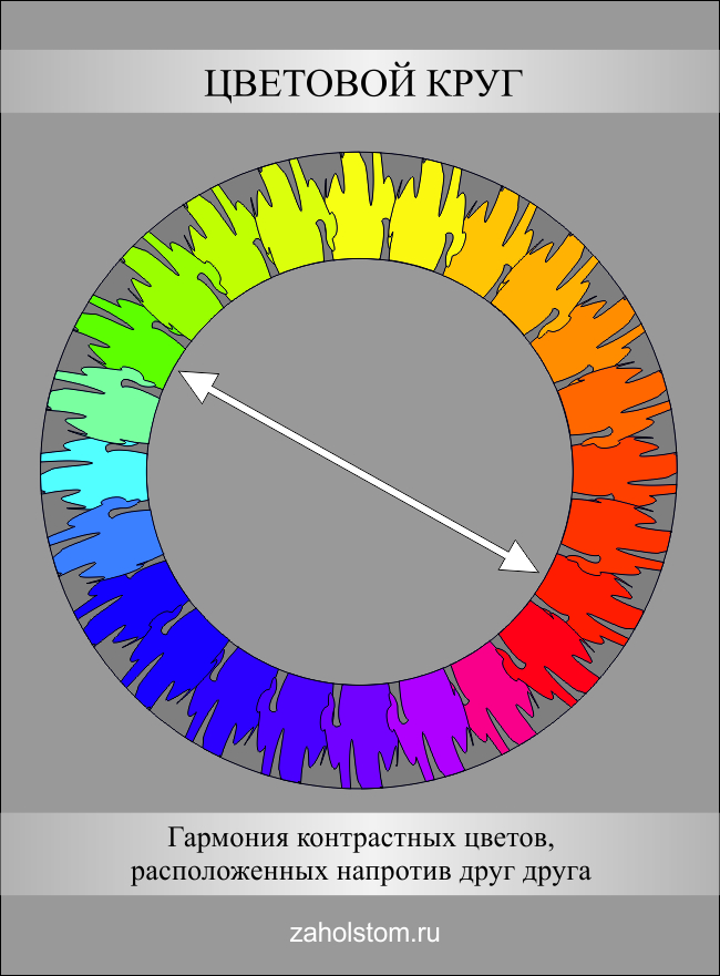
The color wheel has colors that are opposite each other. it contrasting colors... They form the most contrasting combinations. For example, if you place red next to orange, then it will not stand out much. But if the same red color coexists with green, then it will seem to "burn". That is, green and red reinforce each other, create contrast. If you look closely, then red and green are located in the color wheel exactly opposite each other. There are three pairs of contrasting colors: red-green, yellow-violet, orange-blue. These are opposite colors, forming the most contrasting combinations.
Harmony of related colors.
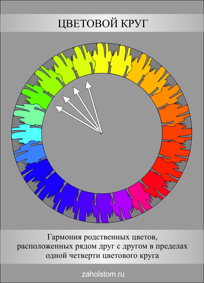
Colors within one quarter color wheel and having one common shade in themselves are called related. They seem to be "related" by the common color contained in them. There are many related flowers. For example, red, red-orange, orange-yellow... They all have a red color. This unites them. Therefore, they are called related. There are the following four groups of related colors: yellow-red, red-blue, blue-green, green-yellow.
Harmony of related-contrasting colors.
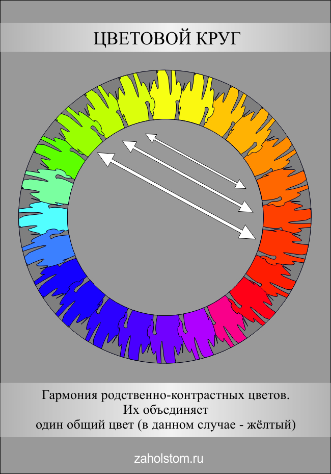
Relatively contrasting are contrasting colors that contain one common color that unites them. Relatively contrasting colors are located in two adjacent quarters of the color wheel. There are four groups of related-contrasting colors: yellow-red and red-blue, red-blue and blue-green, blue-green and green-yellow, green-yellow and yellow-red.
Chromatic and achromatic colors.
![]()
All colors except black, white and gray are called chromatic. Accordingly, achromatic colors are shades of gray, white and black.
Warm and cold colors.
![]()
Warm colors are yellow, orange, red, brown, beige and many similar shades. These colors are associated with the warmth of fire. Cool colors: blue, cyan, violet, green, as well as a large number of colors derived from them. Cold colors are associated with coldness, freshness, spaciousness ...
I am the same teapot mentioned in the title: I didn’t go to art school, I didn’t study color. But I turned out to be a meticulous teapot, and until I independently figured out the basics of this science, I did not start writing an article.
It all started with the fact that I learned to be a stylist-image maker. In the course of training (and with different teachers), the topic of color harmony constantly emerged. But all the time the information was not structured, or poorly structured. The teachers suggested just memorizing color combinations and proportions, but this approach is not at all close to me - if there are objective patterns, algorithms, then I will try to study and understand them. Only then will I be able to apply this knowledge in real life.
Before I took up this job, I honestly shoveled the Internet. Bloggers only quote the authors of books, without trying to explain to the layman what's what. (I did it myself here).
I studied color science from Johannes Itten's book The Art of Color. There are only 95 pages in the book, but I sat on each one for several days - the author's reasoning is so deep and multidimensional. Johannes Itten is an artist and major color researcher of the 20th century. It is he who is the creator of the color wheel - the main tool for color design. In general, I highly recommend purchasing this book in your home library - it will be useful for both you and your children.
PHYSICS OF COLOR
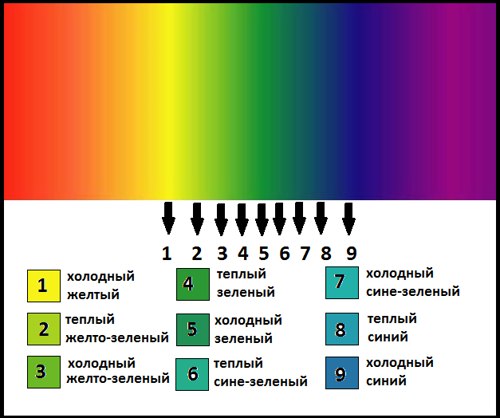
Remember from school: "Every hunter wants to know where the pheasant is sitting?" With this funny phrase, we were taught the sequence of colors in the rainbow. And why exactly such a sequence of these particular colors was not particularly explained to anyone.
We will find explanations by reading about the experiment of Sir Isaac Newton, which he spent in 1676. The venerable scientist with the help of a triangular prism spread out sunlight on the spectrum and received this color sequence. 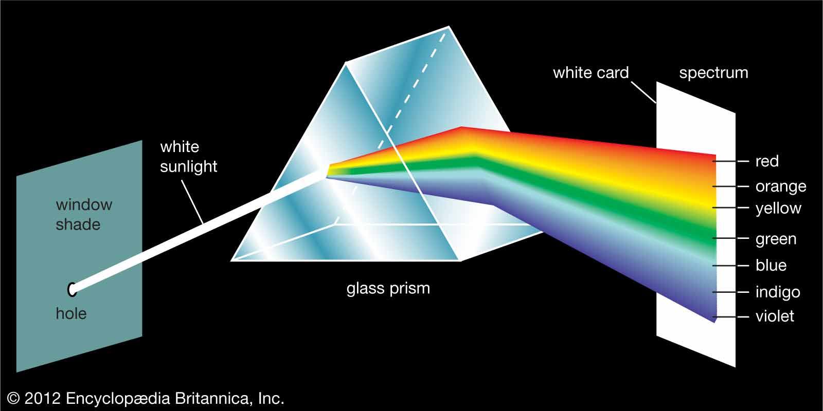
Then he did many other experiments with a prism and sunlight... We are interested in the experience of obtaining additional colors. If with the help of a prism we collect all the colors except green, then we will see red on the screen. And if we collect everything except purple, we get yellow. But if we combine red with green, and purple with yellow, then the result will be sunny color.These color pairs are called complementary. This is very important to know if you want to deal with color harmony.
COLOR CIRCLE
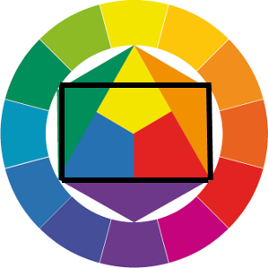
The above information, of course, is useful, but it does not allow you to simply structure the provisions of color and clearly demonstrate them. Researcher Johannes Itten studied color for many years before deriving the formula for his famous color wheel. From now on, I will constantly draw your attention to the color wheel, because he acted as the very visual color designer who simply explains the principles of color harmony.
It is very important to understand how he composed this circle. Below I am writing an algorithm, read it carefully.
1. Itten took three primary colors: yellow, red and blue, and evenly painted an equilateral triangle with these colors.
Skeptics will ask: "Why did he take these colors as a basis?" Great question, thanks! He chose them because anyone with normal vision is able to identify, for example, yellow, without a red or blue tint. It's the same with red and blue. But with other flowers, the whistle begins. 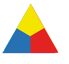
2. Then he began to mix colors with each other: yellow with red, red with blue, blue with yellow. The result is orange, purple and green, respectively. Soooo, to fit these colors into the model, Itten drew a circle around the triangle with a compass and built a regular hexagon on its basis. He filled the resulting empty triangles with new colors. 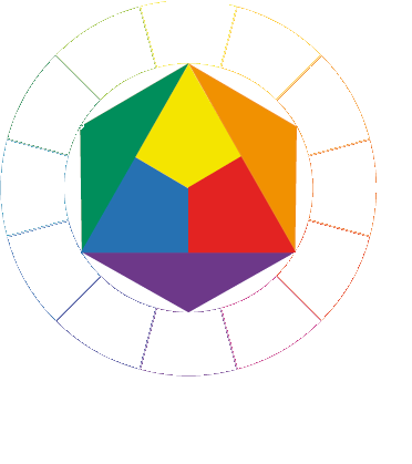
3. Around this circle, he drew another, larger, and divided it into 12 identical sectors. He filled six sectors, according to logic. Look at the picture: the vertices of the triangles clearly indicate what color each sector should be filled with. 
4. To fill the remaining 6 sectors, Itten began to mix neighboring colors: yellow with orange, orange with red, red with purple, etc. With the resulting colors, he filled in the empty sectors.
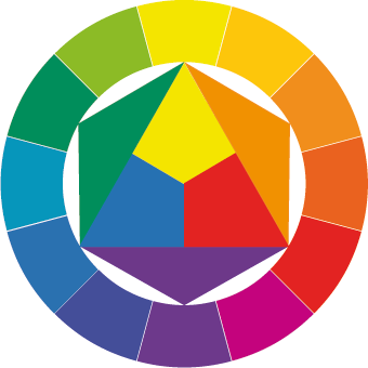
So, if we look at the resulting color wheel, we can see that the complementary colors (these are the ones that form sunlight in tandem, remember?) Are opposite each other. And the 2 main tricolors: red-blue-yellow and green-orange-purple form equilateral triangles (take a closer look, they are located exactly in 3 sectors!).
Congratulations, if you understand how the color wheel works, then it will not be difficult for you to figure out how to use it to determine harmonious color combinations.
COLOR HARMONY
Usually, when you ask people what color combinations are harmonious, they call either mixes of similar colors (purple-blue-blue) or pastel colors (pink-blue-beige).
Itten studied for many years how people relate to flowers and concluded that for different people the phrase "color harmony" means completely different combinations flowers. (By the way, he also deduced some regularities here, he is also the founders of the theory of color typing "Seasons", but today is not about that). Such results did not suit him at all, he tried to find some objective laws according to which absolutely all people with normal vision would perceive some color combinations as harmonious.
And he found them! (Not without the help of Goethe, Gehrig, Rumford and Ostwald, of course, but this, as you understand, is also not in this article).
You and I, that is, people, are so arranged that we love order in everything. And the statement "Harmony = order" is true.
I will tell you here about several experiments that led to a very important conclusion regarding harmony, which I will write about just below. (It's just that you're not ready for it yet).
Experience number 1: Look at the red square on a white background. Now close your eyes. What color will be before your eyes?
That's right, green. When I was little, my mother often trained my eyesight with the help of this exercise: I had to look for 15 seconds at a light bulb on which a black circle was drawn. Then I had to look at the wall. And I saw what circle on the wallpaper? Correctly white. This phenomenon can be called sequential contrast. The eye needs a complementary color to achieve balance. Cool, yeah?
Experience number 2: Look at the gray square on a yellow background. Look for a long time, 30 seconds. 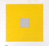
Don't you think it's not just gray?
Now look at this same square on a green background. 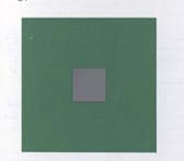
What shade does it have, m?
If you did everything correctly and you have normal vision, then, accordingly, you saw purple in the first picture and red in the second. NS This phenomenon is called simultaneous contrast. Pure colors tend to color other chromatic colors with their complementary color!
I will not force you to carry out any more experiments, but I will tell you about the amazing results of the experiments of obsessed physiologists. In general, we were looking for a color, on the perception of which we spend exactly as much energy as is required to restore them. And it turned out to be ... average grey colour! It is he who gives a sense of balance, which is so necessary for our vision. Itten did a lot of experiments and found out that if you mix additional colors (on paper), you get the same medium gray. It will also work if you mix red with blue and yellow. In addition, if we mix other colors that are formed by mixing red, blue and yellow in the proper proportions, then we also get the same average color.
Friends, congratulations! We got to the last paragraph!
COLOR HARMONY
So, based on all the reasoning and inferences made in the previous paragraph, Itten concluded that all colors that are connected in the color wheel using equilateral and isosceles triangles, squares and rectangles form harmonious color combinations.
Actually, that's all. I have a real color wheel, and when I need to come up with what to combine it with, I begin to speculatively draw geometric shapes with apex in desired color... But you can also use the picture on your phone.
Let's take a look at a specific example.
EXAMPLE.
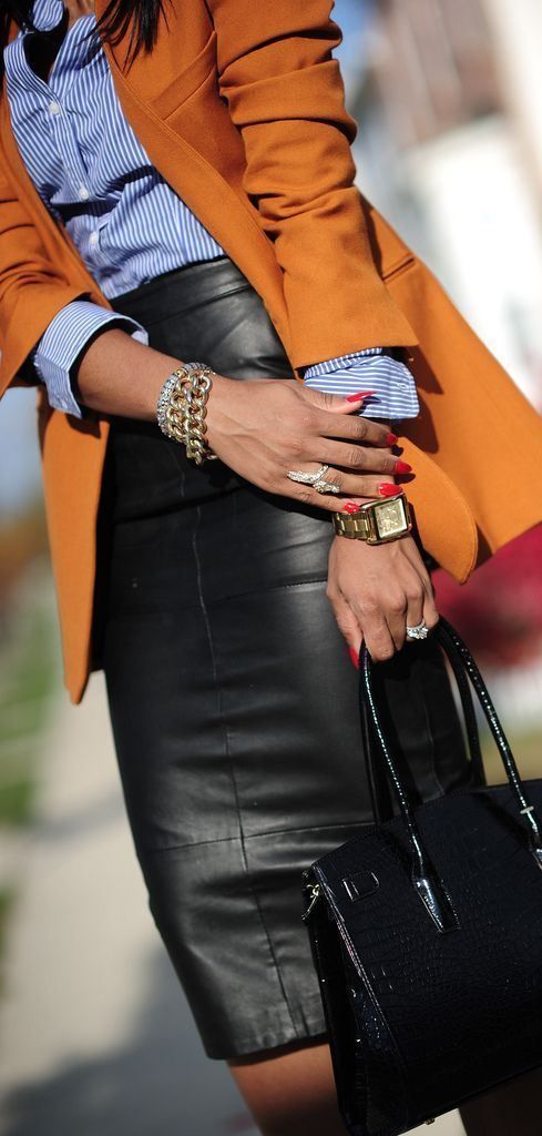
I have a coat orange... What are the possible color combinations?
1). A combination of two colors.
Take from the color wheel a color diametrically opposite to orange. it turns out blue. 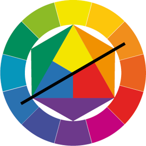
2) A combination of three colors. There are various options here :
a. Equilateral triangle: Orange, green and purple: 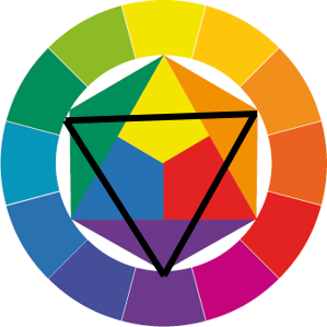

b. Isosceles triangle: yellow, orange and red. 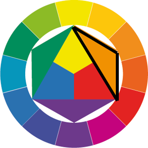
with. Another isosceles triangle: orange, yellow-green and red-purple. 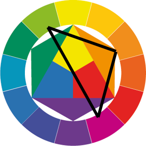
d. The next isosceles triangle: orange, blue-violet, blue-green. 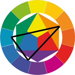
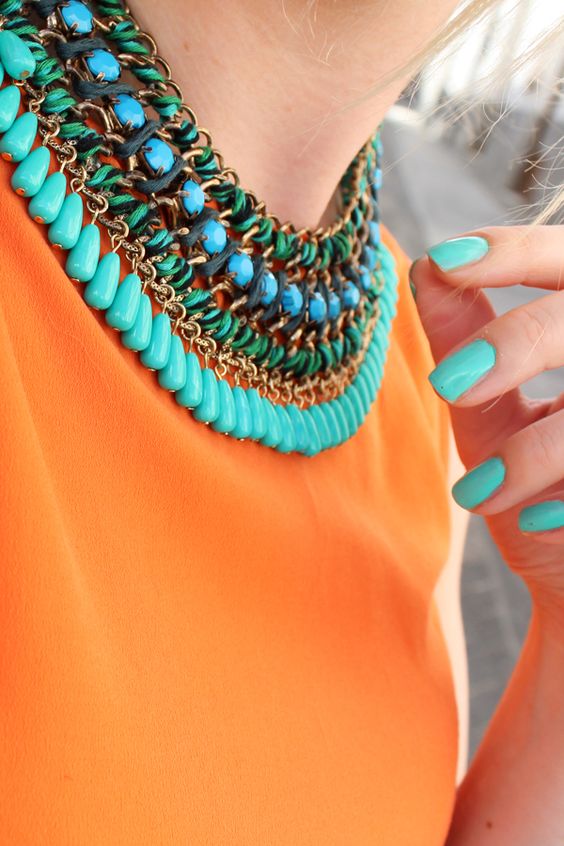
e. So, the smallest isosceles triangle remained, with neighboring colors: orange, yellow-orange, red-orange. 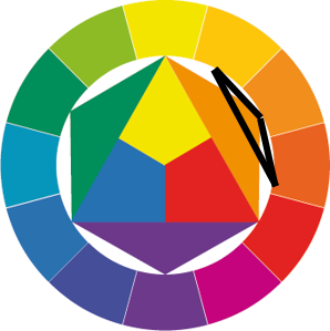
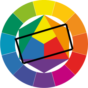
3). Combination of 4 colors.
a. The square is composed of orange, blue, red-violet and yellow-green. 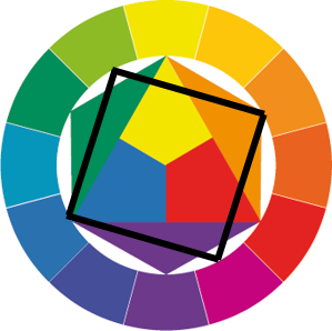
 .
.
b. The rectangle will be orange, red, green and blue.
c. You can also make 2 rectangles: orange, orange-yellow, blue, blue-violet and orange, orange-red, blue and blue-green. I will not even try and pick up pictures, because the combinations will turn out for the eye. an ordinary person similar. 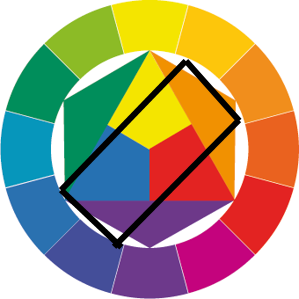
Well, something like that, comrades. As you can see, color is also possible on "you", without the help of the Internet. Personally, I now always have confidence when I create an interior or costume ensemble in different colors.
Of course, this article does not cover everything about color. In it, I only touched on the topic of color consonances. But we'll talk about the characteristics of color, about achromats, about color contrasts and the color ball sometime later.
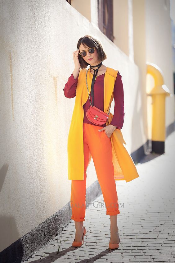
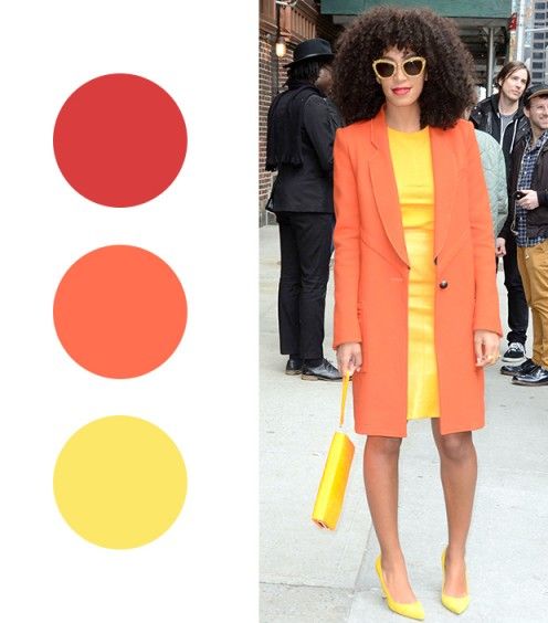
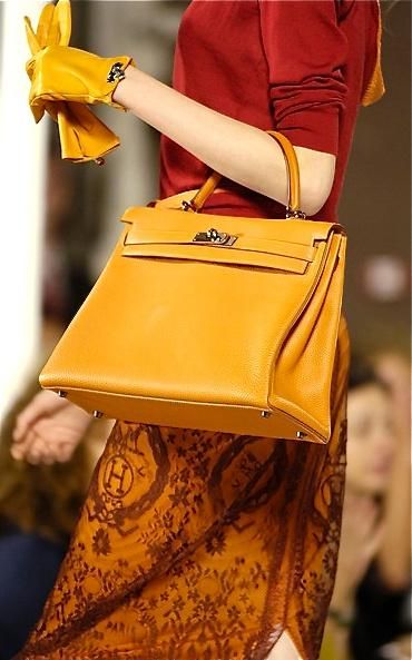
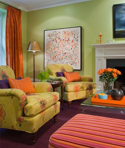
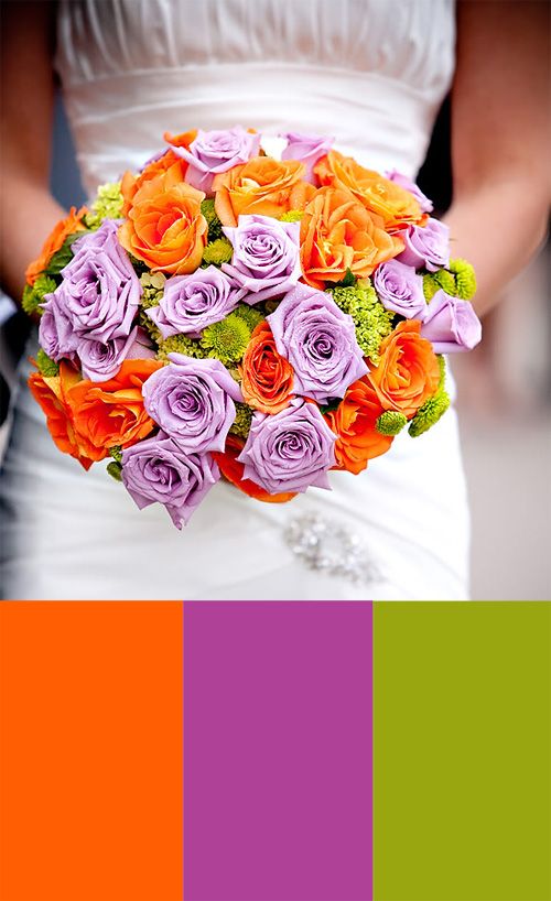
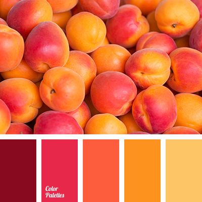
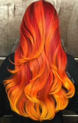
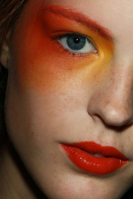
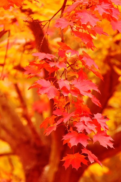
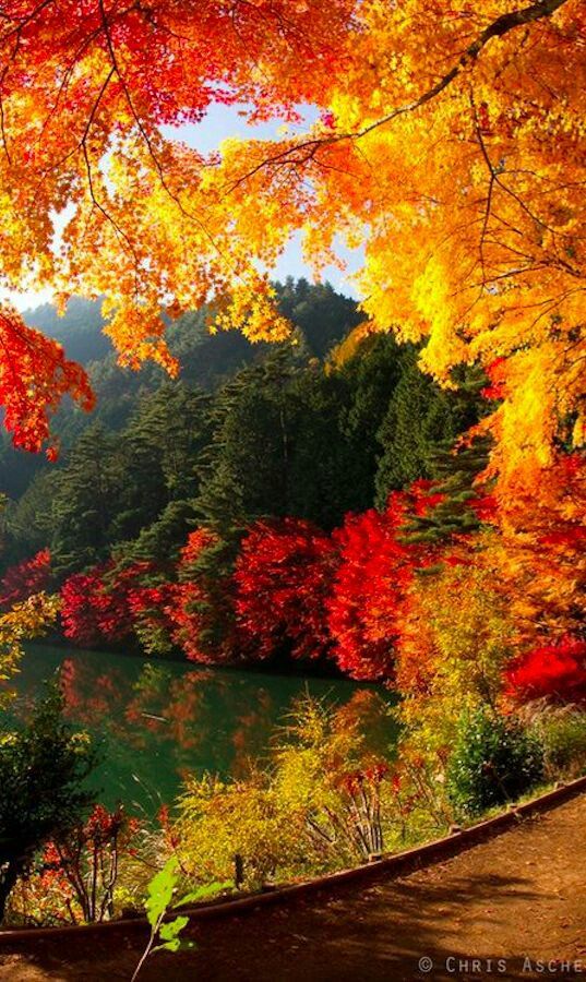
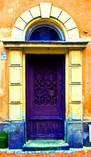
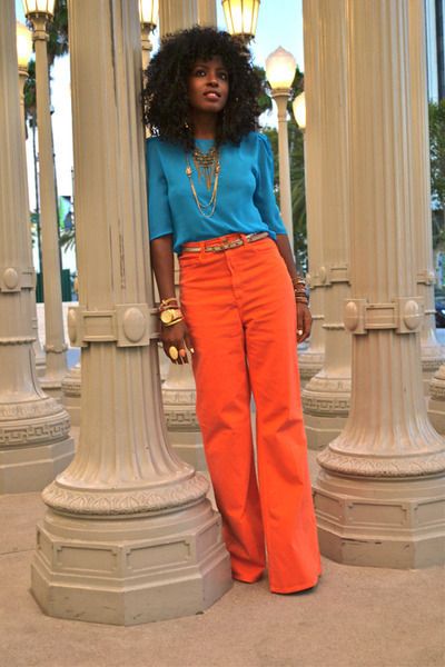
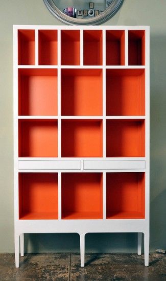
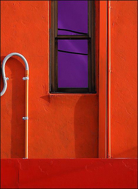
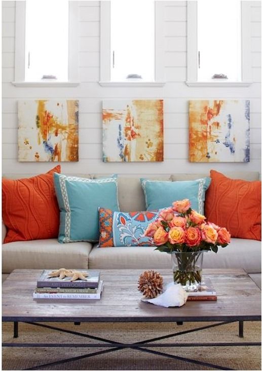
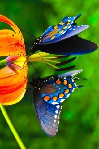
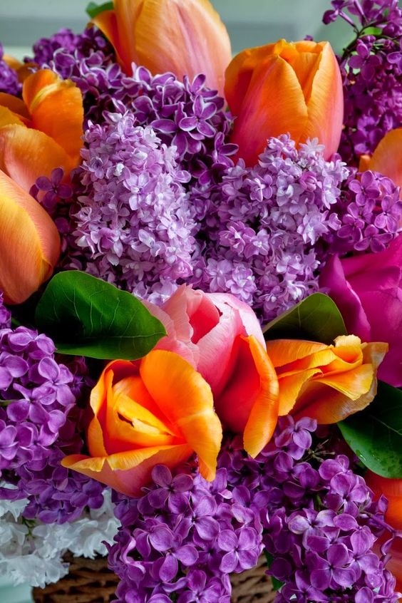
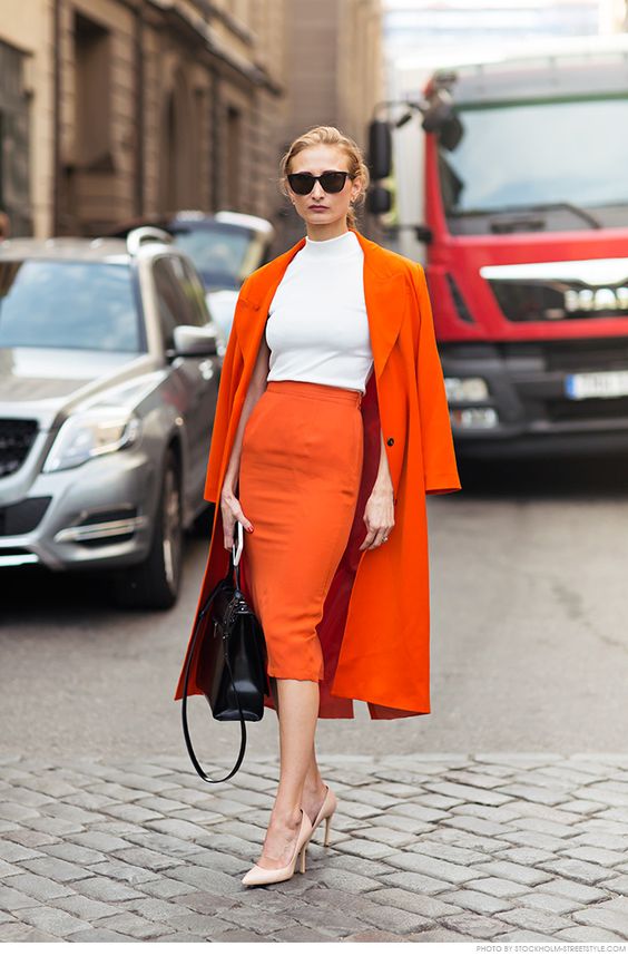
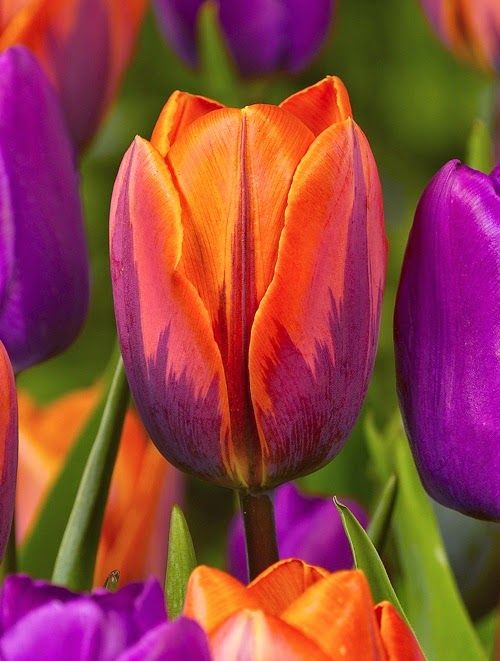
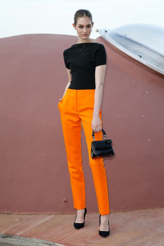
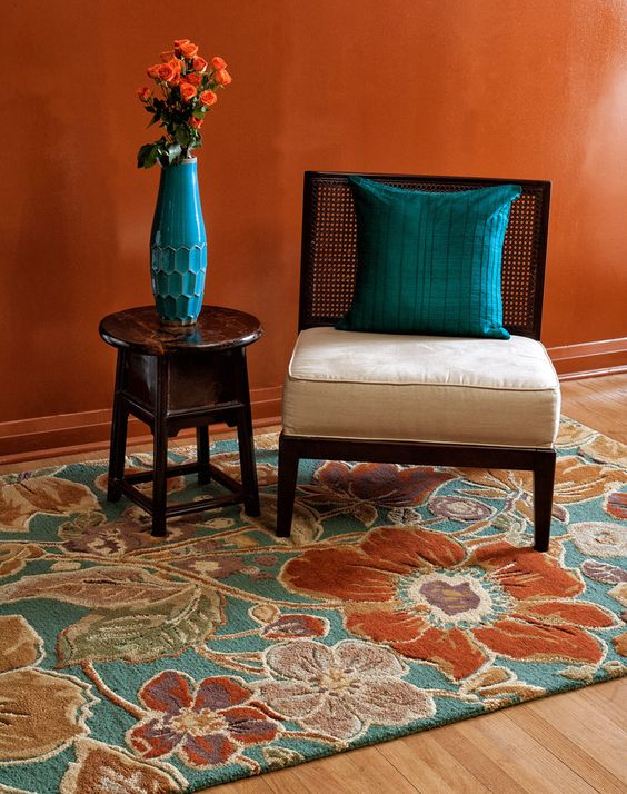
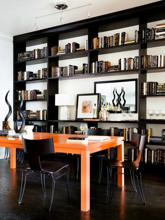
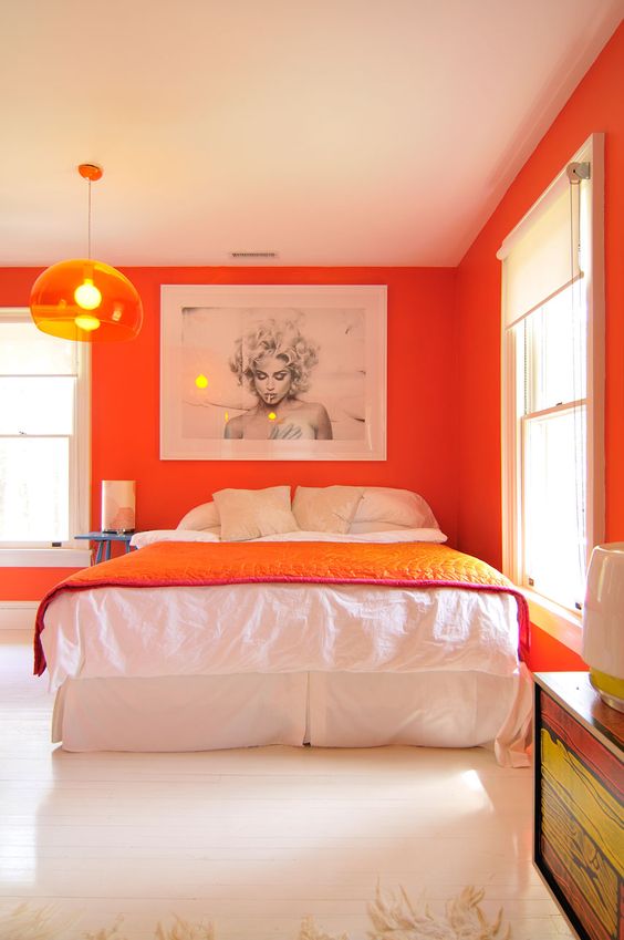
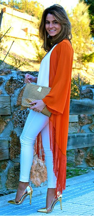
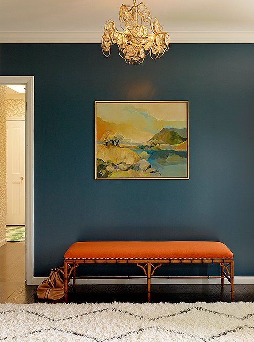
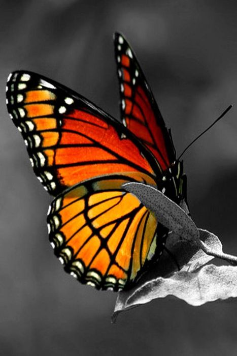
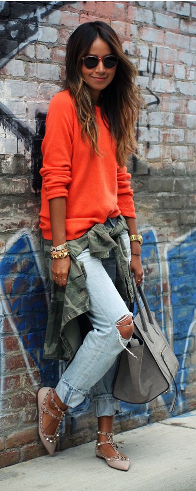
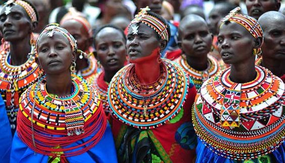
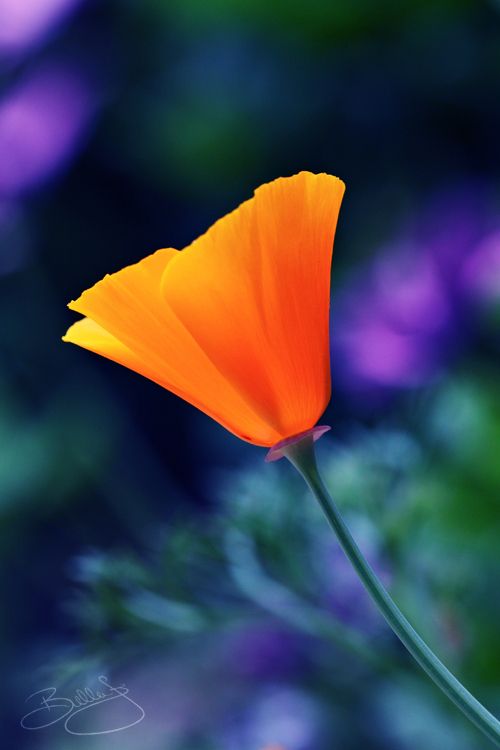
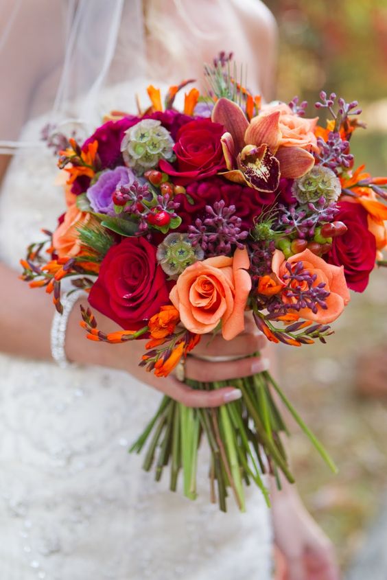
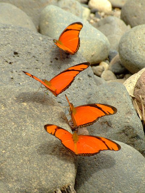
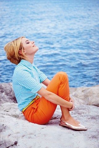
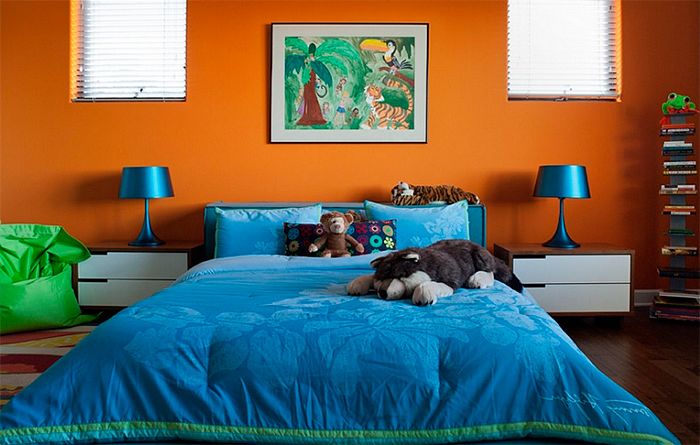
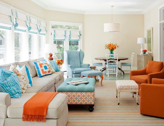
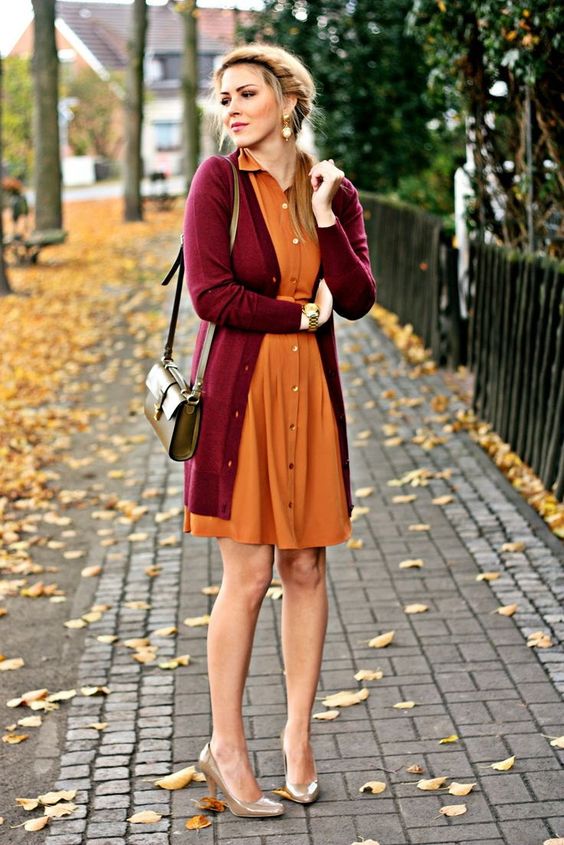
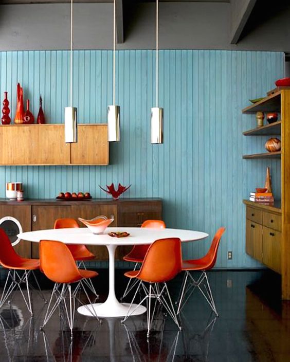
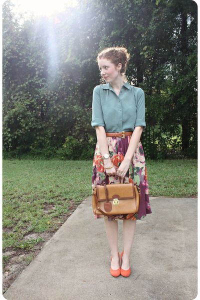
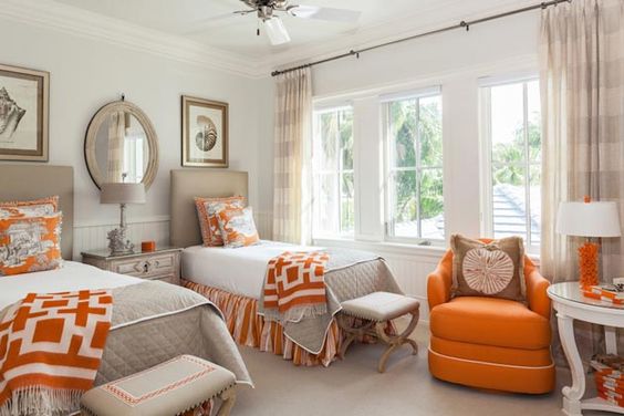
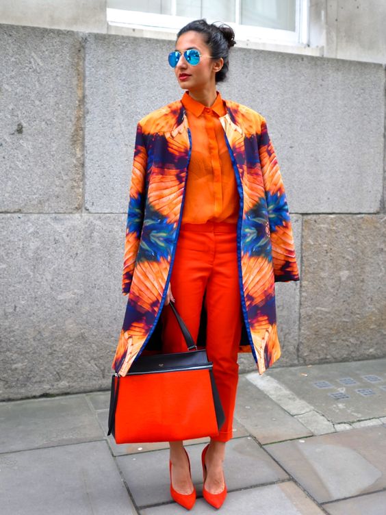
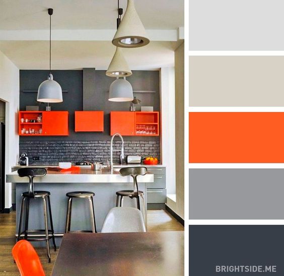
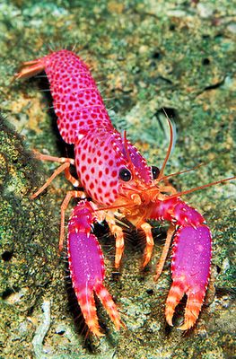
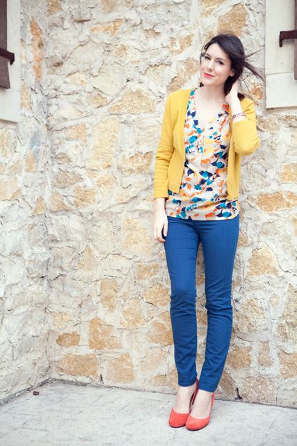
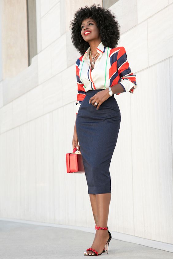
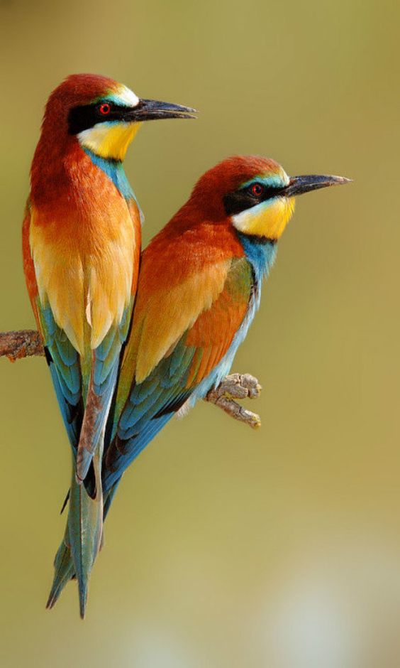
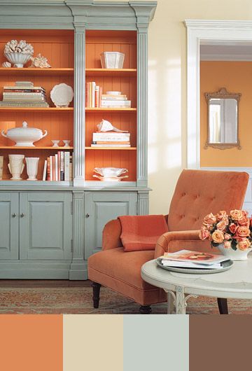
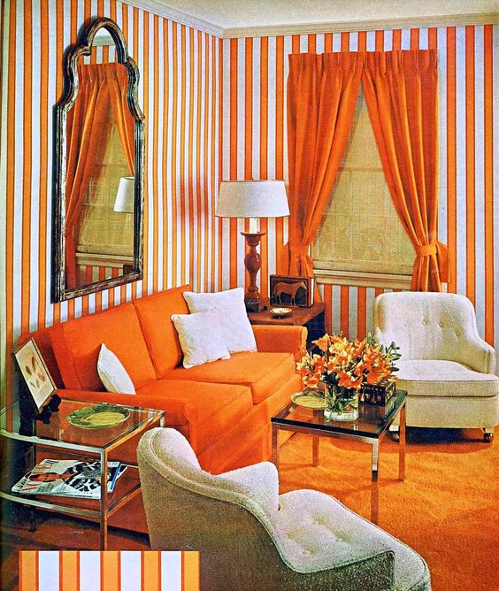
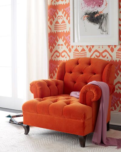
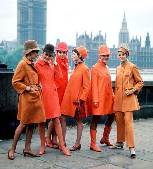
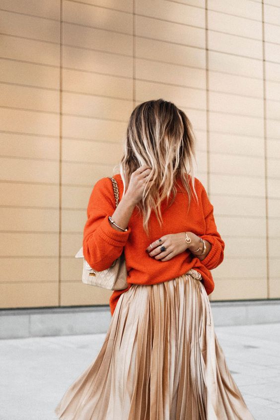
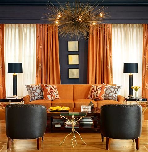
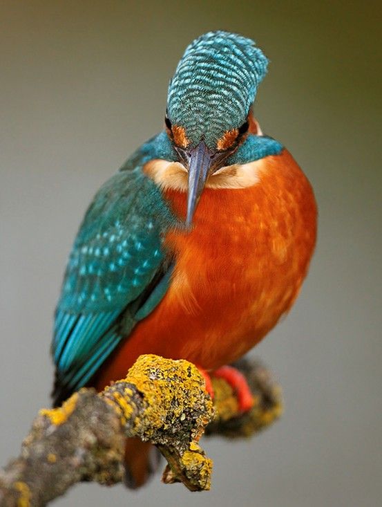
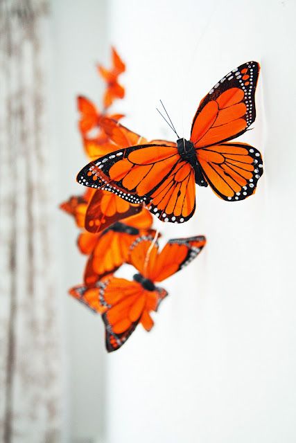
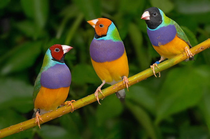
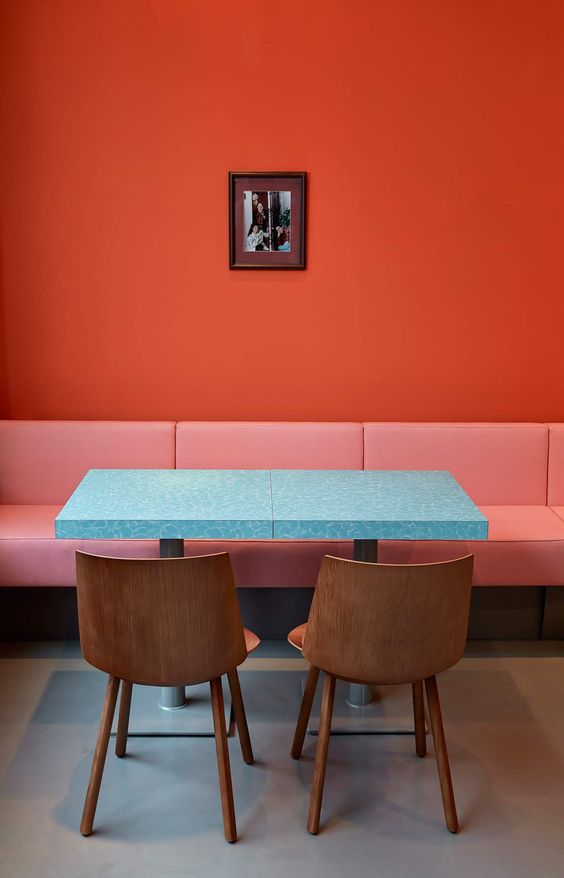
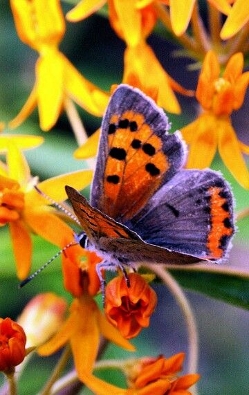
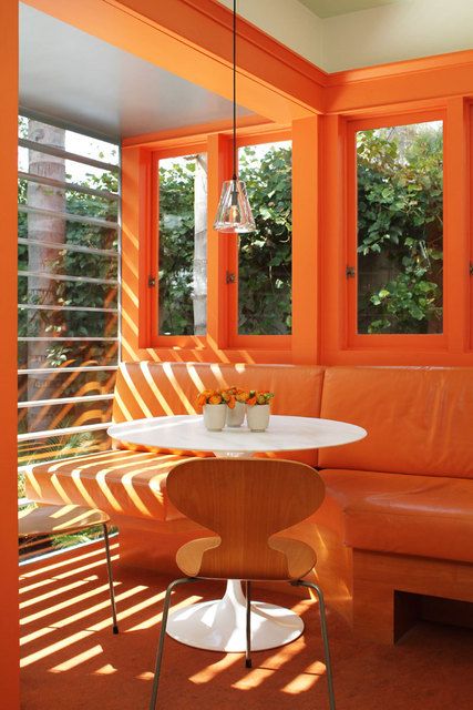
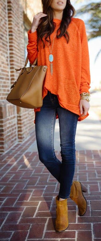
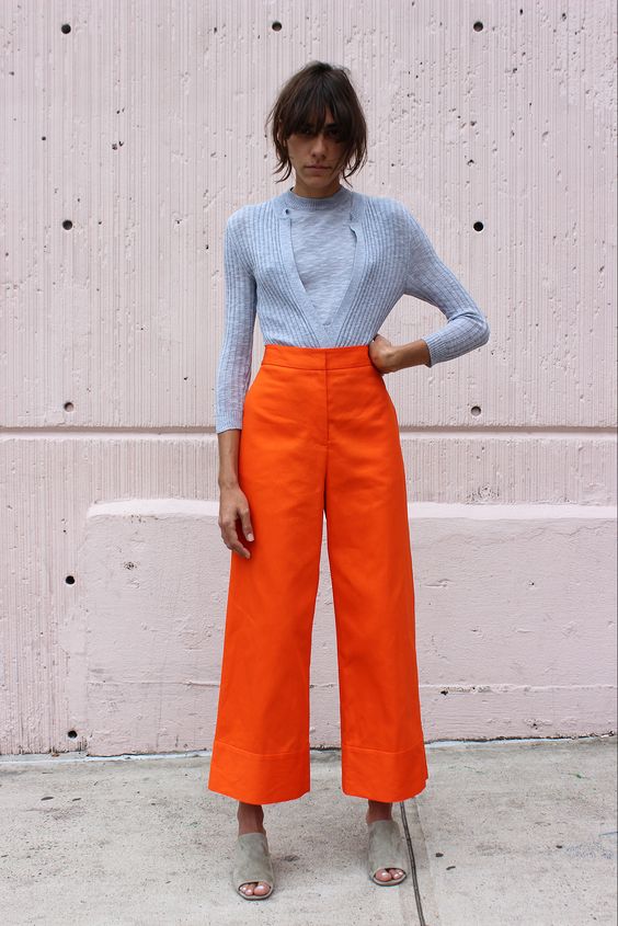
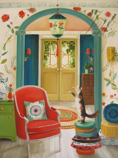
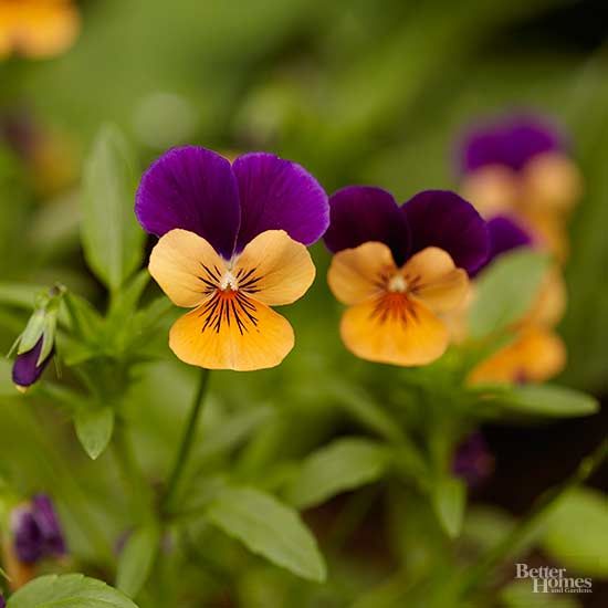
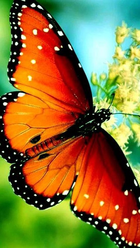
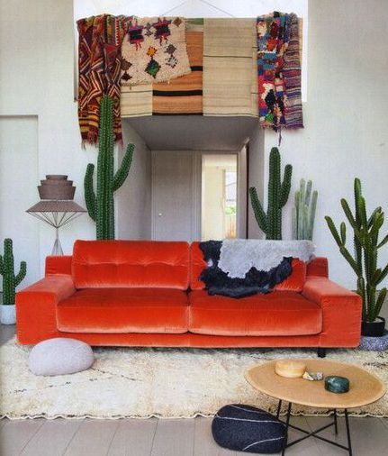
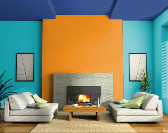
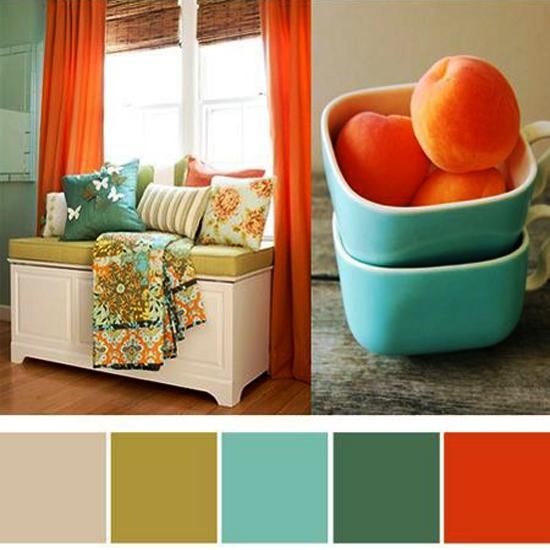
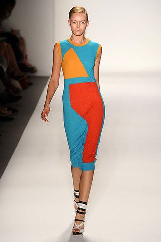
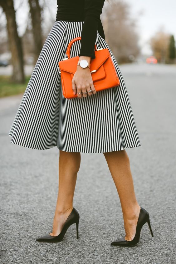
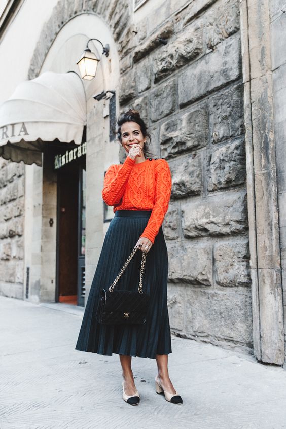
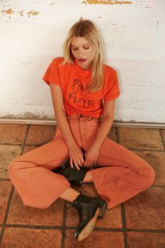
And now an exercise to consolidate the skill. For those who wish. Below I have laid out a lot of pictures with harmonious (and not so) color combinations, with the obligatory presence of orange. Your task is to look at the pictures, catch your emotions and determine the figures that underlie these consonances.
And that's how it is. Holiday greetings!
![]()
![]()
![]()
![]()
As you know, all the colors that we see can be divided into achromatic (white, black, shades of gray - no color waves, only lighting.) and chromatic (the colors of the spectrum, the color waves that our eye perceives). Color waves smoothly transition into each other, creating color continuum- continuous smooth color change.
These two directions do not exist separately, chromatic colors (the entire continuum) are mixed with achromatic colors, which gives the whole range of shades
that our eye sees. The whole range is most successfully presented in the three-dimensional "Tree" by Munsell. 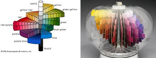
Impurities of different achromatic colors form different tone directions.
If you mix pure color with white, you get bright colors, with black - dark.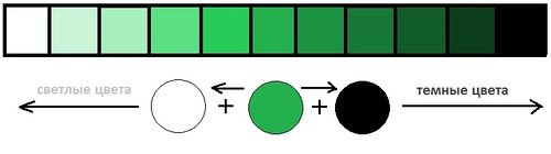
If we talk about color as about color waves, then gray is a mixture of color with its opposite (ie, for example, orange and blue), the two waves "extinguish" each other and the color saturation is lost. Therefore, soft colors (mixed with gray pigment, with the opposite wave, in fact) look "complex, nuanced". So, a mixture with gray gives " soft
colors". 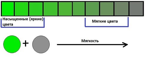
If we talk about artistic color harmony, then not all chromatic colors of the continuum look good with each other, they are combined with a certain rhythm. Colors with a golden undertone are considered warm , colors with blue - cold ... There are also temperature-neutral colors that are in a continuum between two shades.
In total, we have 6 color characteristics, 3 pairs of dichotomies
.
Dichotomy is a scale. It is not so much a choice or - or, as being on this scale. For example, both colors can be warm, but one is pronounced warm, and the other is closer to neutral.
The generally accepted color characteristics are:
Lightness: light
(with white impurity) or dark
(with a black admixture).
Brightness (saturation): bright
(almost pure, saturated pigment) or soft
(mild pigment, close to gray, gray impurity)
Color tone (place of color in the continuum). This includes the division of colors into warm
(with a golden undertone) or cold
(with a blue undertone)
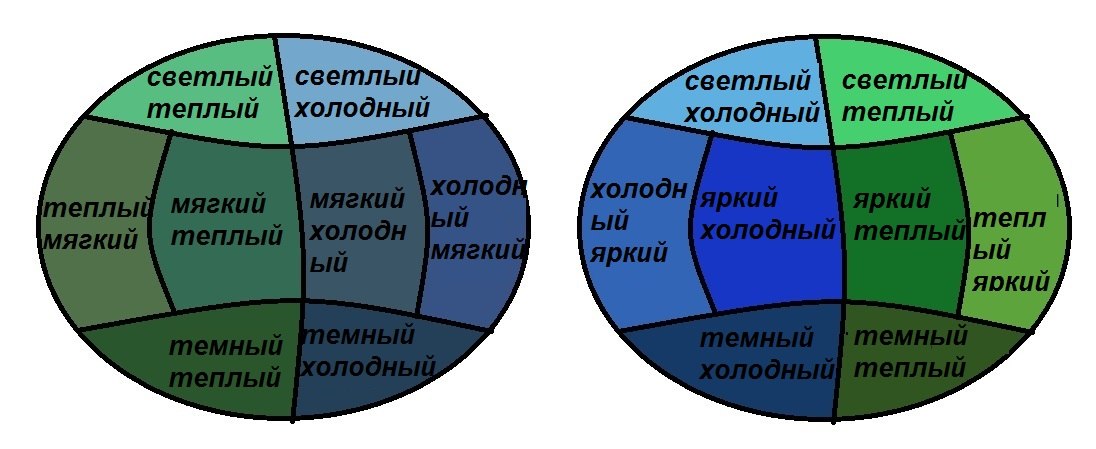
Any color is described by all three characteristics, however, they are expressed with different intensities.... This provides a variety of shades. The characteristic that is most pronounced has the greatest influence on the perception of color, the rest of the characteristics make adjustments. If you combine all the color characteristics, you get 48 options - 48 colors blending into each other
... I have already told you how they transform into each other. This is an absolutely unique author's development, so, I think, the questions about which system I work will disappear - I work according to MY "Color Harmony" system, built entirely on color theory, due to which it is more accurate than most other color theories, if not everyone. 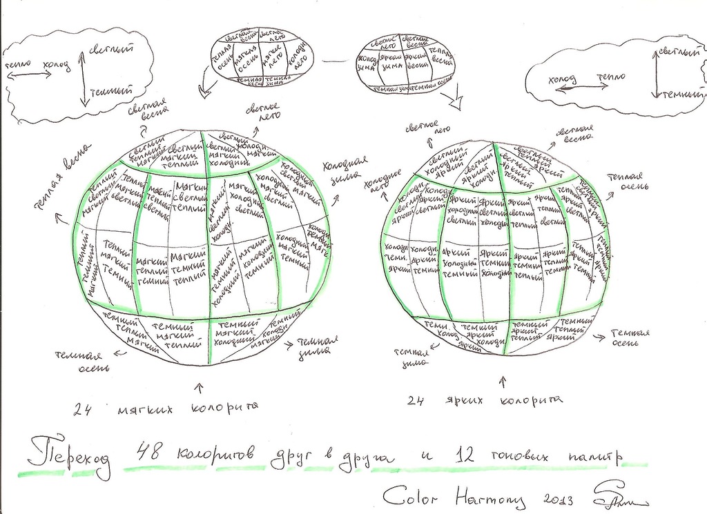
All colors of the continuum can be divided into these cells with blurred borders. However, in practical use 48 palettes is a lot, too many colors will be repeated. Therefore, it is best to reduce the number of palettes to 12. Why 12? I'll explain now. As I said, most of all, the leading characteristic, the most pronounced, affects the perception of color and its compatibility with others. This means that we have 6 directions - bright colors, soft, light, dark, warm, cold. Have bright colors first of all, the purity of color is visible, in the soft - a gray admixture or "complexity" of color, in the dark - depth, darkness, in the light - whitening, airiness, in the warm - gold, warmth, in the cold - iciness, blue.
Compare the cool soft flavor and the soft cold flavor. In the first case, blue, cold is striking. in the second - complexity, gray impurity.
The temperature characteristic is also important for us - because it is precisely when the temperature undertones do not match that the skin optically reacts with unpleasant effects (yellowing, pallor, redness, colored shadows) - this is optics. The waves overlap each other and give an unnatural color.
Therefore, those areas where the temperature characteristic is not the first should be divided into two more subgroups.
The result is bright warm, bright cold, soft warm, soft cold, light warm, light cold, dark warm, dark cold.
In the case of colors, where the temperature is the leading characteristic, brightness is important - pure colors or complex ones. Therefore, they are separated in this way: warm bright and warm soft, cold bright and cold soft.
It turns out 12 colors, and a simplified color globe will look like this:
Some color systems use the old "seasonal" color names, which does not affect anything other than terminology. 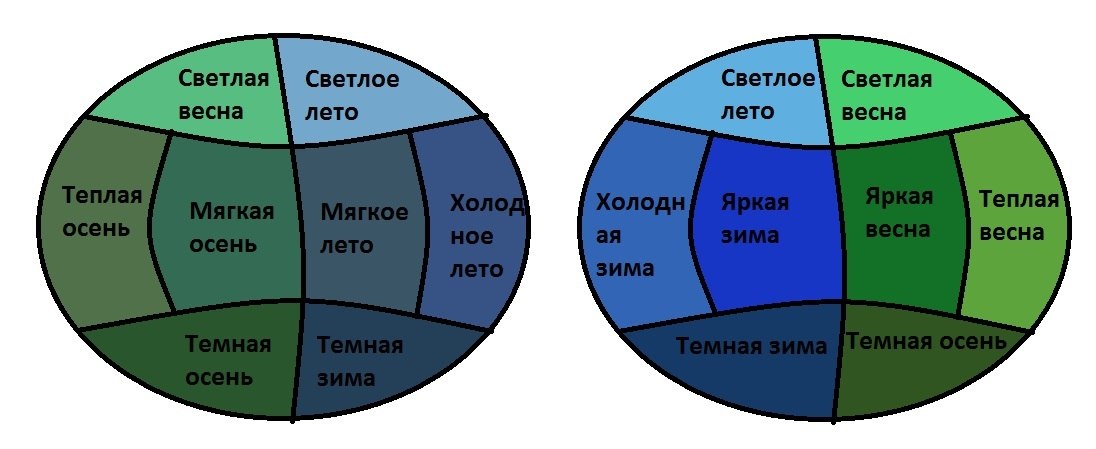
Each person falls into one color out of 12, but with certain adjustments and individual transitions. All colors of a person's appearance have the same set of characteristics. , it does not happen that the skin is cold, and the eyes, warm, everything is painted from the same palette, otherwise the colors of your appearance would not be harmonious. This is the law of nature =)
All colors within the main color are suitable for a person, and in addition to them, some colors of neighboring colors are suitable, which are simply added to an individual palette. These "supplements" differ from person to person.
And I present myself 12 colors that you, in principle, are already familiar with.
I will name them according to their characteristics, although let the seasonal names remain for the time being to correlate terminology =)
And a little bonus - the palettes now have Pantone coordinates , but only in the case of a link to us =)), in addition, I slightly added some palettes. Pantone colors are often requested from me. Although in domestic use it is easier for customers to use the classic 12 tone type.
And .. I represent 12 colors. Each of them causes some associations, I will also give them, but coloring is not limited only to these associations - they will only let you feel the "spirit" of flowers, making up the palette. But in any particular case, colors can carry different associations (!) depending on their use. But I hope I will be able to show all the colors at their best =) After the name of each palette there will be links to my pinterest, where I will gradually collect colors and associations, this will help you to present the colors "in action".
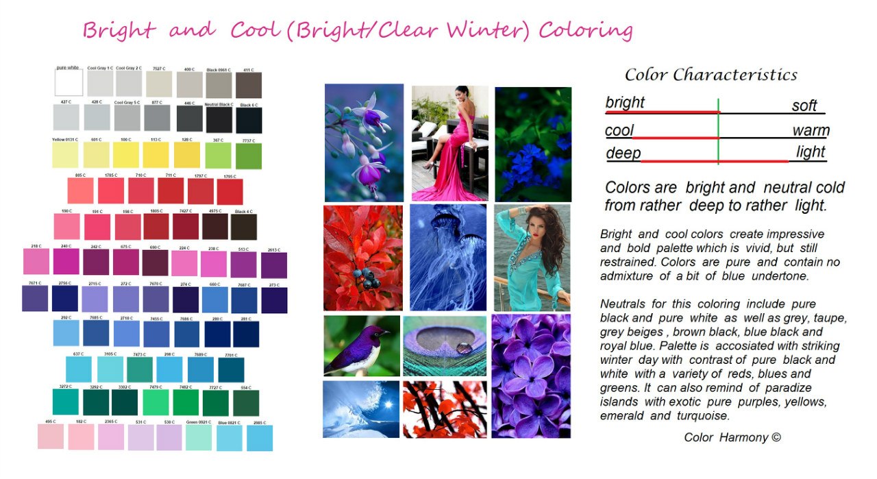
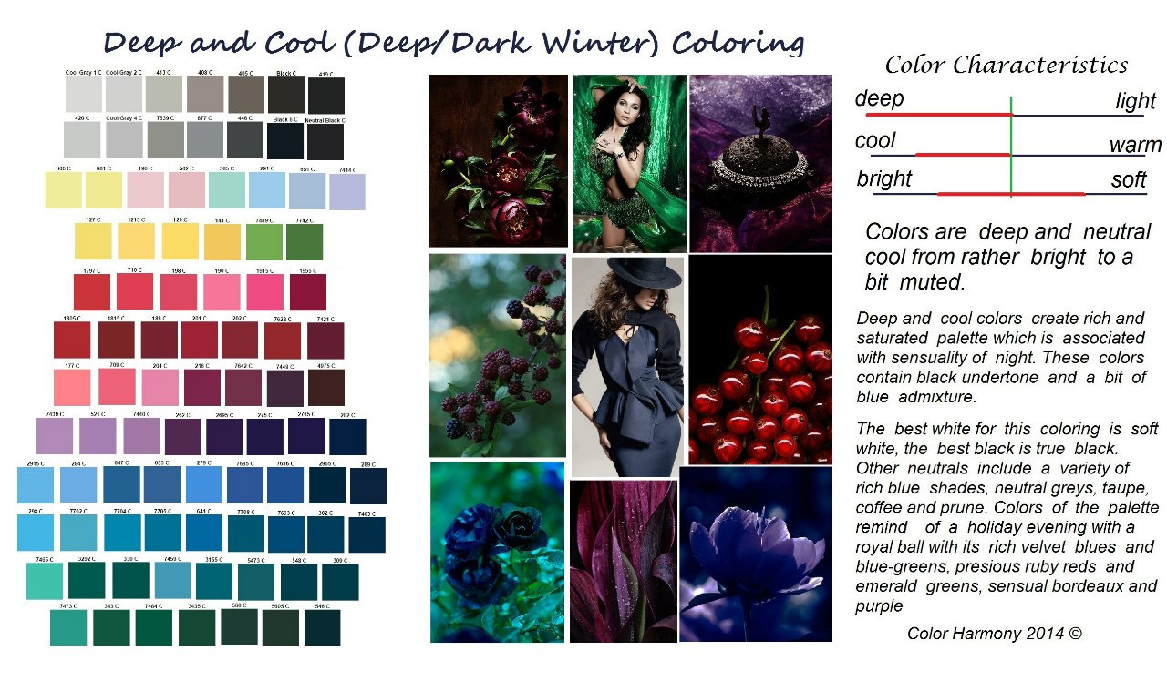
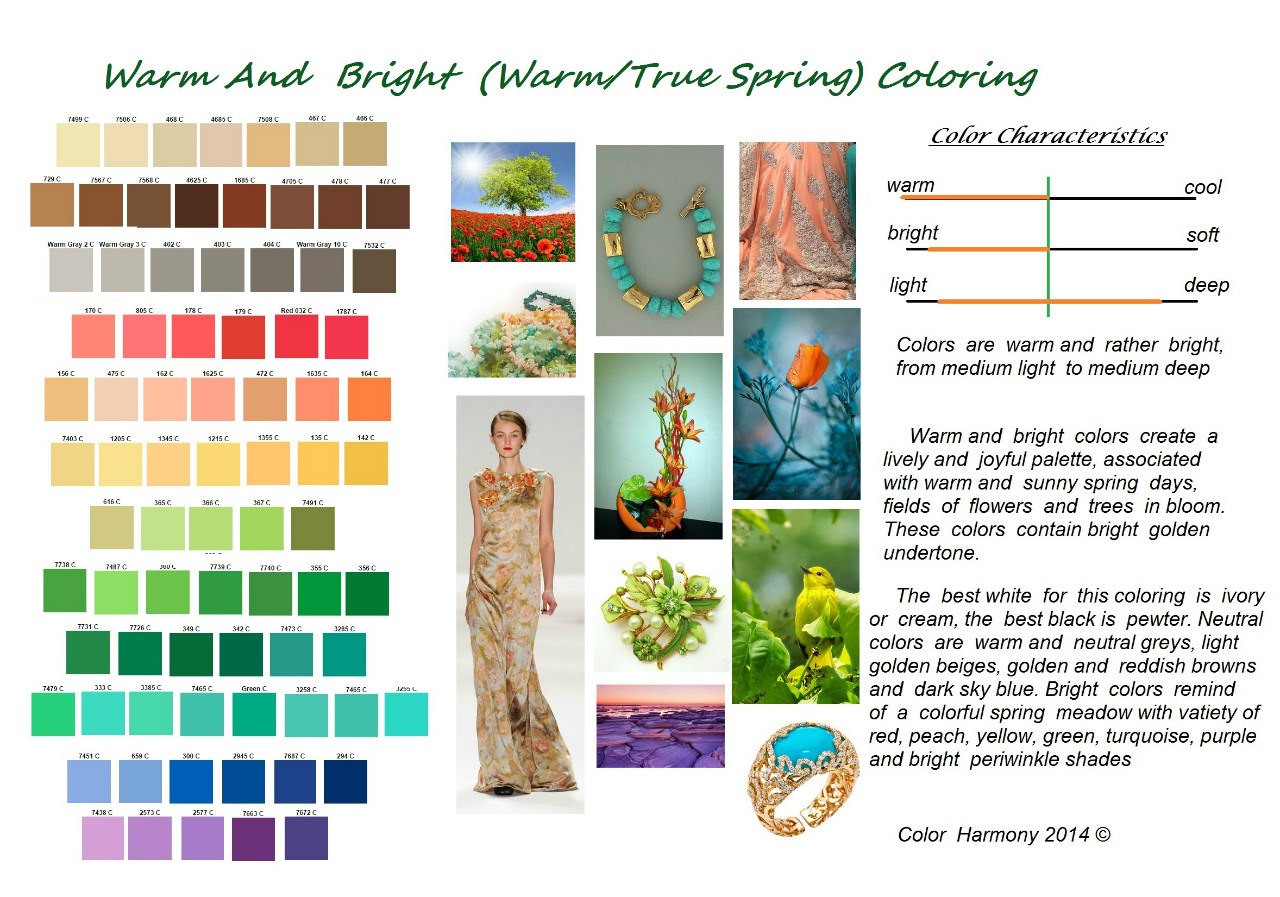
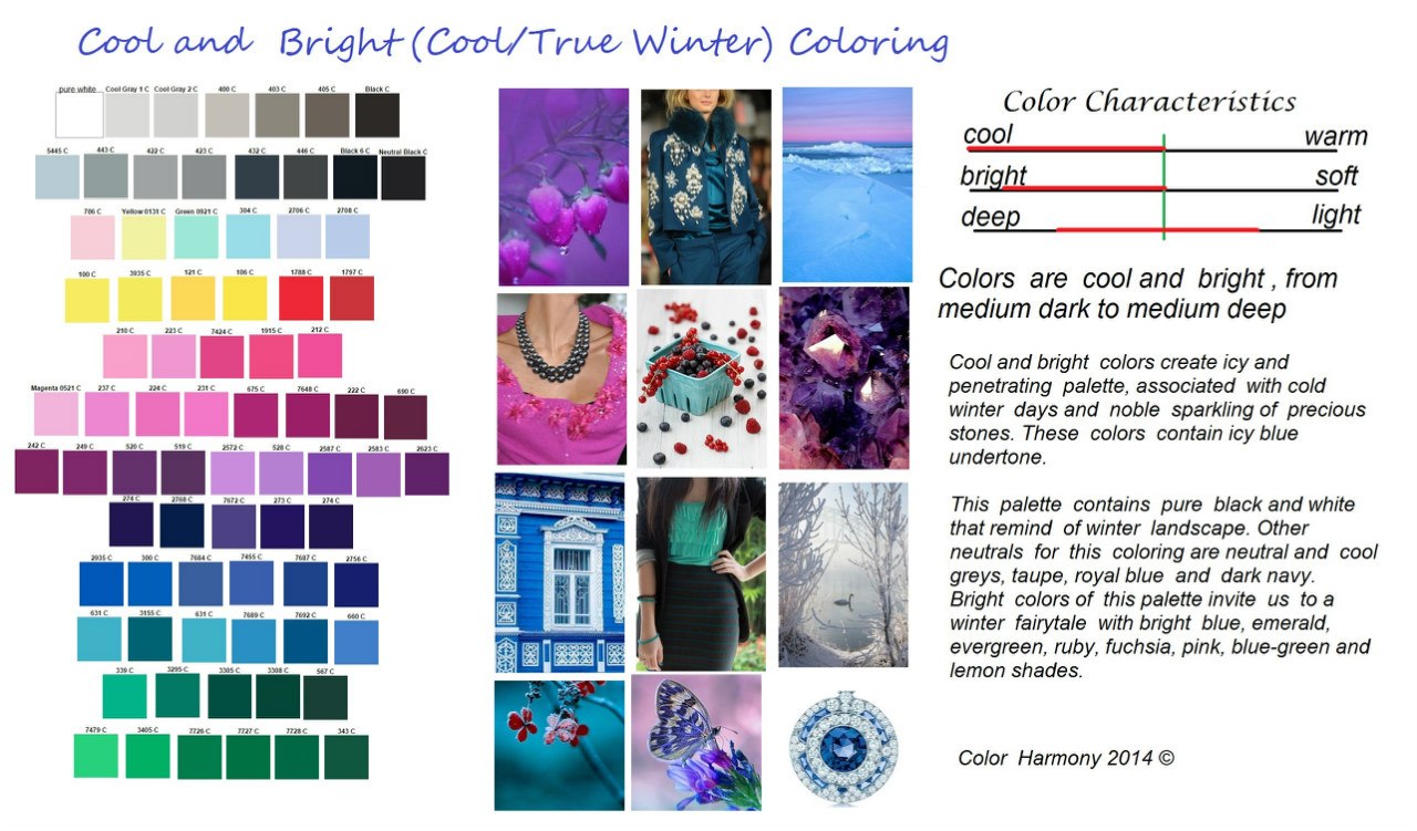
Bright cold color. ("Bright winter") "Impressive" palette - "impressive"
.The leading characteristic is brightness, the additional characteristic is neutral - cold. It can be either relatively light or relatively dark, often contrasting in lightness. The colors are clear, either without obvious impurities, or with a bluish impurity.
The general impression of the palette is brightness, catchy, although at the same time there is some restraint due to the blue undertone.
The palette resembles a winter landscape on a bright day with its color contrasts of pure colors, white, black, red and cold green, or tropical islands with bright birds, flowers, turquoise water, blue skies and emerald greens.
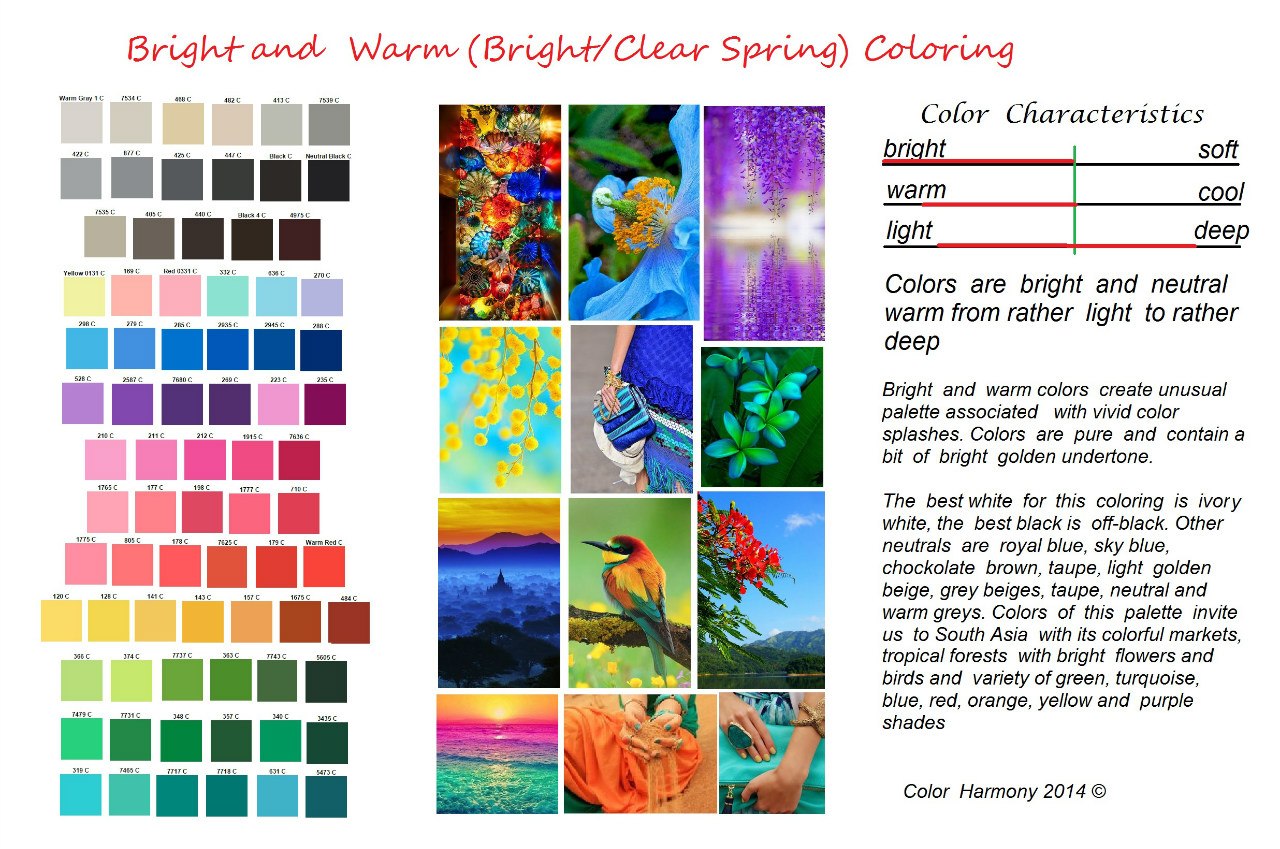
Bright warm color. ("Bright Spring"). Creative Palette - "Creative" palette.
www.pinterest.com/shahrazade/ch-bright-a nd-warm /
The leading characteristic is brightness. Additional - neutral - warm. It can be either relatively light or relatively dark in color. The colors are clear, either without obvious impurities, or with a bright golden impurity.
The palette is associated with the world of South Asia, with the bright clothes of the inhabitants of this region, color splashes in their manner of combining colors, with the cheerful colors of tropical nature.
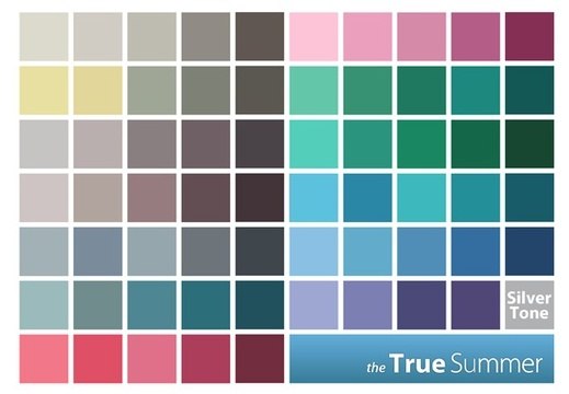
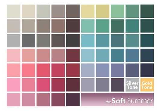
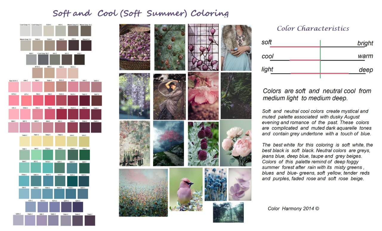
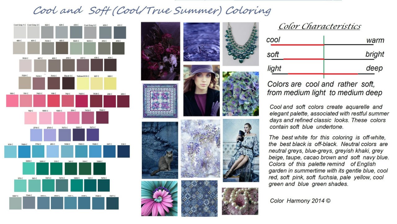
Soft cold coloring ("Soft Summer") - Mysterious Palette - Mysterious palette
The leading characteristic is softness, the additional characteristic is neutral - cold. It can be either relatively light or relatively dark. The colors are softened, with a gray admixture or grayish blue.
The palette is associated with twilight, fog, forest before rain, it creates the impression of a mystery, understatement, a mystery. The colors are very complex and nuanced.
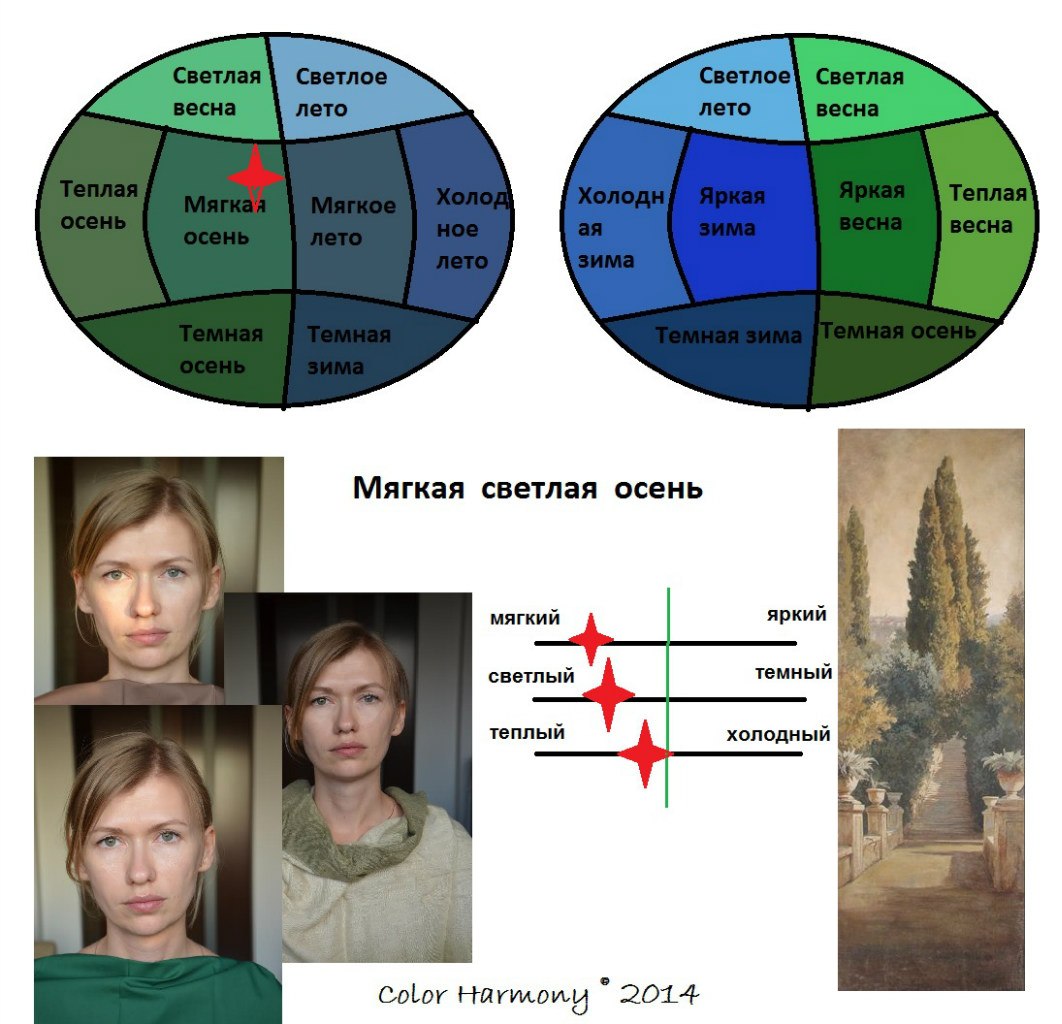
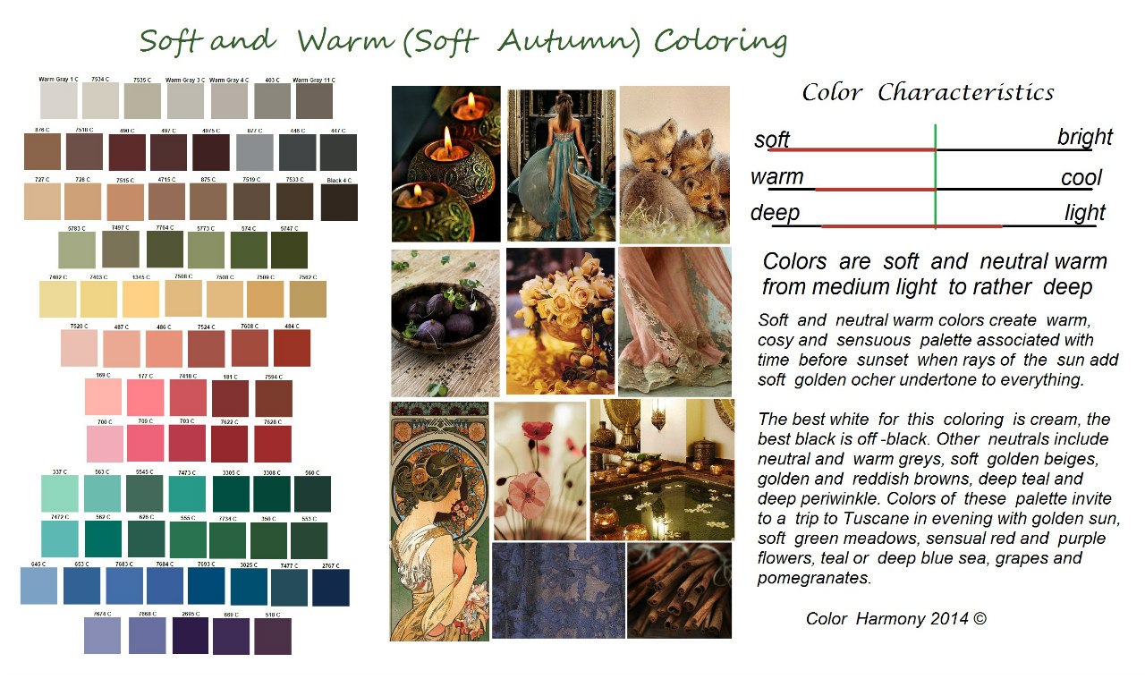
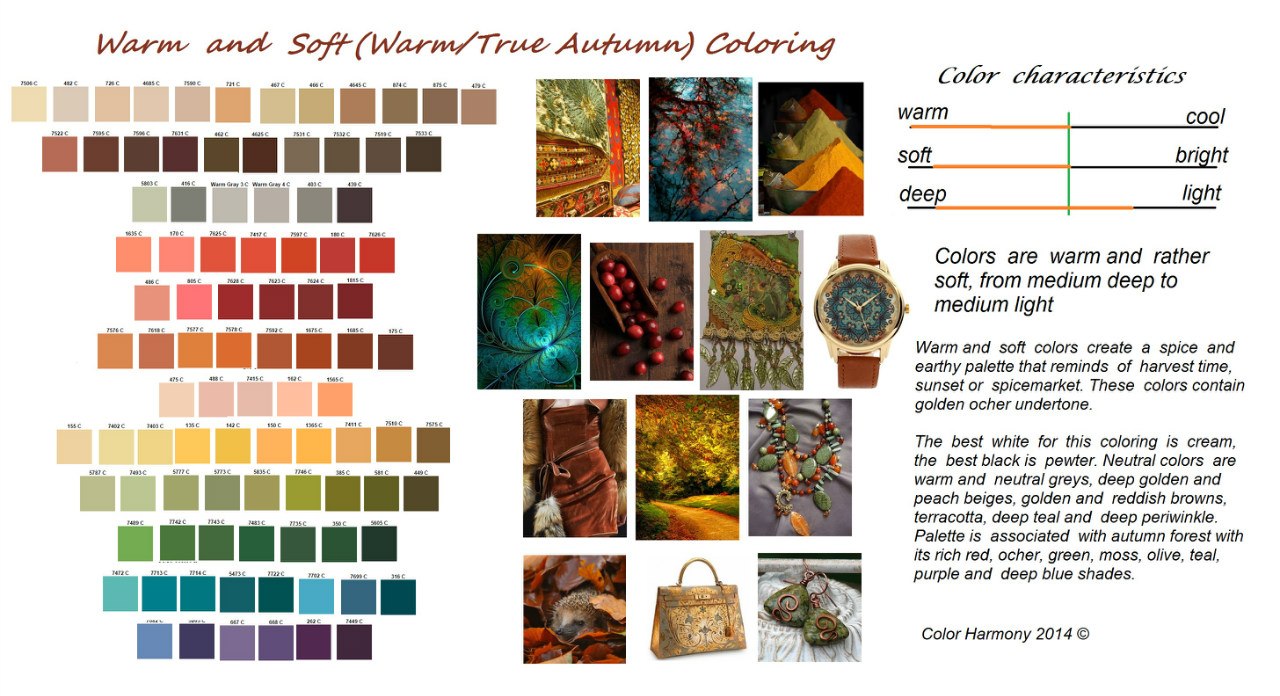
Soft warm color ("Soft Autumn") - "Sensual Palette" - "Sensual" palette
The leading characteristic is softness, the additional characteristic is neutral - warm. It can be either relatively light or rather dark in color. The colors are softened, with a grayish admixture or with a softened ocher.
The palette is associated with earthly sensual femininity, with time before sunset, when the sun paints everything in soft golden tones, with the gifts of Mediterranean nature - greenery and gold fields, with grapes, cinnamon, olives, figs.
Dark cold color ("Dark winter") "Luxorious Palette" - "Chic" palette
The leading characteristic is dark, the additional characteristic is neutral - cold. It can be either quite bright or slightly softened. The colors are deep with black or dark blue.
It is associated with the luxury of royal courts, with velvet of deep burgundy, purple, lilac, blue shades, with rubies, emeralds, jade and malachite, as well as with the dark night and the depth of the dark blue sky.
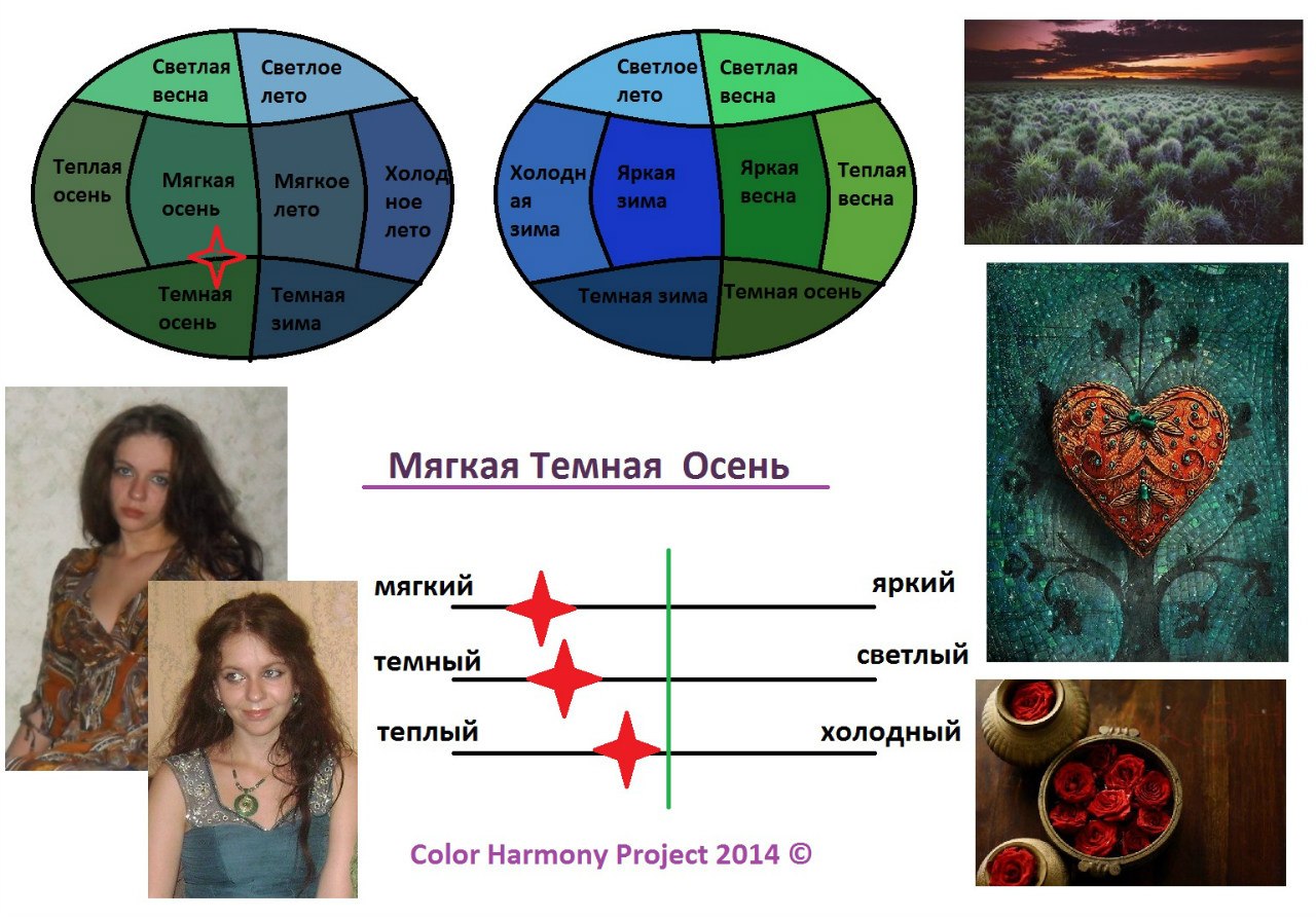
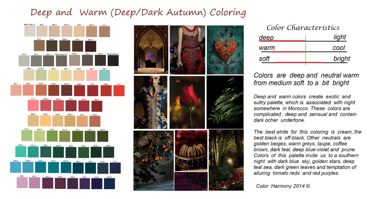
Dark warm color ("Dark Autumn") - "Exotic Palette" - "Exotic" Palette
The leading characteristic is dark, the additional characteristic is neutral - warm. It can be either quite soft or quite bright. The colors are deep, with a black or dark ocher admixture.
Associated with the colors of the Middle East - with the rich ambience of Moroccan interiors, the gold of natural fires, the warmth of spices, the sensual complexity of colors, the rich colors of the southern nature.
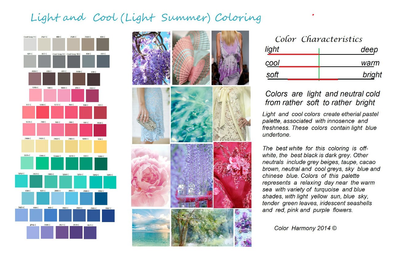
Light cold color ("Light summer") - "Innocent Palette" ("Innocent" palette)
The leading characteristic is light, the additional characteristic is neutral - cold. It can be either quite bright or rather soft. Colors are light, pastel, with white or light blue admixture.
The palette is associated with tenderness, freshness, childhood, as well as relaxation at the sea, with light turquoise water, light greens, yellowish white sand, delicate flowers and carelessness.
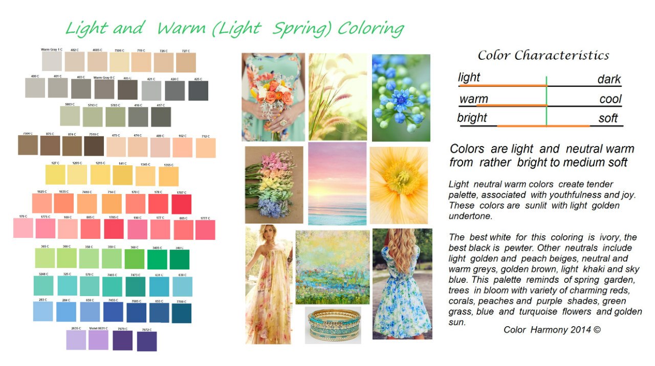
Light warm color ("Light Spring") - "Tender Palette" - "Tender" palette.
The leading characteristic is light, the additional characteristic is neutral - warm. It can be either quite bright or rather soft. The colors are light, cheerful, with a white or light golden admixture.
The palette is associated with youth, joy, flowering fruit trees, all colors are imbued with delicate gold and remind of the rebirth of nature.
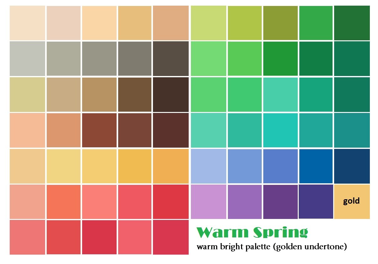
Warm bright color ("Warm Spring") - "Lively Palette" - "Cheerful" palette
The leading characteristic is warm, the additional characteristic is bright. It can be quite light or quite dark. Colors with a distinct bright gold undertone.
The palette is associated with a meadow in the midst of spring with a multitude of bright flowers - lilac, yellow, red, purple, with the golden color of the sun and the blue of the spring sky.
Warm soft color ("Warm Autumn") - "Spicy palette" - "Spice palette"
http://www.pinterest.com/shahrazade/ch-warm-and-soft/
The leading characteristic is warm, the additional one is soft. It can be quite light or quite dark. Colors with a distinct ocher undertone.
The palette is associated with spices - pepper, turmeric, govozdik, saffron, mustard and with autumn nature, deep blue water and warm foliage colors.
Cold bright color ("Cold winter") - "Noble Palette", "Noble" palette
The leading characteristic is cold, the additional characteristic is bright. It can be quite dark or quite light. Colors with a bright blue undertone.
The palette is associated with the world of the Snow Queen - with icy luxury, detachment and some drama, this is a palette of precious stones.
Cold soft color - ("cold summer") - "Elegant Palette" - "Elegant" palette.
The leading characteristic is cold, the additional characteristic is soft, it can be either rather light or rather dark. Colors with a soft blue undertone.
The palette is associated with elegance, with restrained colors of northern summer with blue cool water, bluish-green summer foliage and shades of berries.
All information in this article is the intellectual property of the author, so the repost is only with an indication of the source. =)
Path to Your Charm Project 2014, Color Harmony 2014
three primary colors: blue, red, yellow
medium (50%);
weak (min);
strong, spectral (max).
Three degrees of saturation:
darkened, blackened;
bleached, bleached;
medium (50%)
Three lightness of tone:
Three areas of color spot (amount of color):
Three directions of a color spot by combining spots that are identical in color characteristics:
vertical, horizontal, diagonal;
vertical, diagonal, circular;
diagonal, horizontal, circular;
vertical, horizontal, circular;
vertical, horizontal, circular.
Compositional capabilities of all kinds of chromatic harmonies
Color harmony - a combination of individual colors or color sets, forming a single organic whole and causing an aesthetic experience.
Color systematization- bringing a set of colors to a system that associates a specific color with a specific point in a plane or space for the purpose of coding and harmonization.
Types of color harmonies
achromatic + color
monochromatic (monochrome) harmony
harmony of related colors
contrast of primary colors
contrast of complementary colors
related-contrasting
MainNSe colora- three colors: yellow, red and blue, which together with their complementary colors form spectral colors.
For example, it seems to many that the sharpest contrast exists between white and black. This is not true. In a series of colors that are in contrasting relationships, the pair of white and black is far from the first place. This row: 1 - yellow and black, 2 - green and white, 3 - red and white, 4 - blue and white, 5 - white and black (!), 6 - red and yellow, etc. At the end it is worth the least contrasting brightness ratio of red and green.
Gamma- in the visual and decorative arts, the integrity of color shades, obtained by highlighting one color as the main color and partially penetrating into all other colors, for example, cold gamut, red gamut, silver, etc.
Valera- tonal nuance in the art of painting, graphics or painting; minimal, subtle difference in lightness of the same color (“write with valers”); valers are achieved by the glazing technique.
Ottenok- slight difference, nuance in color or tone; achromatic shade - a nuance of lightness, the same as valere.
Using spatial color properties
There are forces in color that can reveal depth. The spatial impact of color depends on:
contrast of light and dark
color saturation
the area of its distribution
When six colors - yellow, orange, red, purple, blue and green are located on black background one next to the other without intervals, it is clearly visible that the light yellow color seems to protrude, and the violet plunges into the depth of the black background. The rest of the colors form intermediate steps between yellow and purple. white background the impression of depth changes - purple is pushed out by a white background and appears to protrude, while yellow is held by white as "close and akin." Colour. Here we are faced with the relativity of color exposure.
The ability of color to reveal the depth of space - the six primary colors on a black background, in accordance with the stages of their depth manifestation, correlate with the proportions of the golden section. The principle of the golden ratio is based on the fact that the smallest segment refers to the largest, as the largest to their total amount. If the distance AB is divided according to the principle of the golden ratio at point C, then this means that AC refers to CB as CB to AB. In the area of color, this means the following: if we place orange between yellow and red, each of which has its own degree of depth, then the difference in depth between yellow-orange and orange-red will correspond to the ratio of "less" to "more". The same ratio of "less" to "more" exists between yellow-red-orange and red-orange-blue. In the same proportions of the golden ratio, there are yellow-red and red-violet colors, as well as yellow-green and green-blue.
Yellow, reddish-orange and blue against a black background have the following pattern of deepening: yellow protrudes strongly forward, red to a lesser extent, and blue appears almost as deep as black. On a white background, the opposite impression arises: blue protrudes strongly forward, red-orange remains almost in place, and yellow only slightly moves forward. The ratios of depths between yellow and red-orange, red-orange and blue correspond to the ratio of “more” to “less.” All light tones on a black background will protrude in accordance with their degree of lightness. On a white background, the impression will be the opposite: the light tones remain at the level of the white background, and the dark ones gradually come forward.
As for the cold and warm colors of the same lightness, then warm colors will come forward, and cold strive in depth.
If meets contrast of light and dark, then the sense of depth is either enhanced by color, or neutralized, or will act in the opposite direction. Equally light blue-green and red-orange behave on a black background as follows: red-orange protrudes forward, and blue-green goes deeper. If the red-orange is lightened, then it will come forward even more. If you lighten the blue-green slightly, then it will give the same impression of depth as the red-orange, and if it is lightened even more, it will come forward, and the red-orange, on the contrary, will recede.
Saturation contrast causes the following sensations in the perception of color: pure, saturated colors will come out ahead in comparison with similar in lightness, but faded colors. As soon as this contrast is added to the contrast of light and dark, or cold and warm, the impression of depth changes again.
Size contrast color spots play a large role in creating an impression of depth. When there is a small yellow spot on a large red surface, then the red color becomes, as it were, the background and the yellow color in this case protrudes forward. If we increase the area occupied by yellow and decrease the area occupied by red, then a moment may come when yellow will play a more significant role than red. Yellow can become the background and push the red forward.
If we wanted to consider everything possible options from the point of view of changing impressions with respect to color depth, this would not give us any confidence in the correct creation of the spatial balance of each color composition. Here you can count on the artist's personal delicacy and goals set by him.
In order to observe the spatial possibilities of the diagonals, you need to place yellow, red-orange and blue on a black and white background in two diagonal directions, in one case - from left to right and in the other - from right to left. The problems of creating painterly illusions of depth can be explored by comparing, for example, yellow and blue rectangles in all possible vertical and horizontal positions, intersections and overlays, using white and black backgrounds. If they want to judge color as a force capable of providing picturesque depth, then for this you need to exercise your vision in perceiving the possibilities of color in constructing space. "Do not arrange windows, do not make holes in the picture," said Corot, urging painters to be attentive to the overall integrity of the space. A particularly strong sense of the depth of the picture can be achieved using the interaction of color, vertical and horizontal directions and spatial plans of the composition with each other. As a rule, the space of the picture is built on the basis of two, three or more plans. But the most common version of the plane-pictorial transfer of space is based on two plans. Knowledge of the above properties of color allows a more meaningful approach to solving certain coloristic problems in the construction of graphic compositions. However, when implementing an idea, the flow of intuitive sensations should not be restrained by strict rules, since the ideas are always not so unambiguous.
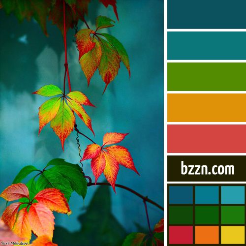
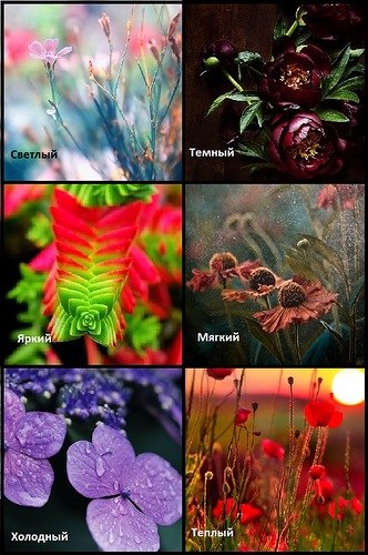
For an artist, color harmony is a special delight. He can give birth to a whole range of feelings, emotions and images in his imagination. That is why many artists collect photographs that are beautiful in color.
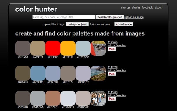
There are many sites on the web that allow you to compose such color palettes for photos. Here is some of them.
The owner of this beautiful site, Jessica, collects harmonious color combinations illustrated with a photograph of these colors.
And these shades are so subtle and “tasty”, so different that the imagination is immediately spurred on by the emotions born of color. I would like to create my own pictures using this color clue.
The Design Seeds website has a convenient search by color shades and by subject.
Winter, spring, minerals, succulents, flora and fauna ..
This is how the search page looks, everything is intuitive. 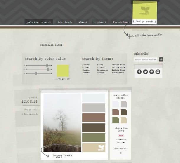
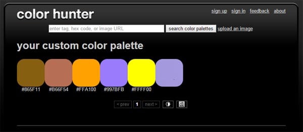
2. DeGraeve
 A good generator that allows you to compose color palette any photo from the Internet. For this just insert the url of the photo and press the button “Color-Palette-ify!”
The generator composes two color scales - the main natural colors photos and their more saturated counterparts.
The disadvantage of this generator is that not every user knows how to find the url address ...
More useful materials:
 On this site you can upload your photo and also get its main colors in two scales:

The downside here is that you can't see the original photo.

Click on the button "Select Image" and select a photo on your computer. Download and get just such a scheme, where you can choose the number of shades. Their maximum number is 8. 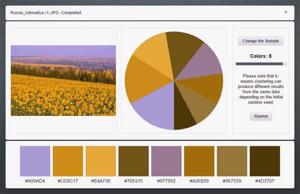
It's already more convenient, isn't it? And the colors are more natural and harmonious.
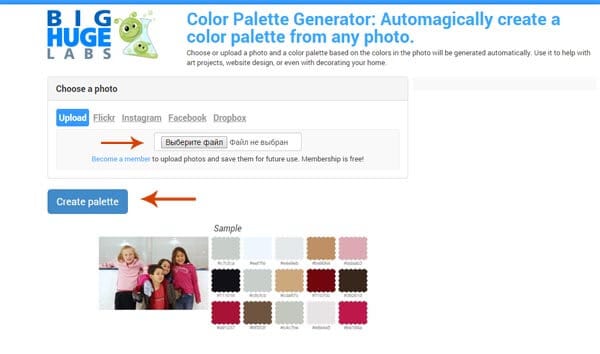 Select the file on your computer and click "Create palette".
We get the following scheme with fifteen shades:
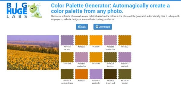
Nice toy, isn't it?
If you still do not understand color well, then it can be used to select a shade for a picture. Separated from the landscape, it is more understandable.
But are these colors harmonious?
How to find harmonious color combinations?
Other color generators will answer these questions.
They match colors according to color schemes.
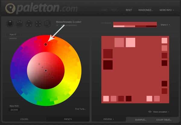
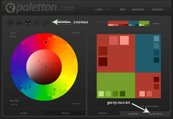
Use the mouse to select a color on the color wheel. On the right, you will see a monochrome harmony diagram.
Above the wheel there are buttons for selecting other color schemes.
To get the result in the form of a scale, click on the color tables button at the bottom right.
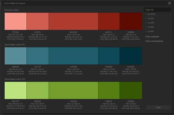
7.SessionsCollege
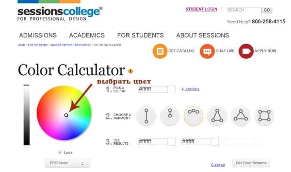
Another similar generator, but with fewer colors in the results .
Selecting a color on the color wheel.
We choose the number of colors for the combination and the scheme. 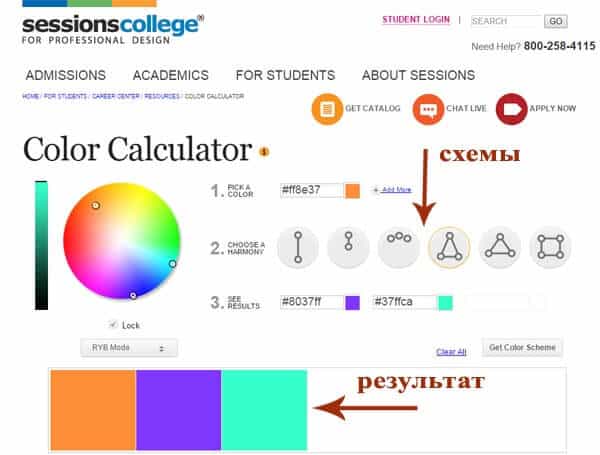
These generators are made for website and blog creators.
They allow you to quickly find shades that are harmonious in color and use them by copying their digital name.
For an artist, such sites can become a "toy" for developing a sense of color harmonies and for inspiration.
If you want more fundamental knowledge in understanding color harmony for painting:
- how to choose harmonious
- how to mix the necessary, how to express the desired image with color
then all this can be learned in the course
This is how we study there color harmonies on practice: 
Indeed, in painting everything is somewhat more complex and multifaceted than in design ...
I would be grateful for your comments on the article. And if you took my course in color science, share your impressions and successes!