First, let's figure out how the lilac color in the interior differs from other shades of purple? Unlike lavender, it clearly shows a pink tone, reducing the dark violet to a pastel tone. By the way, it can be called the color of the Russian aristocracy - the landowners always planted lush bushes of lilacs in their gardens, and the painters never tired of capturing their beauty.
- Lilac + milky
- Lilac + shades of white
- Lilac + yellow
- Lilac + purple
- Lilac + pink
- Dark lilac + honey and straw shades
- Lilac + beige
- Lilac + gold
- Lilac + peach
- Lilac + Silver
- Lilac + chocolate
- Violet + white
- Lilac + menthol
- Lilac + indigo
"What do psychologists say?"
The lilac color is just a storehouse for those who like hints and ambiguities, they say. It is associated with conversations that in the old days were carried on in secular circles - full of allegories and veils. This color is by no means simple and childish, but you should not use it, obeying the trends of fashion, it can plunge someone into a state of melancholy and melancholy. If you are a person with an explosive temperament, lilac runs the risk of annoying you more than calming you down. It has little in common with the pacifying one - a slightly nervous violet component will take its toll.
On the other hand, lilac is gentle and poetic. It is classified as a spiritual flower that promotes meditation and mindfulness. At the same time, it is the color of fantasies and castles in the air - divorced from reality, prone to enchant and carry away into the world of dreams.
"How to fit it into the interior?"
The lilac color is quite capricious, revealing its best qualities only in the right environment. It is minor, therefore, in combination with pulsating warm colors goes into the shade, and traditionally it is complemented by the same cold scale. Lilac is not so demanding on light, acquiring a bluish tint in its absence, which also looks expensive and unusual. Yes, it is noticeably colder, so it is suitable for lovers of freshness and spaciousness. As a rule, the interior is built in advance with an eye on it, but we will consider several options where lilac is a secondary character.
"Living room"
The lilac color looks best in the interior of large spaces, where there are many opportunities to beat its airiness. He is partial to the elements of antique architecture, arches and high ceilings.
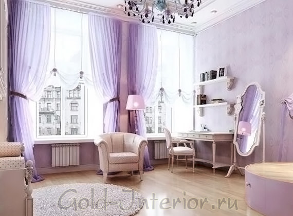
"Lilac + milk"
- As well, lilac is suitable for a sublime Empire style, merging wonderfully with shades of silver and white. In this era, delicate colors literally went crazy. Even perfumers created, inspired by blooming gardens - they used the aromas of lilac, rose, jasmine. This charming atmosphere can be recreated in your living room - let the delicate fabrics resemble fragile petals, and daylight fills the space as much as possible.
"Lilac + shades of white"
- The lilac color is often found in Scandinavian interiors, combined with traditional smoky and milky tones. The fact is that the Scandinavians have a beautiful legend that the lilac color is a product of the rainbow and the sun. Such a romantic description cannot leave you indifferent, so take inspiration from the Swedish living room in the following photo.
"Lilac + yellow"
- Lilac + yellow in the interior fit together well, but are considered an alarming combination, so one color will have to be slightly modified. Pale yellow will look too superficial, therefore, we use a harmonious shade, peeped from nature - the greenish color of swelling buds.
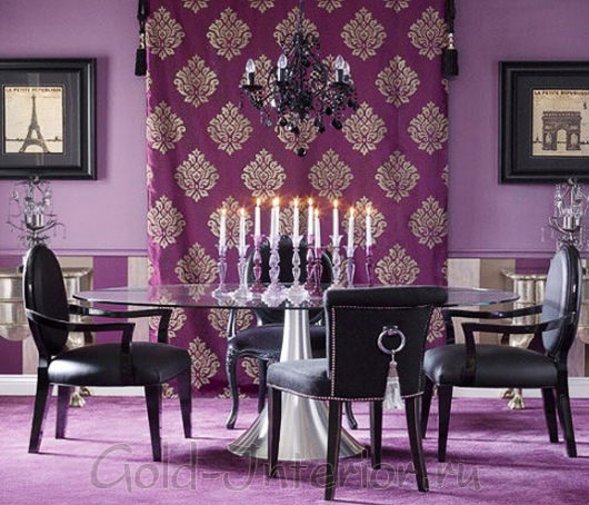
"Lilac + purple"
- Saturated + lilac is a classic of the genre. The hero of our article in the next living room fades into the background, playing only the role of a background. Its porcelain tone is able to exquisitely set off the blues and sapphire colors, making the overall atmosphere more elegant, referring to the aesthetics of the rocaille era.
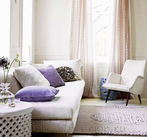
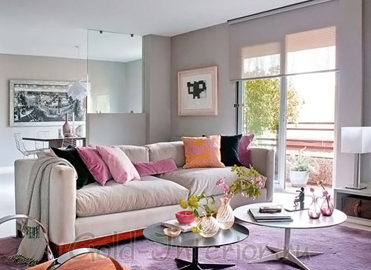
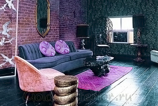
"Lilac + pink"
- And of course, the girlish lilac color goes well with the same pink, naive and light. There is no need to draw parallels with the atmosphere of the boudoir, the photo below shows an example of a completely modern stylish living room. The purple carpet almost merges with the grayish floor and is well set off by the red furniture, and the sakura-colored pillows are a bright addition.
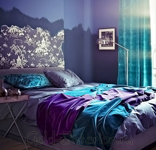
"Bedroom"
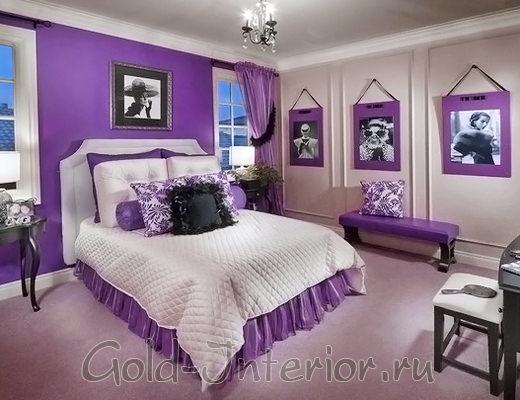
The lilac color in the bedroom interior is a hint of romance, quivering feelings, the embodiment of sensuality and flirting. Frivolous and exciting, he will certainly meet with a response from sensitive natures.
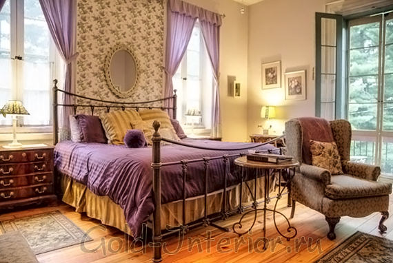
"Dark lilac + honey and straw shades"
- Lilac goes well with neutral shades, which include Brown color... But their tonality shouldn't be very different - see how this rule is followed in the next bedroom. Here we see a rich lilac, close to purple, looking very cozy. Wooden shades do not overshadow it, but emphasize - honey and straw tones will be the best option.
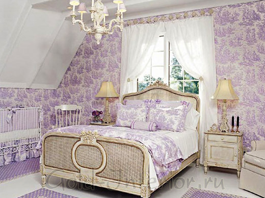
"Lilac + beige"
- The next interior will proclaim an atypical idea: there is never too much lilac. This is true if you use its lightest tone and introduce a second primary color. In this bedroom, it is either white or beige - they do not leave purple alone for a second, diluting its surface with a small pattern. Thanks to the numerous details in the decoration, the eye is not lost in the kingdom of purple, being distracted either by the vintage bedside table or by the Greek ornament of the bed.
"Lilac + gold"
- Such an unusual combination of colors evokes associations with expensive jewelry, where amethysts and diamonds are combined in gold of the highest standard. It is no coincidence that this combination can be found in descriptions of the interiors of palaces and royal castles. Accordingly, you need to choose expensive materials for decoration - silk, cambric, marble and natural wood for parquet.
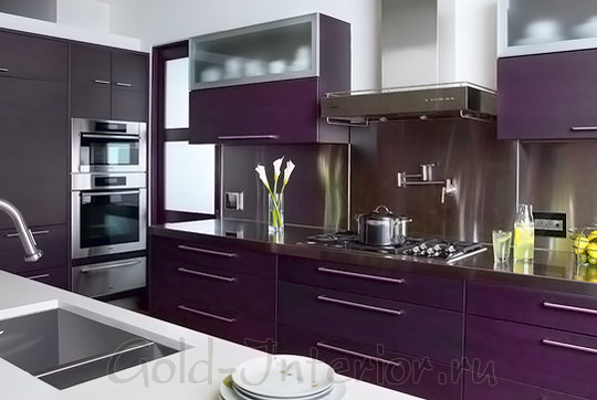
"Kitchen"
Lilac color in the interior of the kitchen can hardly be called a traditional solution. Familiar colors tend to be more credible. But you will be surprised what a different mood he can carry in himself! We look at specific examples that do not differ in similarity.
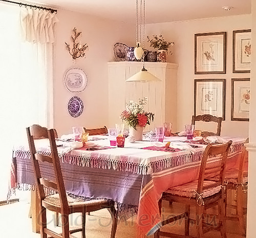
"Lilac + peach"
- The interior of this kitchen does not want to be ranked as any particular style - yes, there is a hint of country music, but rather, it is just the embodiment of home comfort and warmth. The color of lilac and peach is incredibly consonant. Here they are the basis, the main logical focus. They are complemented by brighter little details - plates on the walls, colored glasses, photographs. The tree was also successfully selected - we are more and more convinced that dark rocks have no place next to quivering lilacs, sunny warm shades in this regard are much better.
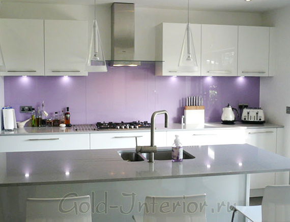
"Lilac + silver"
- Since the lilac color goes well with silver and white, it is logical to use it in a high-tech interior. This additive feminizes laconic surfaces and steel shine. Having studied the trends, we found out that it is now actual to emphasize it with a strip of patterned wallpaper, highlighting the seating area or the dining table.
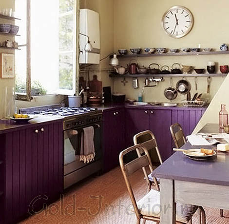
"Lilac + chocolate"
- The following photo shows classic interior cuisine, which can be found in many modern apartments... Everything is simple, convenient and practical - and individuality is lost behind this thoughtfulness. There is no need to give up your favorite white and gray, you just need to put in two additional strokes. Here their function is performed by silky chocolate and matte lilac, and they are united together by a mosaic on a kitchen apron, of these two colors.
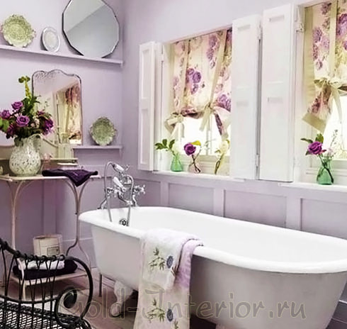
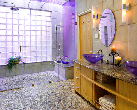
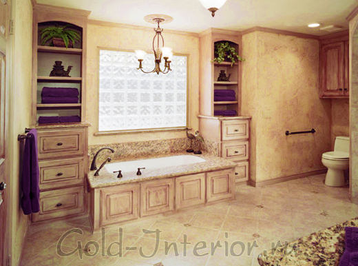
"Bathroom"
The interior of the bathroom is where we spend the first hours after waking up, so it is especially important that it evokes only positive emotions in you. There is no need to wait for stimulation of activity from lilac, so if an early rise is difficult for you, use azure or. If you are an early riser, or the bathroom is mainly used for evening relaxation, give preference to lilac. It will relieve fatigue and switch thoughts to a more pleasant wave.
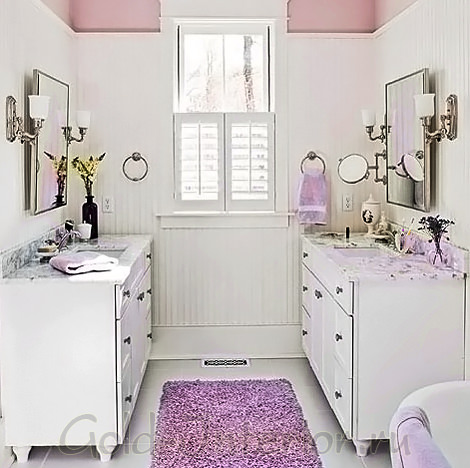
"Violet + white"
- Surrounded by pure white, lilac looks almost pink, becoming more cozy and homely. Purple textile accessories are held in high esteem in this bathroom - coupled with vanilla, this combination is worthy of a true lady. The owners did not even have to spend energy on decorating the walls, such bright accents were enough.
- Lilac can be safely used to decorate the bathroom in a rustic style, implying floral prints, natural materials and the pursuit of sustainability. In this room, it is combined with elegant vervain, fuchsia and pine needles, echoing the look of a French garden. In such an interior it would be appropriate and , but not eggplant, but a cheerful cornflower blue.
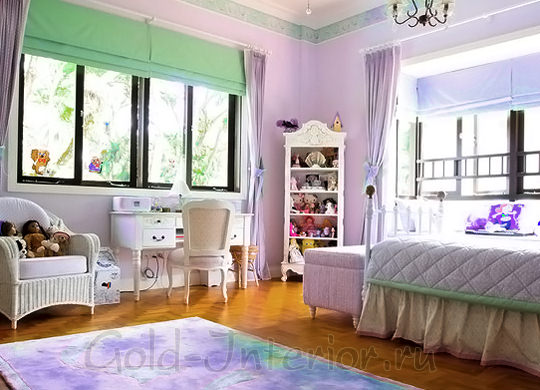
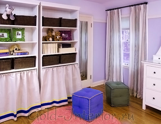
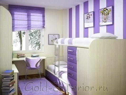
"Children's"
While parents are arguing among themselves about who is more suitable for the lilac color - boys or girls - let us recall the recommendations of psychologists, advising in the first years of life to surround the child with gentle pastel colors. Therefore, we will discard all prejudices and proceed to the decor of the children's room!
"Lilac + menthol"
- In this case, we are not faced with the task of highlighting the lilac as best as possible. You just need to create the most harmonious and unobtrusive combination. For this purpose, menthol green is suitable, as in the photo below, to shade the lilac a little. Decorate the rest of the space as simply as possible - using white, beige or flesh pink.
"Lilac + Indigo"
- The same colors are used here, only in more saturated shades. There is no question of gender - the room is absolutely universal. In addition, in combination with indigo, lilac acquires a pronounced "denim" shade, so it will never be too late to make a design project more masculine.
And in conclusion, we add that the lilac color in the interior of your home is in itself a sign of good taste. After all, the fact that you decided to use such a complex color speaks of your thoughtful attitude to the surrounding space, of your desire to express yourself as fully as possible, even in the design of the apartment.
Yellow is the color of joy, positive emotions, openness. Purple is a complex and ambiguous color. It is composed of red and blue tones that embody the struggle and unity of opposites, thereby creating its unique shades.
The combination of yellow and purple refers to the contrast of complementary tones. This means that when the color waves of these two colors merge, White color... That is, this combination itself, despite all its brightness and unusualness, is quite harmonious and pleasing to the human eye.
It would seem that these flowers have nothing in common. But surprisingly, both of them - both purple and yellow - symbolize a connection with the unconscious. Only yellow is associated with the female subconscious. And purple, respectively, with a male subconscious.
A person's attitude to these shades tells psychologists about the stability of his psyche. As a consequence, the fusion of yellow and violet combines masculinity and femininity. The combination comes out natural, despite the differences in shades. After all, purple is most often a cold color. And yellow, on the contrary, is warm.
Let us now consider with examples how we can combine these colors in our wardrobe and create amazingly beautiful images with their help.
In everyday ensembles, you can safely experiment with shades of both yellow and purple flowers... Combine a lemon dress with a light raincoat in a delicate pastel shade of purple. Support the outfit with accessories in the same colors. With such an outfit, you will brighten the grayest day.
Want to create a more color-active kit? Try to combine a bright yellow blouse with a print with purple shorts with a predominance of red in it. A bag and earrings in neutral black will balance the ensemble.
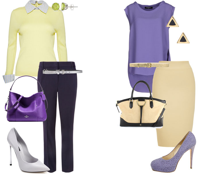
Perhaps few imagine a business-style set in similar colors. But it’s quite possible. One has only to take a closer look at the choice of shades. A dull yellow will perfectly “make friends” with a muted ink color. The accent in the image will be a lilac bag. The third color in the kit will be gray. He will give nobility to such a combination.
Shades of yellow turning into gold will also look great. They will easily support products in purple tones. The black color in the accessories will add chic to a simple-shaped look.
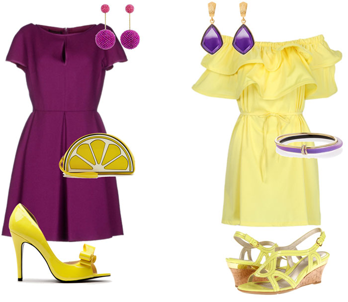
A bright, unusual and romantic outfit will turn out if you support the purple dress with cheerful yellow shoes and a clutch in the form of a lemon slice. In this form, you can go to a party, and for a walk with friends. And a young man, seeing you in such an ensemble, will surely appreciate your enthusiasm and sense of humor.
A set can be made up and vice versa - a yellow dress can be supported with purple accessories. The dress with wide flounces is reminiscent of the famous Brazilian carnival. Contrasting decorations only enhance this festive impression. With such a girl you will surely not be bored!
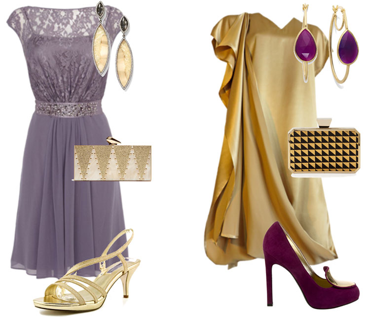
Truly royal outfits come from a combination of purple shades with gold. This option is perfect for special occasions. Delicate lace dress muted gray-violet will support the same sophisticated accessories in a dull golden tone. The kit will come out refined and sophisticated. In it you will feel like a real princess.
But a bright gold asymmetrical dress requires a more active addition. Bright shoes with a golden insert and unusual earrings will come in handy. The accent of the image will be a clutch bag with a geometric black and gold print. Such an outfit is quite worthy of the red carpet!
The combination of yellow and purple is eye-catching. A girl in such an image will never go unnoticed. This combination is expressive and bold enough. But if you decide on such an experiment, you will definitely not regret it. Try and discover new facets of your style!
Purple tries to combine two opposite hypostases - fiery active red and deep philosophical blue. In pure violet, we will not see a clear dominance of one of them, the merger stopped exactly in the middle, in a shaky balance. That is why purple in the interior is considered restless and ambiguous.
- Purple + yellow
- Purple + lilac
- Purple + white
- Magenta + oriental shades
- Purple + black
- Purple and bohemian chic
- Purple and enchanting magic
- Purple lilac + ocher
- Dark Magenta + Sand + Ivory
- Amethyst + light wood
- Eggplant + pink shades
"What do psychologists say?"
The antipode of violet is yellow, which we know as open, cheerful, contact, conscious. Purple is usually associated with the sphere of the unconscious, considered closed and self-sufficient. This color is characterized as spiritual, and whatever meaning has not been endowed with it throughout history. Since childhood, we associate it with a riddle, magic, something mysterious and unknown. Purple is a kind of a symbol of detachment from everyday worries, concentration on self-knowledge, inner transformation, so do not decorate with it places where you need to quickly make decisions and act actively.
"How to fit it into the interior?"
We have already considered similar examples more than once and now we can deduce a pattern - the violet color should not be a unique spot, an accent that appeared from nowhere. Use at least two, and preferably three shades of different lightness. The white we are accustomed to can make up too bright a contrast with purple. If you are not ready for such a radical change, use pastel shades close to beige or gray.
"Living room"
Consider some of the obvious, and at the same time bold decisions on the use of violet shades with no less "strong and unique" colors.
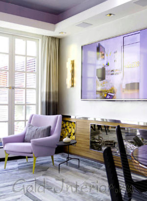
"Purple + yellow"
- Well, let's start with the most obvious combination, interior purple and yellow. Strictly speaking, in the photo below we see not a pure purple tone, but rather a bluish tone. In this room, the objects are so competently arranged that the number of shades used is not easy to count - lilac, gray, copper patina, lilac. Yellow needs to be diluted to match them - and here it becomes lime green.
![]()
"Purple + lilac"
- It's hard to resist not using lilac to decorate the living room in a vintage spirit. After all, violet surprisingly favorably accepts all kinds of ornaments - stucco molding, forged lattices, gilded frames, antique mirrors, trophies on the walls, unusual trinkets. In the next photo, we see a classic but gentle example of this solution - lilacs are shaded with the color of a withered rose and cherry tree.
"Purple + White"
- The purple color symbolizes the readiness for change, the search for new solutions and meanings, so it seems appropriate to arrange a corner of solitude for them. If you are haunted by problems that cannot be resolved, purple in the interior can suggest hitherto unobvious options. It is also an effective backdrop for Baroque or Rococo patterns - twisting stems, intertwining colors or irregular geometry.

"Magenta + oriental shades"
- One of the most ancient and unusual shades of violet is magenta (or electronic magenta, later created for computer color rendering), self-sufficient and bright, which occurs when a large amount of red is added to the mixture. It was discovered in ancient times, but only emperors were allowed to use it in their decoration. This color, on the contrary, is best combined with juicy oriental shades, which are lingonberry, orange or.
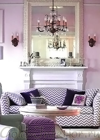
"Purple + black"
- This combination is both gothic and pretentious. To be in such an interior requires a high degree of internal conformity. This is the most mystical combination with powerful energy and involvement with subtle matters. Such a living room can be a little modernized with photographs or paintings so as not to feel uncomfortable in front of its grandeur, but candles in candelabra and exquisite crystal must be present.
"Bedroom"
Most often, dark purple and its light shade can be found in bedroom interiors. In addition, this color is considered a kind of stop signal, slowing down the flow of new information into a tired brain. For our century, in which events fall on us with a crushing avalanche, this is a valuable quality. It's no secret that purple is also the embodiment of sexuality and sensuality in its deepest manifestation.
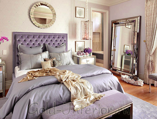
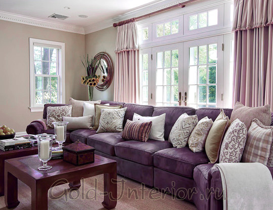
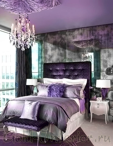
"Purple and Bohemian Chic"
- With the help of purple in the interior of the bedroom, you can create an atmosphere of bohemian chic, impressive in its complexity. Look at the illustration - it's glamor, but how luxurious! Its inherent shine is noticeable, but delicate - in the silky upholstery, flowing curtains, a crystal chandelier. The furniture gives the impression of being unearthed from secret antique stores, a color combination typical of a bygone era. These are the shades precious stones- emerald and amethyst, although such an interior would like to be compared with a rare and expensive pearl.
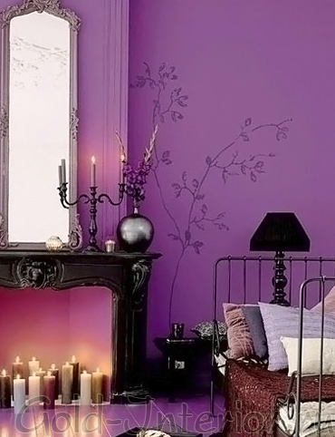
"Purple and enchanting magic"
- If you have a craving for otherworldly worlds, even if not seriously, you can highlight in the interior of the bedroom a kind of place of power, at the same time serving as an invitation to a romantic pastime. In such a room, you will feel a connection with ancient female magic, capable of enchanting and bewitching. To enhance the ambiance, you can borrow the idea of a false fireplace, which serves as an unusual container for candles.
- In a state close to a meditative one, the following combination is capable of plunging us - violet and. It will help you fall into deep sleep, relax every muscle in your body so that you physically feel the slowing down of time. It is as if the world does not exist behind the tightly drawn emerald curtains - there is only you and a long quality rest. Isn't it tempting?
"Kitchen"
In the interiors of modern kitchens, purple is not often found, usually it is chosen by extraordinary people or passionate fans of luxurious purple. If you consider yourself one of them - go for it, and we will show you two examples: laconic and more comfortable.
And traditionally we will mention appetite - alas, purple cannot improve it, rather the opposite. However, in modern world this equates to positive qualities so let's leave that fact for your consideration.
- Perhaps the only style that will readily accept any of its shades is hi-tech. Glossy surfaces can be painted in any color - from lilac and lavender to cherry and purple. If necessary, any of them can be made more positive or stricter - by combining with dark and light metal and glass.
- And for the next kitchen, the designers chose a more delicious eggplant shade - a wise decision that makes the room cozy. Please note that it is easy to overdo it with it, so use it either for the facade or for the walls, but by no means all at once. It's easy to add bright strokes to it - it can even be fresh flowers or vases with fruit.
"Bathroom"
The purple color in the interior of the bathroom can reveal completely unexpected edges for us - both due to reflective surfaces and due to artificial lighting... Try replacing the most common one, and you may discover something new.
"Purple lilac + ocher"
- We had a chance to enjoy the spectacle of thin purple glass in the bathroom - after all, transparent materials are not at all the same as dense wallpaper. In their depths sparks are born, they flicker and shimmer, as if alive. This bathroom uses the classic combination principle complimentary colors- bright lilac accentuated with ocher. Please note that natural materials dominate in this room - even the floor is laid not with tiles, but with mosaics.
"Dark purple + sand + ivory"
- Or use a more contrasting and at the same time softer combination - antique sand, ivory and dark purple. The fact is that famous artists used it so often in their works that it seems to us to be related and well known. Let the texture of the walls imitate painting on raw plaster, then the interior will look in the best traditions of the classics.
"Children's"
According to research conducted, almost 70% of teens noted purple as their favorite color. But at the same time, it is the color of emotional instability, capable of a large number lead to depressive disorders. It is not forbidden to design a nursery with it, but two rules must be observed. Either use its delicate shades - lilac and lavender, or opt for one or two accessories. See examples and choose what is closer to you!
"Amethyst + light wood"
- Option one - we reduce the saturation of the violet, as in the room in the photo below. The untrained eye will even count it, which means that the annoying red component has disappeared. Lilac goes with sunny tones, so complement the interior with light wood and a sand carpet.
"Eggplant + pink shades"
- In a girl's room, bed linen can be juicy eggplant, which is not striking during the day - very thoughtful. Otherwise, use the already mentioned flower bouquet palette - pink, fuchsia, lilac.
So, the purple color in the interior has thrown off the veil of its mystery a little - you learned the basic rules of its use and looked at the ready-made color combinations. The only thing is small - choose the time for their implementation, and do not be afraid of experiments!