Each person strives to create a harmonious atmosphere in his home, which is by no means the least determined by the interior.
One way to make a space vibrant and memorable is to use interesting color combinations. One such combination is purple and yellow. Both of them are bright and spectacular in themselves, and therefore you need to carefully consider how to plan color combination elements of decoration, furniture and accessories, using yellow and purple in the interior. The cost of a mistake in this matter is very high, because choosing the wrong colors or incorrectly placed accents can lead to the creation of a room intended for the covers of design magazines, but completely unsuitable for living in it.
Perception of colors and their combinations
Used together, purples and yellows are quite common in design as they are considered mutually complementary or complementary. They are successfully used to create fashionable images in the fashion industry, graphic design, etc. But in interior design, everything is not so simple.

Traditionally, yellow is perceived as the color of optimism, warmth, and youth. Violet color is perceived as mysterious, somewhat dangerous, pressing on the psyche. Based on this, it is logical to assume that when mixing purple with yellow when decorating a living space, you should choose purple as an accent, and yellow as a background or main, although exceptions are possible.
The combination of these colors in saturated shades is not suitable for bedrooms and relaxation purposes, since although it is beautiful and effective, it is flashy, tense and harsh for perception. But yellow and purple in the living room interior will create a pretentious and solemn atmosphere.
Used shades
Shades of color are important in creating an interior. The slightest change in color can create a different atmosphere in the room. So, purple and yellow colors of light shades can give the effect of airiness to the space. Light yellow and delicate lilac will look great in the kitchen or nursery without causing negative impressions. Alternating them in stripes on wallpaper or textiles, as well as the correct organization of furniture made in these colors, do not even need to be supplemented with some kind of neutral shade.
If a universal golden-yellow shade is taken to decorate walls or one of the walls, details of different shades will easily fit into the interior. purple- from light lilac to blueberry. Such a room will look bright, elegant and sunny, especially if you additionally use white or light beige paint for large surfaces (floor, ceiling, part of the walls).
If you plan to use yellow and purple in the interior of the nursery, it is better to take pastel shades that do not irritate the eyes even with prolonged exposure. After all, the child will not only play here, but also have a rest. To this combination, you can additionally pick up accessories of any "fruit" shades: peach, light green, pink, blue.
When both colors - purple and yellow - are accent, and white or light gray is chosen as the main one, the space looks very energetic and modern. But it looks impressive only when a bright purple sofa and armchairs stand out against the background of white walls and ceiling, as well as, for example, bright yellow textile accessories.
To adhere to the principle of "white plus bright" or "light plus bright", accents should be the most saturated shades.
But it is worth remembering that this principle is appropriate to use in studio apartments, spacious living rooms or halls. For children, small hallways and bedrooms, such combinations are unlikely to work. It is also important to consider the shade of a neutral color. If white and light gray are able to smooth out sharp transitions from one bright color to the other, then dark gray will only enhance this effect and deprive the space of the necessary comfort.
To avoid such abrupt color transitions, in addition to these two bright shades you can use light green, turquoise, burgundy, sand, orange. Quite large interior details should be made in these shades: pillows, poufs, furniture, wall panels... Small details of different colors are not very well perceived in the same room. Three accent colors (but no more!) On a background of neutral white or gray - this is quite appropriate when creating modern interiors... The main thing in observing this rule is to choose equally saturated shades. different colors.
![]()
So that there is no pile-up and riot of colors in a miniature space, it is advisable to place purple with yellow and additional colors at a short distance from each other. The best option is the space of a light wall or floor between bright details. For example, a purple sofa with a turquoise painting above it, a light lilac carpet in the center, a golden floor lamp and a purple armchair in the distance will create a feeling of free space, not an oriental bazaar. Decorative pillows of various shades of colors used on a sofa, vases on a contrasting floor, table or nightstand can combine details into a single whole.
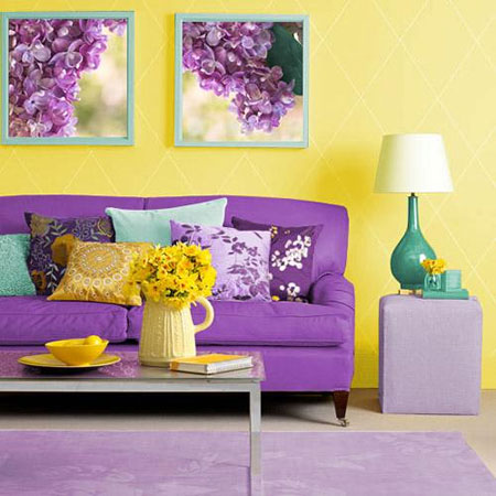
If you want to use purple as your main color, go for a dirty purple shade. In this case, the purple color of a washed-out shade, which is rather heavy for perception, allows it to be used for wall decoration, but at the same time it allows the use of yellow as an accent color. It should be borne in mind that this option is only suitable for sunny, bright spaces.
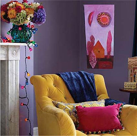
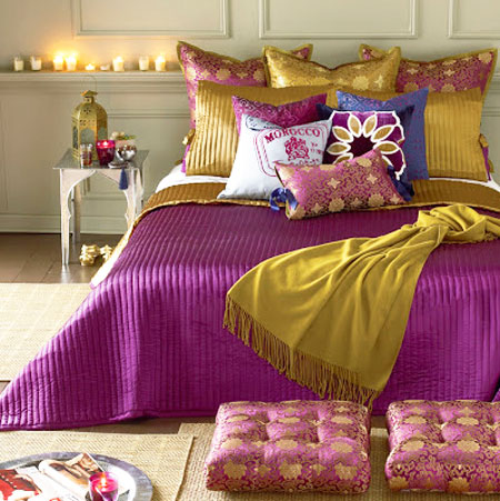
Yellow and purple Is another extravagant color combination that I would like to present to your attention. Yellow and purple combine perfectly, but they are rarely used in interiors - the combination is tough, even tense, although, without a doubt, very beautiful and effective.
Of course, it does not suit relaxation interiors at all, but if you are planning an original, energetic and somewhat dramatic interior, pay attention to the combination of yellow and purple, it is very interesting.
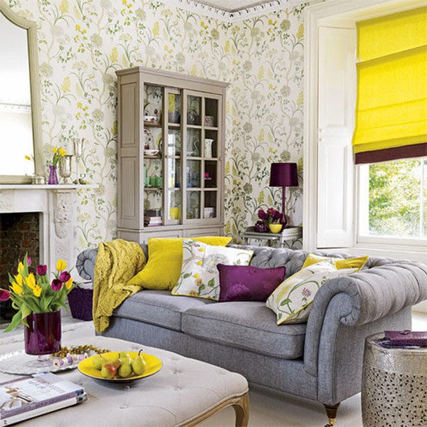
I'll start with lighter combinations - yellow and lilac. The photo on the right is a soft combination of sunny yellow and pale lilac. There is no drama here, because the colors are light and light, very pleasant. A very nice option.
_________________
 Golden yellow is generally an almost universal color, it goes with almost all colors, and in the photo on the left you can see that it goes well with both light lilac and rather dark purple.
The interior looks very unusual and stylish, although it is, of course, too sterile for an amateur. Compare with the photo below.
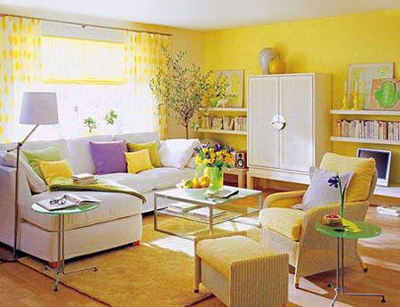 The interior in the photo on the right is simply striking in its cheerfulness. Take a closer look at it if you have a room with windows to the north - it demonstrates one of the best basic combinations for northern rooms: sunny yellow + white + green.
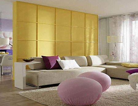
Stiffness does not arise, because a pastel lilac shade is used.
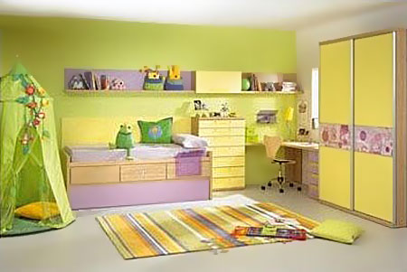 Pastel yellow and lilac are a great combination for children's rooms. It can be both basic and accent, as in the photo on the left. It is supplemented with all colors from the pastel and fruit palette - all soft shades of green, pink, peach, blue are perfect for it. In the pastel version, the combination of yellow and lilac or light purple is not harsh.
_________________
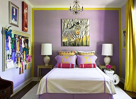
 Let's move on to more energetic options. The photo on the right is a combination of light yellow and deep purple. The colors are contrasting in relation to each other and to the white background, and it looks very impressive and even catchy. If you want to build your interior on the principle of “white + bright”, consider a combination of rich shades of yellow and purple - it will look amazing.
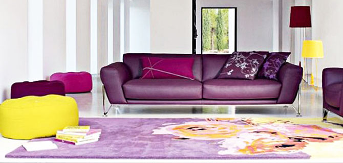
 Notice in the photo above that the “white + bright” solution with yellow and purple becomes too stressful if you only use these two colors. It is much better when additional accent colors are added to them - bright lime green, grass green, turquoise or a bright sea wave, fuchsia, tangerine orange.
At least like in the photo on the left, where purple and golden yellow are complemented by a bright lime color (lamp). In general, you shouldn't be afraid to add two or three accent colors.
 Yes, if there are a lot of bright details, as in the photo on the right, then the interior will be very energetic and even overloaded. To avoid overloading, use two or three accent colors not for small, small details, but for relatively large accessories - ottomans, cushions, large vases, paintings or posters.
Place them not next to each other, but at a distance - for example, a purple couch, a yellow carpet, yellow and turquoise pillows on the couch, a painting above the couch that has purple, turquoise and green.
 Here in the photo on the left is an absolutely wonderful work, where yellow and purple are generally the basic colors - they are used for the background and for accessories. Notice that they alternate clearly so that the purple is contrasting with the yellow at all times. Such a competent alternation of colors already makes the interior energetic and not boring, and an additional accent color (dark mint) perfectly sets off each of the basic colors. Very beautiful, very original and quite affordable (the main thing is to choose the right shades).
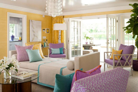
 And here is an example of the so-called colorful interior - multi-color, in which many colors are used. Here you have yellow, and purple, and pink, and blue, and colorful accessories. As you can see, the blurry purple background is a good base for rich colors. However, here in the photo we see only a small fragment of the interior, which perfectly demonstrates to us the possibilities of combining several colors, but which is hardly worth repeating in the conditions small room... Such a purple color is suitable in order to highlight one wall for them, and it is better not to use it on all four.
 Another multi-colored interior is pictured on the left. Lilac wall, yellow outline of the wall and yellow curtains- a very interesting combination. Lots of white, colorful accessories. I would not call this interior very harmonious (for example, I want to replace the white bedspread and the red picture), but this is absolutely a matter of personal perception - it is obvious that the owners of the interior did not have the task of creating pure harmony, they just expressed themselves cheerfully, which is always good.
_________________
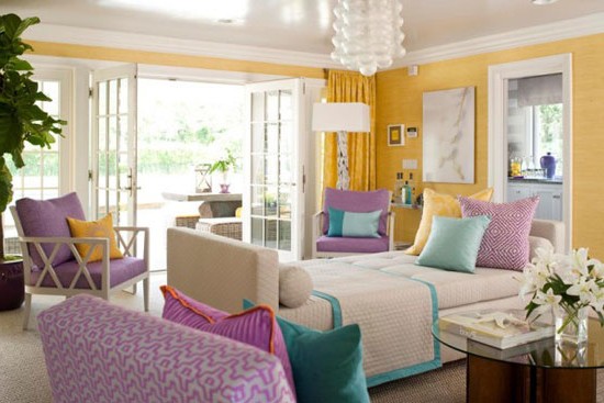
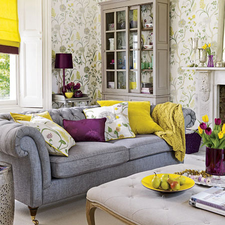 An example of pure harmony is in the photo on the right. I love this interior, it is so beautifully made that it can be used in design textbooks. In addition to being very professional in principle, he certainly attracts with his original color scheme: only three basic colors - gray, yellow and purple - and the most competent distribution of these complex colors in space.
Notice again how contrasting and even tense the combination of yellow and rich deep purple looks. In this interior, it is not perceived as harsh, because calm gray shades soften it and because bright details are on a light visually light background.
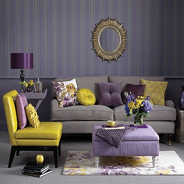
 And here is a completely different story, and now we find ourselves in the "dramatic" zone of purple and yellow. Look - it would seem that everything is similar to the previous interior: gray, yellow and purple, a sofa, pillows, a lamp. But the impression is completely different! And all because of the background - a dark violet-gray wall with a rigid vertical stripe creates a very strict, frozen picture, and our perception of color immediately responds to this and “sees” more clearly how the combination of yellow and violet stands out against this background. The contrast (and not weak in itself) is immediately perceived even more sharply. This gives rise to a sense of drama, despite the fact that the picture is objectively beautiful.
 Another example of high contrast and dramatic combination of yellow and purple. Different shades of dark purple are used here, which always gives the interior sophistication and a certain languor. Therefore, the contrast of dark purple with yellow and white is again perceived more sharply, hence the feeling of the rigidity of the picture.
Note that this and the previous interiors, for all their beauty, cannot be called cozy. They are very spectacular, but they do not create a relaxing atmosphere.
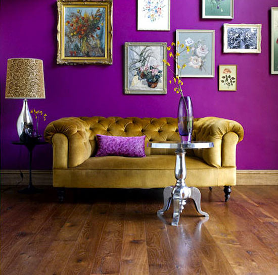
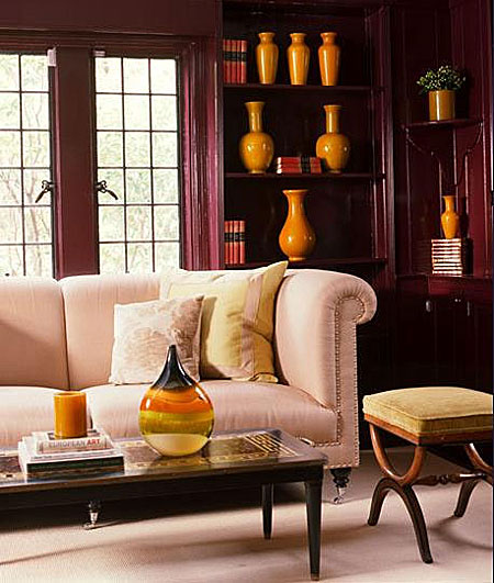
![]() Well, the champion in the spectacular contrast of yellow and purple against a dark background - the interior in the photo on the left. Here, everything is sacrificed to showiness - comfort, light, and proportions. We will not criticize this interior, but rather see what it can teach us. Bright purple effectively stands out against the background of dark chocolate - and vice versa, while bright golden yellow sets off both colors. This is actually a very beautiful and even bewitching combination - again, if you are striving not for comfort, but for the showiness and emotionality of the interior.
Well, the champion in the spectacular contrast of yellow and purple against a dark background - the interior in the photo on the left. Here, everything is sacrificed to showiness - comfort, light, and proportions. We will not criticize this interior, but rather see what it can teach us. Bright purple effectively stands out against the background of dark chocolate - and vice versa, while bright golden yellow sets off both colors. This is actually a very beautiful and even bewitching combination - again, if you are striving not for comfort, but for the showiness and emotionality of the interior.
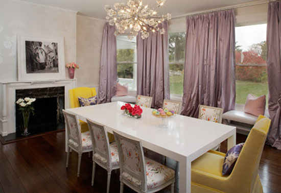
 You can soften the contrast and make the interior more calm by using warmer shades of both colors - purple and yellow. The photo on the right is just such a case. The walls are of a deep, very beautiful purple hue, in which there is a high proportion of red, so it is noticeably warmer than the previous versions of purple (and even gives off slightly brown). Yellow is also thick and warm - a mixture of orange is well felt in it. As a result, even though the picture is very dark, the contrast looks less harsh and calmer. The fact that the sofa and the carpet are not bright white or gray, but creamy pink also plays a role.
 Now let's talk a little about textures. Purple is a very texture-sensitive color. The same shade of purple in different textures (smooth, fluffy, glossy, matte, mother-of-pearl, satin, rough, etc.) will look completely different. Most of the photos in this article use deep shades of purple - in glossy / varnished, as in the photo above, or satin, as in the photo on the right, or velvet / velor textures. These textures make the color especially beautiful and iridescent, but they also give the interior that very drama and even theatricality.
Each person strives to create an atmosphere of harmony in his home. And not the last place in this is occupied by interior design.
The most in a simple way to make the interior of a house or apartment boring and original - use an interesting combination of bright colors. One of these is the combination of purple and yellow. These colors are very effective and bright in themselves, therefore it is necessary to plan well their combination in decoration and pieces of furniture. When creating a yellow-purple interior, a sense of proportion is important. Otherwise, you can get a room that is perfect for the cover of a glossy magazine of a design magazine, but it will be difficult to stay in this room for a long time.
Perception of a combination of yellow and purple
The combination of yellow and purple is often used in the interior. These colors are complementary and perfectly complement each other, thereby balancing the interior.
Yellow color in the interior symbolizes optimism, youth and warmth. Violet, on the other hand, is perceived by most people as mysterious, pressing on the psyche and, to some extent, dangerous. From this we can conclude that when creating an interior, yellow should be taken as a basis, a background, and purple should be used to make contrasting accents. There may be exceptions, though.
The violet-yellow combination of colors is not suitable for decorating a bedroom, the main purpose of which is relaxation and rest. Since such an interior, although quite beautiful and spectacular, is difficult for perception and tense.


Shades of yellow and purple in the interior
An equally important role in the interior must be assigned to shades. Since minor changes colors in the interior they are able to create a different atmosphere of the room. The combination of light shades of yellow and purple makes the room lighter and more airy. The combination of light shades is perfect for the interior of a children's room, kitchen. They will not cause aggression and psychological stress. If you use striped wallpaper of these shades when decorating a room or correctly arrange furniture, then interior items of additional shades will not be required.
If the decoration of the walls or only one wall has a golden yellow tint, then such an interior can be diluted with objects of any shades of purple: from dark blueberry to light purple. Such an interior will always look bright, fresh and elegant, especially if you dilute the combination of yellow and purple with objects that have a white surface.
For the interior of a children's room, it is necessary to use light, bedding shades that will not act irritatingly, even with a long stay in the room. After all, the child in the nursery will not only spend time playing, but also relax. Any accessories of peach, pink, light green and blue colors will make such an interior harmonious.

The room looks modern and energetic, in which yellow and purple colors are used as bright accents of decor, and the main background is gray or white. As accents in such an interior, it is necessary to use objects of bright, juicy shades. These can be brightly colored chairs, a sofa, or textiles. This method of interior decoration will be appropriate in spacious living rooms, halls and studio apartments.
To prevent the yellow-purple interior from being too aggressive, you can use additional items that will help smooth out the abrupt transition. contrasting colors. Additional subjects can be orange, burgundy, light green, turquoise or sand. These can be fairly large decor items: pillows, furniture, panel paintings, poufs.
In order not to get a riot of colors instead of a harmonious interior and not visually overload a small room, it is necessary to place objects of yellow, purple and an additional shade side by side. The best option for small room is the light background of a floor or wall.
If, nevertheless, it is decided to make purple the main color in the interior, then it is better to choose its dirty shades. These shades are well suited for indoor wall decoration and allow you to use objects. yellow color as accents in the interior. But this design option is suitable only for well-lit, bright rooms.
For rooms that are on the north side or have poor lighting, it is better to choose warm shades of yellow and purple. In this case, for wall decoration, you can use purple shades, reminiscent of red, and place accents in bright yellow, closer to orange.
The combination of yellow and purple colors in the interior photo