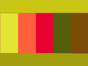
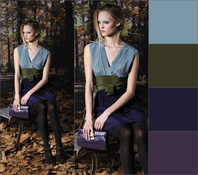
There are colors that are most flattering for you. And their skillful combination with the rest creates the concept of elegance and taste. A lucky few, endowed by nature with a subtle artistic taste and color perception, can choose color scheme wardrobe, relying on your intuition. For everyone else, in order to always be stylishly and tastefully dressed, you need to learn a few rules
White color goes with all colors. White lifts the mood; it is used to treat diseases of the central nervous system. White is the color of purity and clarity. The color of justice, faith, innocence and beginnings. This is a blank slate from which history is written. By giving it preference in clothing, you are entering a new time for yourself. It is better suited for creating contrast than any other.
White and black are the best combination of colors in clothes: photos of women in them always look solemn. When combining it with other colors, it is worth considering the fact that white casts glare and visually enlarges things.
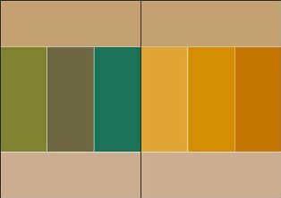
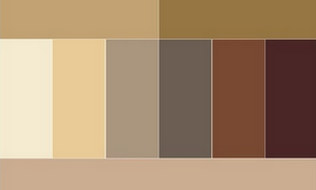
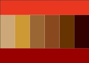
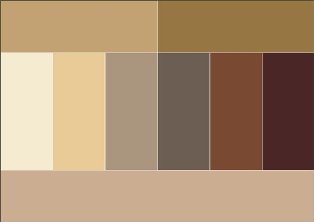
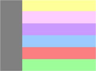
Beige color combination table
Beige color boldly combines with calm tones, and can also be perfectly combined with more saturated and bright tones. Beige color is combined with colors: khaki, marsh, cocoa, gray, taupe, chestnut, chocolate, yellow-green, olive, rusty brown, terracotta, eggplant, purple, bright blue.
 |
 |
 |
 |
 |
 |
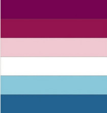
Pink color combines with white and soft blue, with light gray, intermediate between red and white tones.
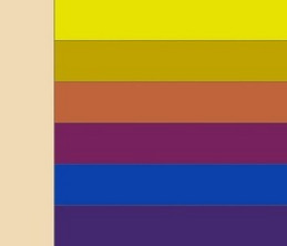
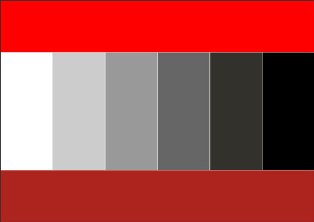
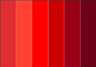
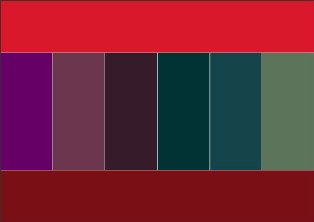
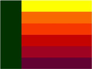
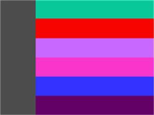
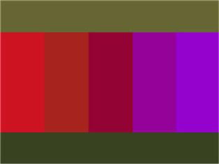
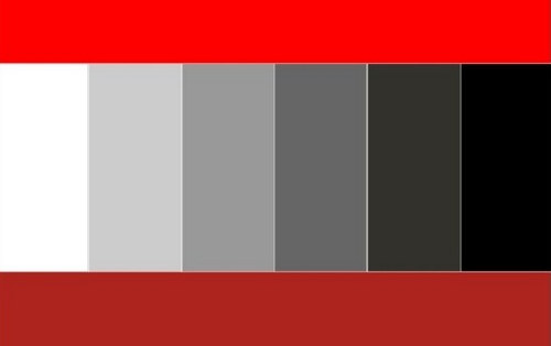
Red color combination table
Red color combines with yellow, white, brown, blue and black, lilac and pink, black and silver, black-brown and sand. Red tones are now boldly mixed with each other, and look stunning at the same time. A more moderate option is to combine red with black.
 |
 |
 |
 |
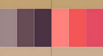
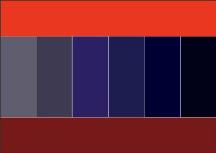
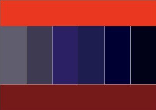
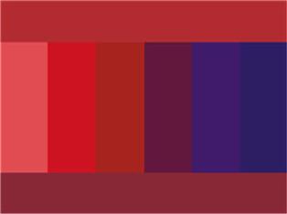
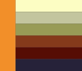
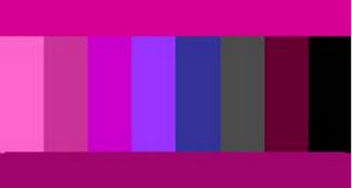
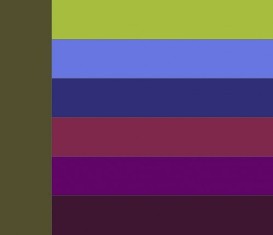
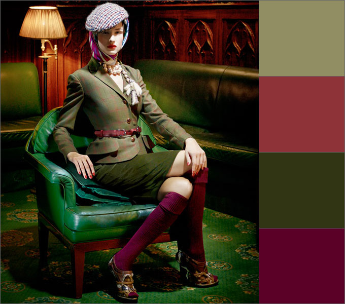
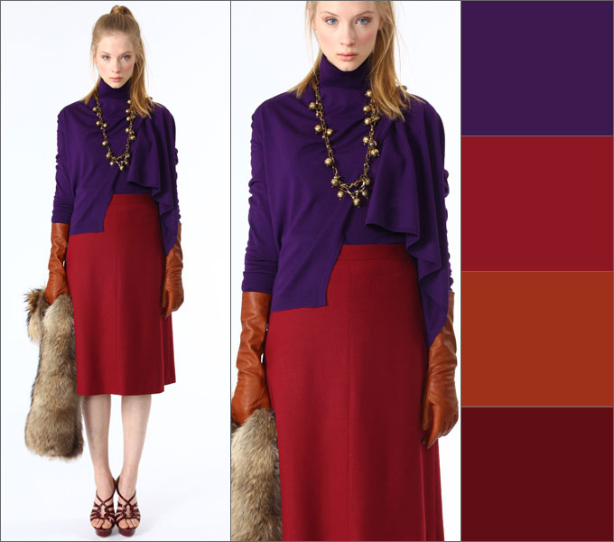
Bordeaux color combination table
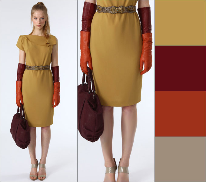
Bordeaux- the color of a woman who knows her worth. Bordeaux goes well with black and dark blue, as well as with colors: green, olive, gray, blue-green, tomato and other shades of red. Berry tones go very well with Bordeaux: blackberry, blueberry, elderberry.
 |
 |
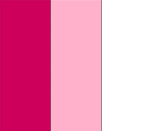
Raspberry color combination table
Fuchsia, crimson, purple colors combined with colors: yellow, orange, dark green, green, bright blue, purple. Raspberry color also harmonizes well with pink and white colors.
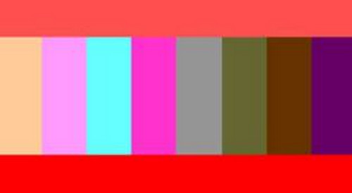
Coral color combination table
Coral color has twelve varieties, these include pink-orange shades and rich red-orange. Combines with colors: white, beige, gold, nude, brown, dark brown, khaki, shades of gray, scarlet, pink-peach, lilac, lilac, hot pink, orange, yellow-orange, pale yellow, dark blue , gray-blue, black.
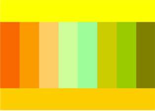
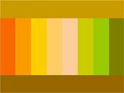
Yellow color combination table
Yellow- represents the sun, wisdom, fun, self-confidence and freedom. Golden color- This is the color of fame and wealth.
Yellow color goes well with colors: marsh, blue-green, orange, warm brown, chocolate, black, dark blue.
Golden color goes well with colors: olive, brown, red, purple, dark green, violet.
Yellow color - with blue, violet, lilac, turquoise. Yellow color without decoration or addition to it is unattractive.
 |
 |
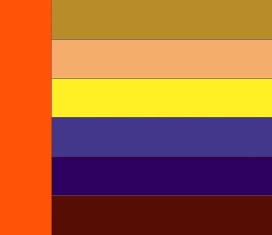
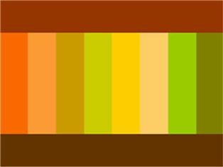
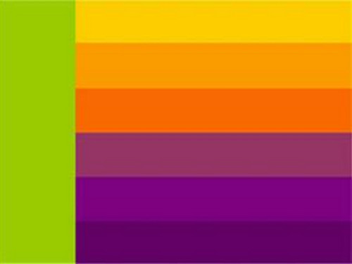
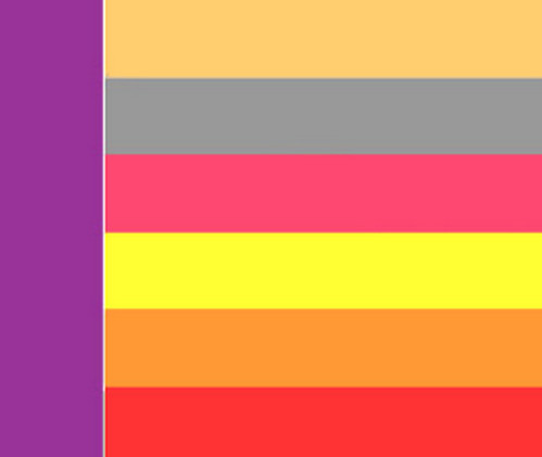
Orange color combination table
Orange color- cheerful, bright, summer and positive color, dynamic and ethnic, the color of the brilliance of the setting sun.
Bright orange color goes well with bright colors: bright yellow, mustard, beige, purple, brown. Muted orange or terracotta goes well with calm shades - pale yellow, gray-green, khaki, brown, chestnut, chocolate, navy or taupe.
To orange and yellow flowers The contrasting black color is very suitable.
 |
 |
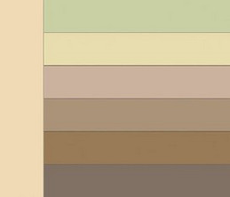
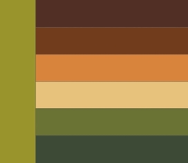
Brown color combination table
Brown color goes with sky, cream, yellow, green and beige, denim blue, smoky blue, light green and white; the color of May grass and very light green, lilac and faded pink.
Brown color goes well with olive, gold, blue-green, orange, lilac, light pink, all shades of beige, ivory and gray. And the unexpected and extremely successful combination of warm brown and turquoise will make an excellent impression.
Rusty brown combined with plum and brown; purple with orange and creamy white; light green with camel; red with yellow and creamy white; brown with blackberry.
 |
 |
 |
 |
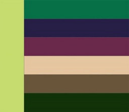
Green color combination table
Green color- with brown, orange, light green, yellow and white flowers and only light greens - with gray and black tones. It is intermediate between cold and warm tones.
 |
 |
Olive color combination table
Olive color harmonizes with colors: blue-green, warm green, khaki, apple green, herbal, eggplant, burgundy, cherry, purple, dark purple, brown, golden, red, orange.
 |
 |
Mustard color combination table
Color of mustard goes with colors: brown, chocolate, terracotta, yellow, beige, khaki, blue-green, coral, hot pink.
|
|
 |
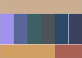
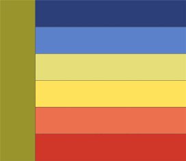
Blue color combination table
Blue color goes with orange; brown and peach, khaki and faded orange, creamy white, blackberry with splashes of brown, light brown and tomato; greyish-orange and purple.
Combine night blue with caustic pink and pine green; red and white; pale pink with dark brown and silver; May greens with blue-green; gray with bright yellow and pale pink.
Blue color comes in light and dark tones.
Light blue- with white, yellow, orange, pink flowers, is intermediate between red and blue.
Dark blue- with light blue (cyan), gray, red,
denim blue, smoky, plum blue; with green and white; gray, light pink and brown; pink and green-blue; vanilla yellow and light blue; dark brown, purple.
 |
 |

Blue color combination table
Blue goes with colors: pink, lilac, coral, light purple, yellow, bright blue, dark blue, gray, white, beige.
Turquoise combines with white, yellow, orange, purple, blue-green.
 |
 |
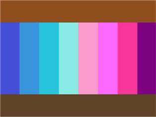
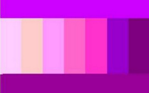
Table of combinations of purple and lilac colors
Purple- the color of nobility and luxury. Pairs best with blue.
Purple- with white, yellow, orange, pink flowers, is intermediate between red and blue.
Bright hues purple are called purple. They are combined with yellow, orange, gray and white colors.
To lilac color They include the colors of violets or dark lilac inflorescences, violet. Lilac is the color of femininity and is associated with sophistication, grace and elegance. The best thing lilac color goes well with dark neutral shades - black, gray or navy blue.
Purple colour
and all its various shades are considered one of the sexiest, mysterious, mysterious and sensual flowers.
Lilac color goes well with colors: pink, white, blue, lilac of a darker or lighter shade, lemon, faded rose color, silver shades, blue, cornflower blue, lilac and violet.
Lilac pink goes well with lavender and dark blue; dark brown with pink-red; brown with light brown; silver with denim blue and yellow, goes well with lavender.
|
|
 |
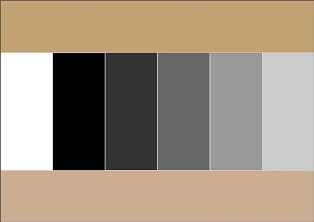
Gray color combination table
Grey colour- the color of elegance, intelligent, harmonious, calms contrasting combinations, used in a business dress code. Light grey colour looks good in the finest natural lace or sensual silk, graphite gray in suede, and smoky gray in fine wool.
Gray color is boring, so it is better to combine it with contrasting colors: white, blue, black, burgundy, red. For elegant outfit can be combined with other shades of gray, lighter or darker, and even beige. Light gray color is best combined with pastel colors: soft pink, yellow, lilac, blue, purple, coral.
Gray-blue goes well with ocher, white and brown; with brown and beige; with purple and pink; with lobster red, turquoise and white; with silver and blue; with May greens and white.
 |
 |
Apricot blossom goes well with camel and brown; light brown, beige and splashes of pink; gray-blue, blue and ocher; sky blue; green, white and silver; red and white.
Camel color combines with gray-blue and purple; beige-brown, blue and lilac; ocher and brown; yellow, red and white; green and white; lobster red.
Khaki color combination table
Khaki combines with gray-orange and tomato; lobster red and white fur color; blackberry, plum and yellow-gold; golden and blue-green; red, soft green and peach; purple, red and peach.
 |
|
 |
 |
It's even better if you pair a solid khaki with a printed garment in these vibrant colors.
Black color, white and gray color
Looks good black color
Here are examples of some successful color combinations
1. light and dark olive, dark pink and magenta
2. burgundy, dark blue, black
3. pink, blue, sepia tones
4. light blue, blue, beige and dark brown
5.
6. ash pink, anthracite, blue majolica, ocher
A rare example when light contrast in an active multi-color combination looks organic:
7. shades of beige and brown, ash lilac, gray
8. blue, dark olive, dark blue, deep purple
9. Two looks are based on the same color combination - terracotta, khaki, turquoise, nude
10. terracotta, carrot, dark cherry
11. cherry, blue and plum, complemented by achromatic shades
12. indigo, lingonberry, dark orange and burgundy
13. taupe , burgundy, dark orange and brown
14. plum brown, cinnamon, dark olive
15. saffron and turquoise with red-brown shades
16. mustard, burgundy, dark orange, taupe
Avoid:
Red and purple, brick, orange, olive, pink, brown, chestnut.
Pink and with blue, olive, red, chestnut, ultramarine, lilac.
Orange And purple, red.
Dark blue and black, sgreen, pink, brown.
Fpurple and with lilac, red, brick.
Lavender and parma color.
Golden And pink, lilac
Yellow and burgundy, pink.
Grey And brown, beige.
Black, white and gray often used as decoration.
Looks good black color in the vicinity of orange, yellow, pink, red, lilac and salad tones, with caustic pink, gray, lemon, indigo, gray, lush green with azure, pale green with bright green.
General rules for combining colors in clothes
The right combination of colors in clothes will make your look complete and harmonious. General rules say that this can be achieved by combining:
- contrasting colors, for example, cherry - pink, blue - cornflower blue, lilac - lilac, green - light green. Such combinations are used in various types clothes.
- P olutonal colors, for example, soft pink - soft blue, soft salad - soft lilac.
- solid colors, for example, brown - beige, light red - dark red. Such combinations are used in everyday clothing and clothing for overweight women.
All pastel shades combine with each other regardless of shade.
Pastel colors- beige, peach, pink, light blue, etc. Those. all colors that add a lot of white. These colors can be combined with each other in any order. Be careful with pink - the only color that is fattening.
Use from 2 to 4 colors. If you use only 1 color, it creates a feeling of dullness and paleness. If you use more than 4 colors in your clothes, then when they see you, people's eyes jump from one color to another, not knowing where to stop, which unconsciously increases anxiety.
Can be combined with each other either related or contrasting colors. All other options are inharmonious.
Related- these are colors that differ from each other in shade (red, pink, dark red).
Contrasting- these are colors that are completely opposite (purple - yellow, blue - orange). The only contrasting combination that is risky is green and red. You can find out which colors are related and which are contrasting using the color wheel.
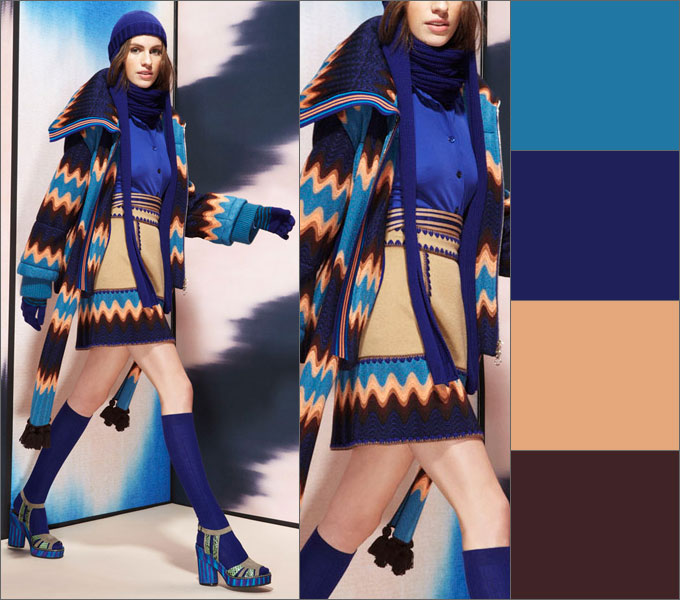
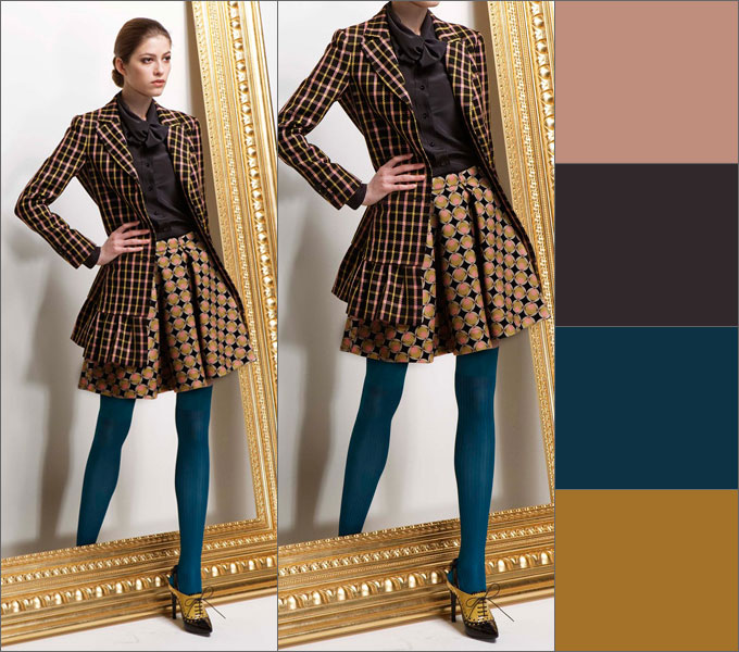
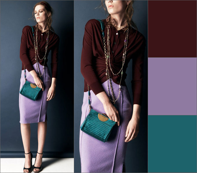
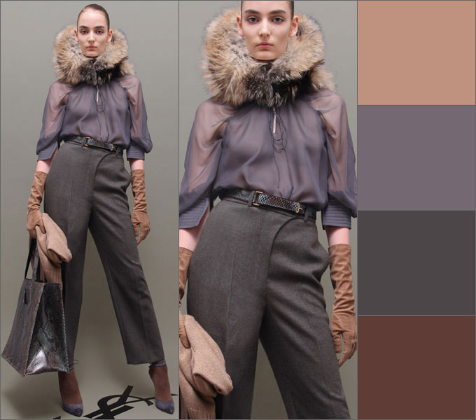
Choosing the right color of clothing and correctly putting together a style ensemble is a very difficult task, but very necessary. The ability to do this stylishly and successfully will save you from questions about whether this scarf will suit my look, what jewelry to choose today, whether my bag matches my shoes, etc. It would seem that such simple questions, but they require solutions every day. Just look at these diagrams like a cheat sheet - and everything will be fine.
Based on materials from izuminka-club.ru, fashion-fashion.ru
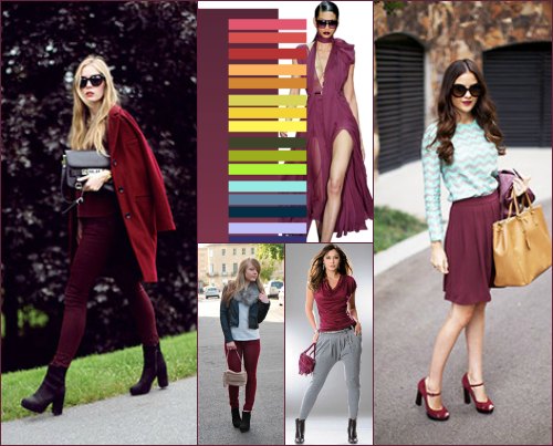
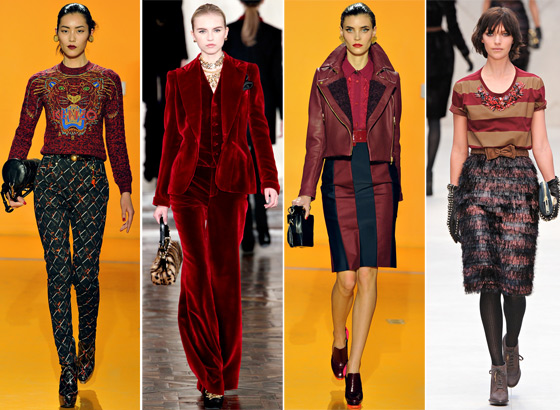
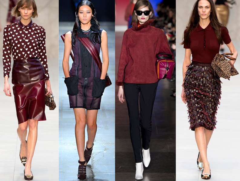
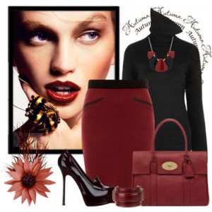
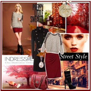
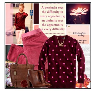
Burgundy color only true fashionistas can afford it in clothes; it is very difficult to combine in clothes and it is not suitable for everyone. People who prefer burgundy color, according to psychology, are more confident in themselves; the color adds severity and elegance to the image. Girls who prefer to add burgundy color to their clothes, or as it is correctly called, burgundy, look elegant and somewhat arrogant.
However, burgundy is hard not to notice; it makes the image look respectable, serious in the eyes of others, however, with a certain amount of arrogance. This color perfectly slims and elongates the figure, eliminating imperfections, but it must be used wisely - in large quantities it pushes others away from you, creating some kind of external barrier that will be perceived as arrogance on your part.
Burgundy color: features
It just so happens that our girls rarely use burgundy, and sometimes this is appropriate - it’s the rare girl who doesn’t have a good sense of style who knows how to combine burgundy or reddish shades with other colors. These shades must be used in doses, and then you will achieve the necessary simplicity and elegance of your outfit.
Despite these significant limitations, burgundy is considered almost a universal color - it can be used at formal receptions, in casual wear, and even for home - it gives warmth and coziness.
Casual style usually does not include burgundy color, however, by diluting the outfit with a shade of burgundy, you can make a gray rainy day a little brighter and add color to your life.
If we talk about business style, then the wine shade fits perfectly into it, adding that very elegance that was mentioned a little above. Moreover, there are no restrictions on its use - it can appear as the color of individual accessories or be the main note of the entire style.
Sports style in a wide range includes burgundy colors, and we are not only talking about clothes that are intended for sports. Sports style implies clothing in which a woman can move conveniently and comfortably in any situation and regardless of the load.
The burgundy color carries brightness and cheerfulness, but also aloofness or some detachment from the general crowd. This color can make absolutely any girl or woman stand out from the crowd, but its tasteless combination can kill the original idea in the bud.
Therefore, if you are not sure how exactly you want to use it, you should not add clothes and accessories of this shade to your wardrobe. But if you still decide, know that burgundy concentrates all the attention on itself, therefore, having chosen one thing in burgundy color, all the rest should be dim, a background for it, and light gray or black is very suitable for this role.
Who should use this color in clothes?
Girls with dark skin color can safely use this color in clothes - it will add luxury to the image and give some touch of elegance. The color of burgundy in clothes for formal receptions can be diluted with golden color or a little leopard print, but for everyday use, burgundy color can be diluted with olive or gray.
Despite the fact that the color is mainly suitable for dark-skinned women, those with lighter skin tones can also use it, but in much more moderate quantities. Accessories of this color will look great against a background of black and beige tones. They can also be combined with light gray or white clothes.
What shades should I add to burgundy?
As mentioned above, this color needs some muted background shade. As mentioned above, white, light gray, olive or black are ideal. The color burgundy also goes well with all denim items, since this color “loves” all blue shades. For example, you can take one bright accessory and add it to the rest of the look - let it be beautiful high-heeled shoes, or a handbag that is fashionable this season.
You can combine this color with monochrome elements. For example, take a plain burgundy skirt and combine it with a striped top. By following these simple rules, burgundy color can be combined in any style of clothing.
Burgundy looks great with leather or fur, thick fabrics or simple lungs, and is able to add brightness to absolutely any image. The main thing is to keep it in moderation and then this color will become a beautiful and elegant addition to your look.
A girl in burgundy will never be left without attention. But all you need is nothing!.. What exactly? Read on. We'll tell you what colors go with burgundy the best thing.
Classic duet: combination of burgundy and black
The burgundy-black pair does not need any special introduction: it is a classic that will always be relevant.
We invite you to check out the duo of a burgundy blouse accompanied by ankle boots of the same color, black skinny trousers and an elegant bowler hat (by the way, very fashionable this season!).
It is impossible not to note another black and burgundy option: a dark translucent blouse, a fitted burgundy coat and high-heeled shoes. Fatal image!
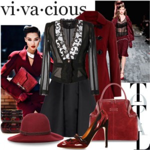
The last combination that we simply couldn’t ignore was an ensemble in which a burgundy pencil skirt was “sung” with a black jumper decorated with a cowl collar. Soot-colored patent leather shoes and a wine-colored leather bag complete this look, which is perfect for autumn days.
Burgundy color in clothes... In gray clothes!
Burgundy color goes with gray is no worse than black! Take a look for yourself: rich wine-colored chiffon, a steel-colored top and a black leather biker jacket. This image has everything: airiness, audacity, and individuality. Worth a try!
But I want to continue the autumn theme. We can easily combine a burgundy fitted skirt, a gray sweater with inserts and dark ankle boots.
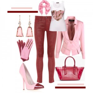
Burgundy+pink=...?
Burgundy color combination and it seems somehow... strange? But it also has the right to life.
Burgundy skinny jeans, a pink fitted blazer, matching shoes and burgundy pink accessories.
A pair of these two colors is well diluted with gold.
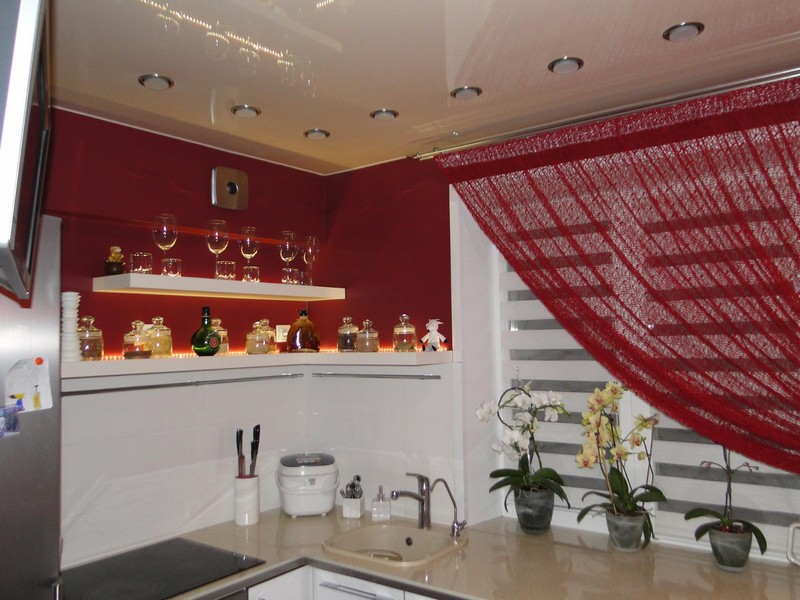
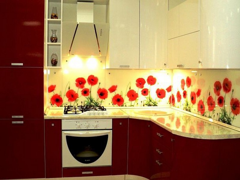
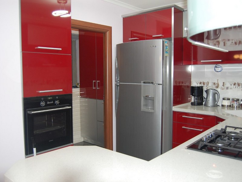
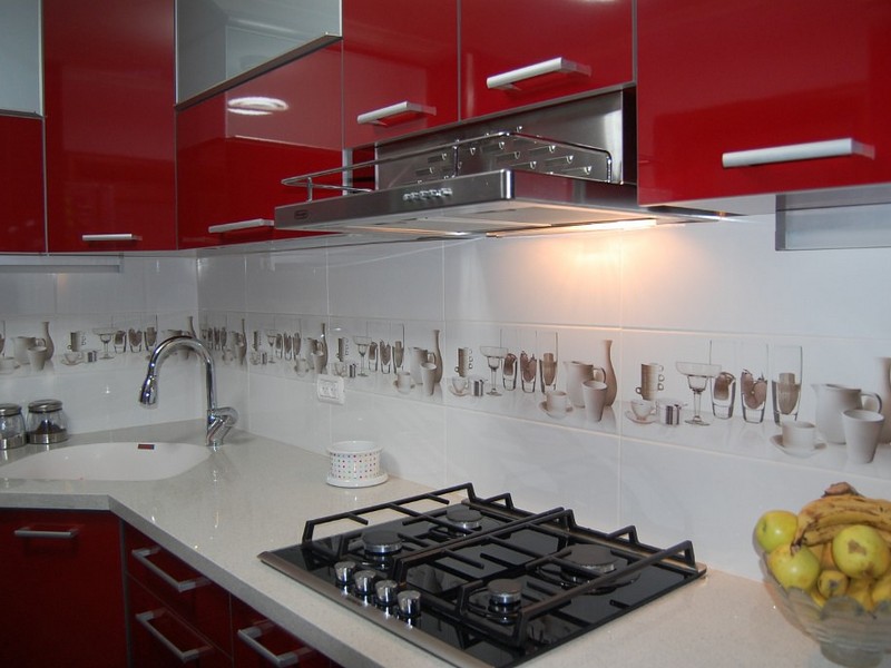
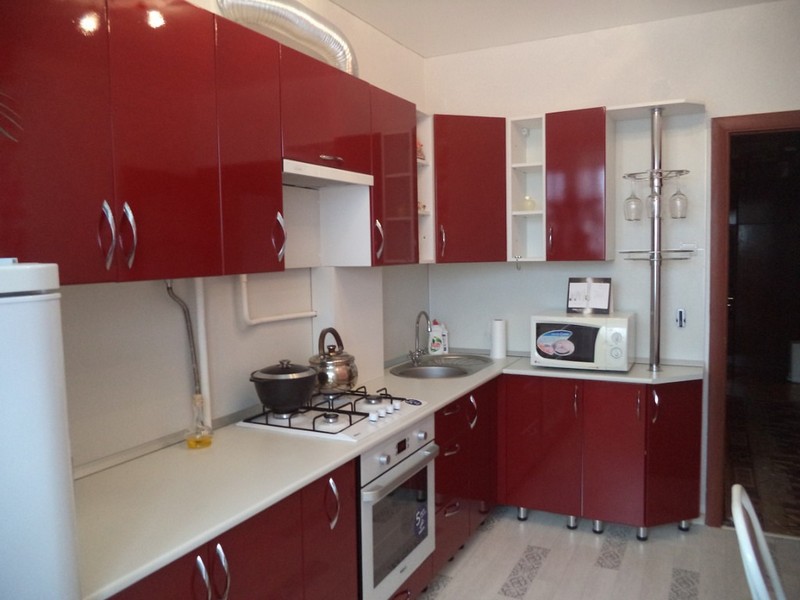
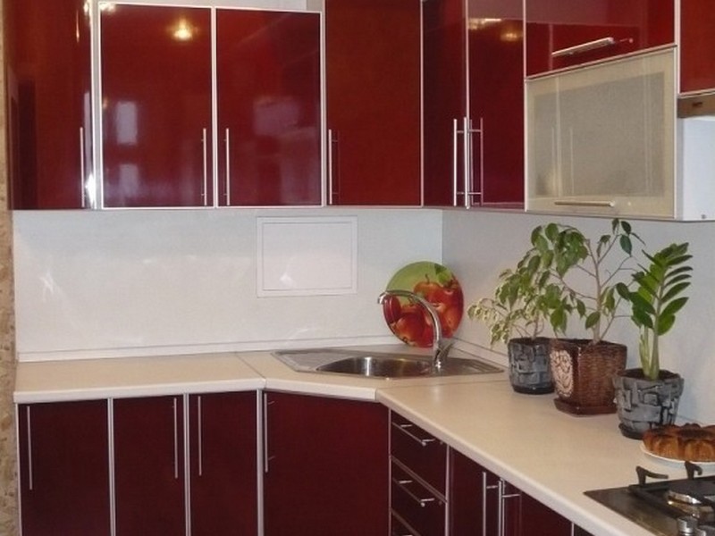
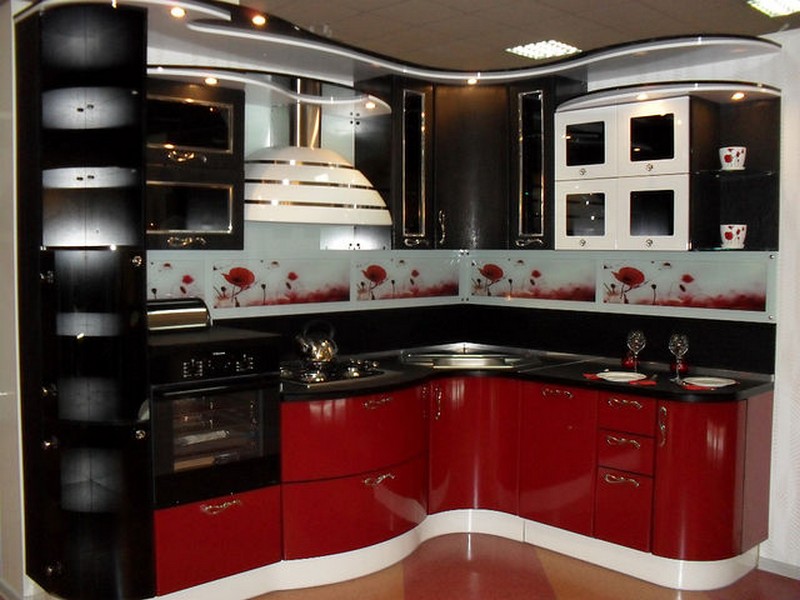
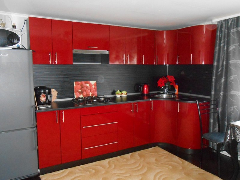
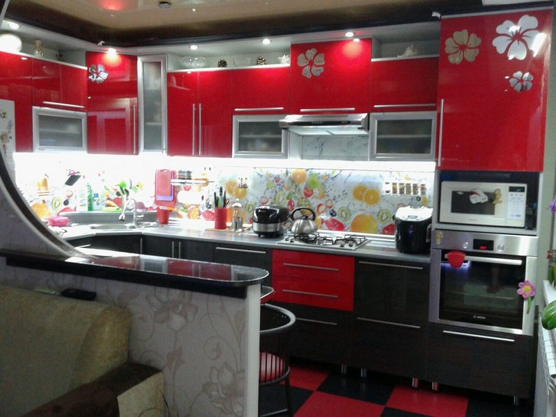
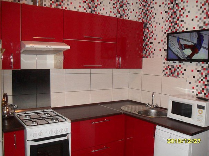
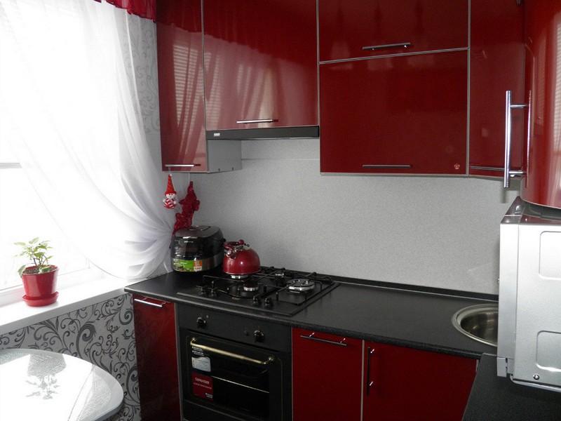
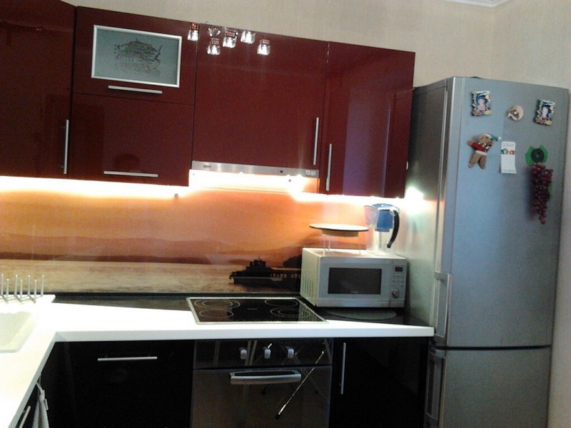
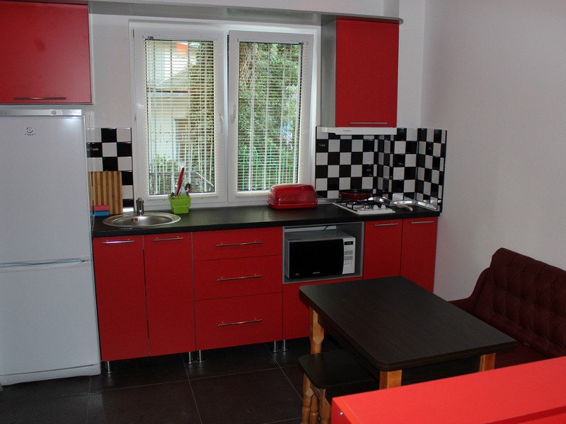
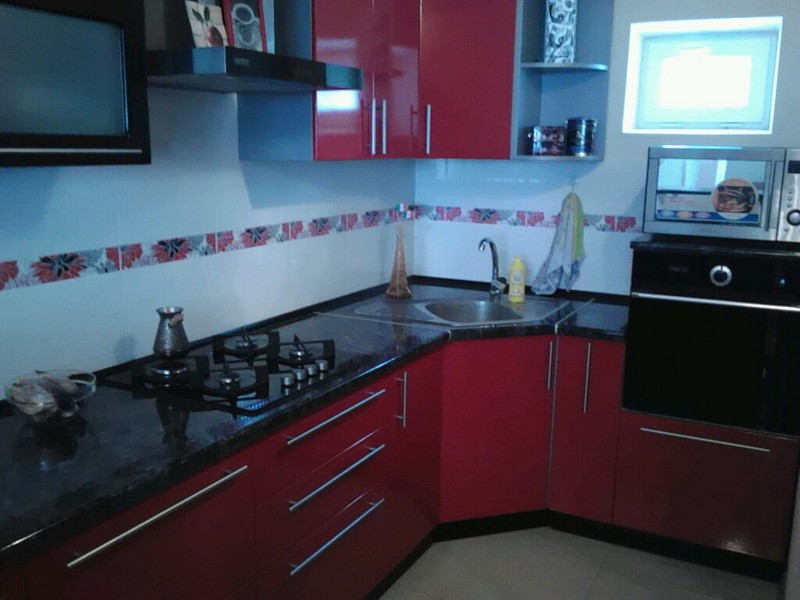
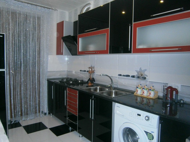
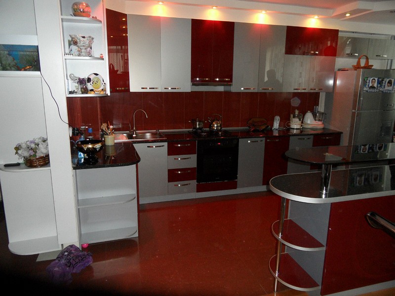
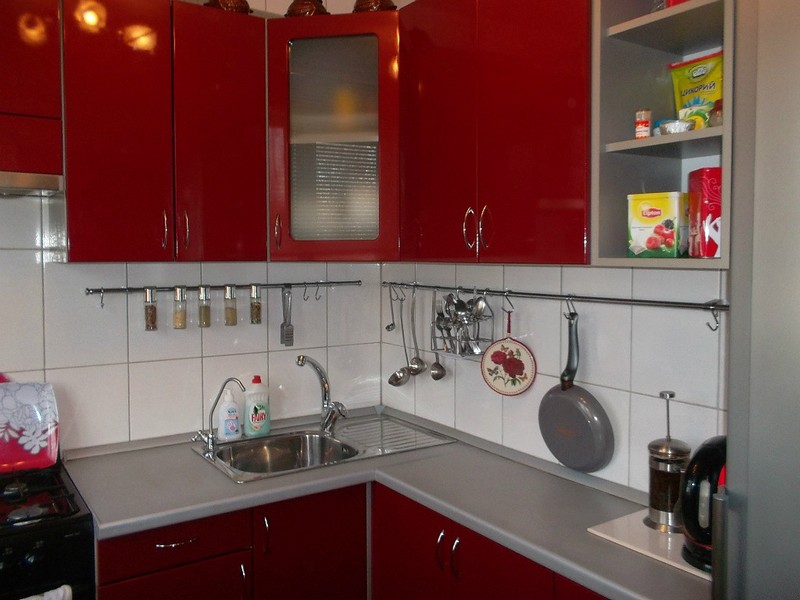
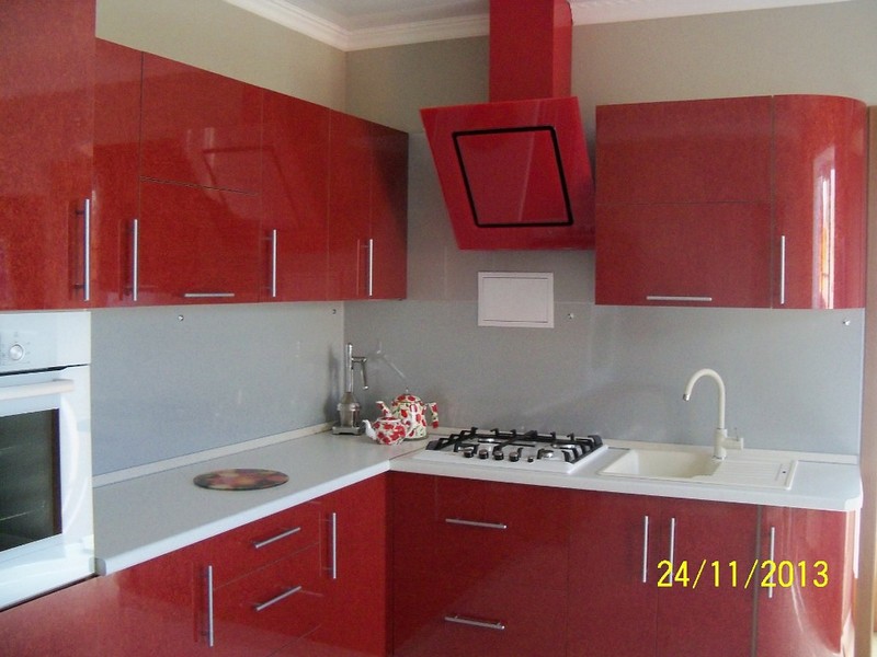
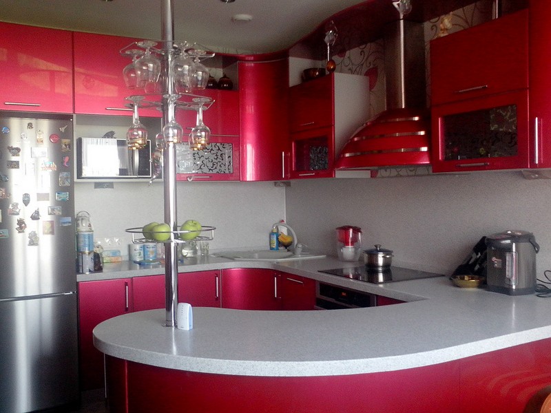
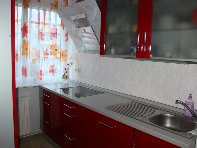
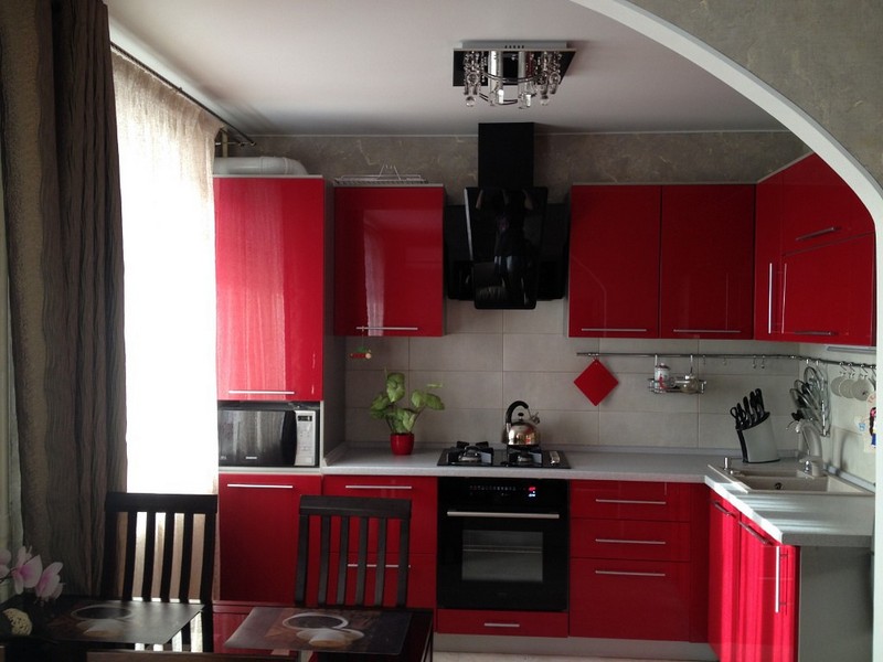
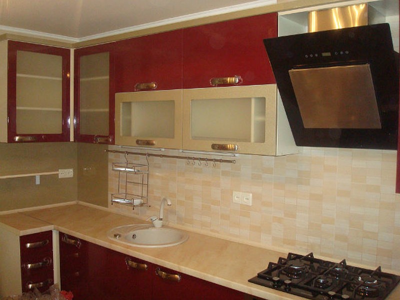
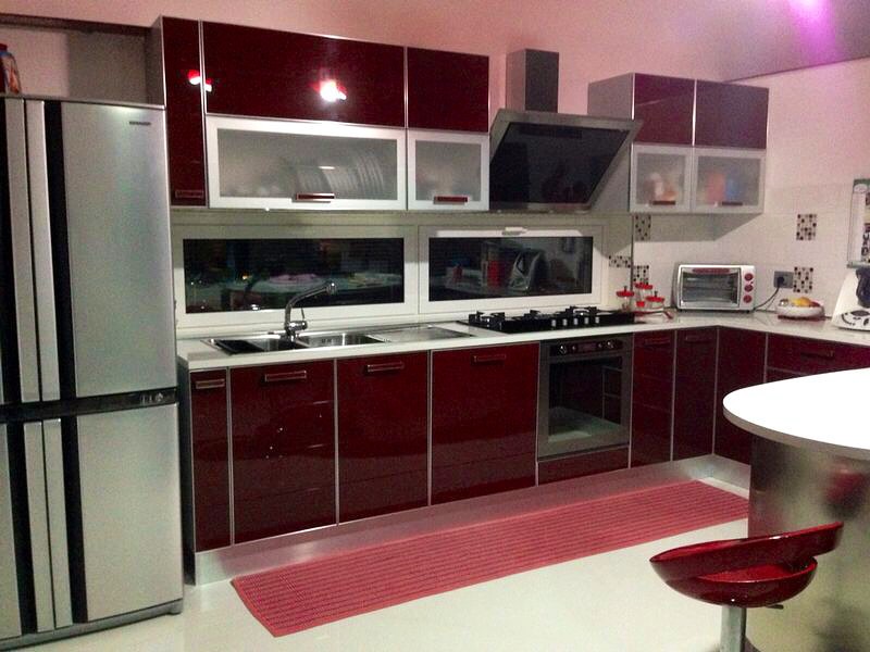
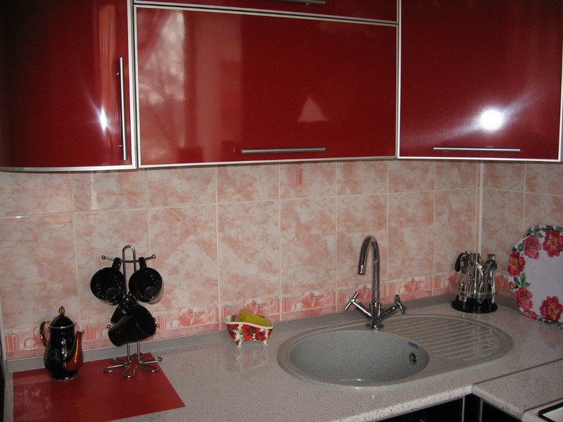
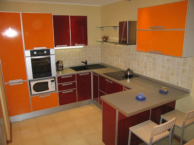
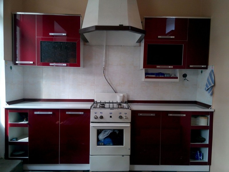
The kitchen is one of the most important rooms in the house, where we all spend a lot of time. Therefore, the space should be cozy, functional and attractive. The color scheme of this room plays a significant role.
Along with white, gray and black classics, burgundy shades in various variations are often used to decorate the kitchen.
Burgundy is a shade of red, but it is not so flashy and bright. It looks expensive, expressive and original, so it can highlight any interior. It is usually chosen by people who are confident and a little powerful. The color is very strong from an energetic point of view.
The color is elegant and festive, and at the same time quite calm and peaceful. This combination is very successful for the kitchen.
From a practical point of view, we can also find advantages in this shade. Various stains are not as visible on it as on light colors, which increases the functionality of the kitchen space.
It is known that colors have a certain effect on the psyche. In this regard, Bordeaux is attractive because it calms and pacifies. In his environment, you can simply spend quiet time with your loved ones, discussing current problems with them.
It is worth mentioning the shortcomings of color. It is quite dark, so it can visually make the room smaller, which is why you should not use it as a primary color.
But burgundy details would be appropriate in this case too. Also keep in mind that a lot depends on the color combination. If you combine burgundy with other dark colors, your room can become very gloomy and uncomfortable.
Shades of burgundy
Burgundy color is multifaceted. Being a shade of red, it itself in turn has different shades, each of which has its own characteristics.
Conventionally, these shades are divided into four groups:
- Directly burgundy– classic color, a mixture of red and brown.
- Ripe cherry. The darkest and most saturated tone of the entire burgundy palette.
- Pomegranate. Very bright and rich. Good to use with contrasting colors. Looks beautiful with white.
- Deep carmine. Cooler than other shades. Along with red and brown, there is a hint of blue in it.
Color combination
The most important thing if you choose burgundy is to successfully combine it with other tones. It can be combined with both classic monochrome and other contrasting tones. Let's look at the most popular combinations.
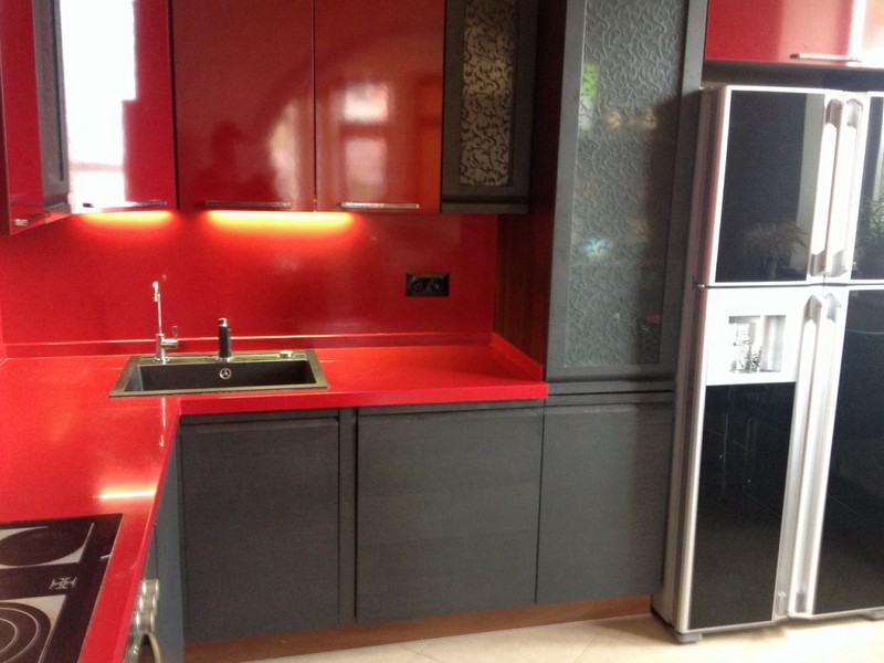
Burgundy and white
For white characterized by the ability to emphasize the characteristics of those shades that are next to it. With white burgundy it will look even deeper, more multifaceted and rich.
White is suitable if you want to visually expand the space, make the room lighter and airier, or connect several colors together.
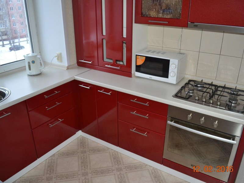
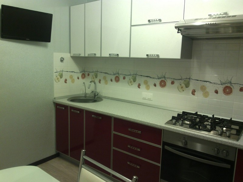
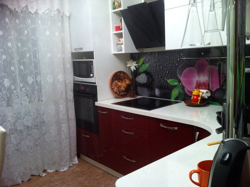
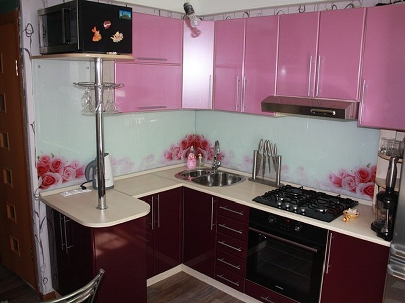
A good option– burgundy kitchen set and white walls as a background. This is the perfect choice for a classic style.
Countertops that imitate marble look interesting, for example, white ones with burgundy-colored veins. Often the contrast of white and burgundy is used to create a room in the spirit.
Perhaps a two-tone white and burgundy kitchen looks a little boring, but that is not the case at all. By playing with bright details, you can change the concept of the room, making it either playfully funny or modestly solemn.
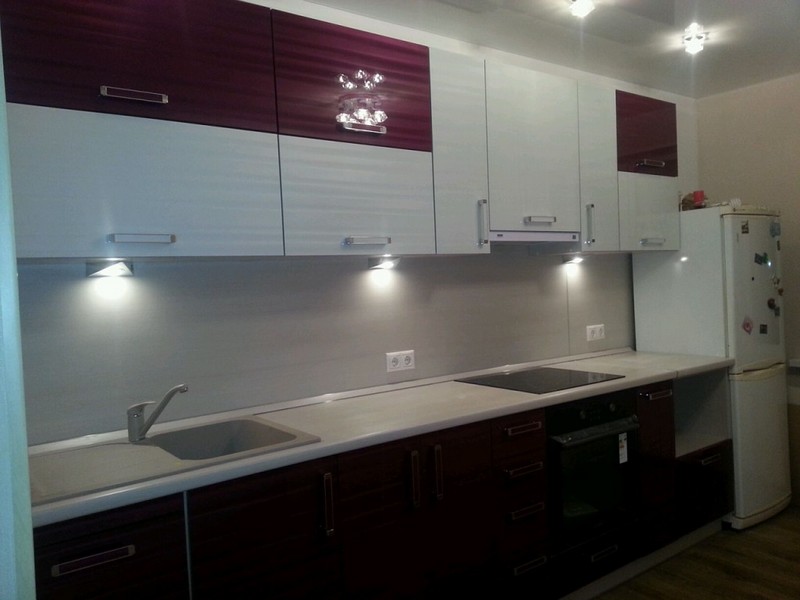
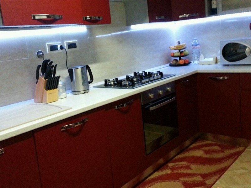
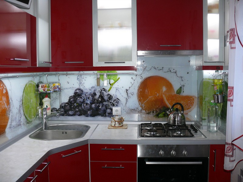
Tip: The interior can be diluted with bright textiles, indoor plants, fruits that will make it more fresh and lively.
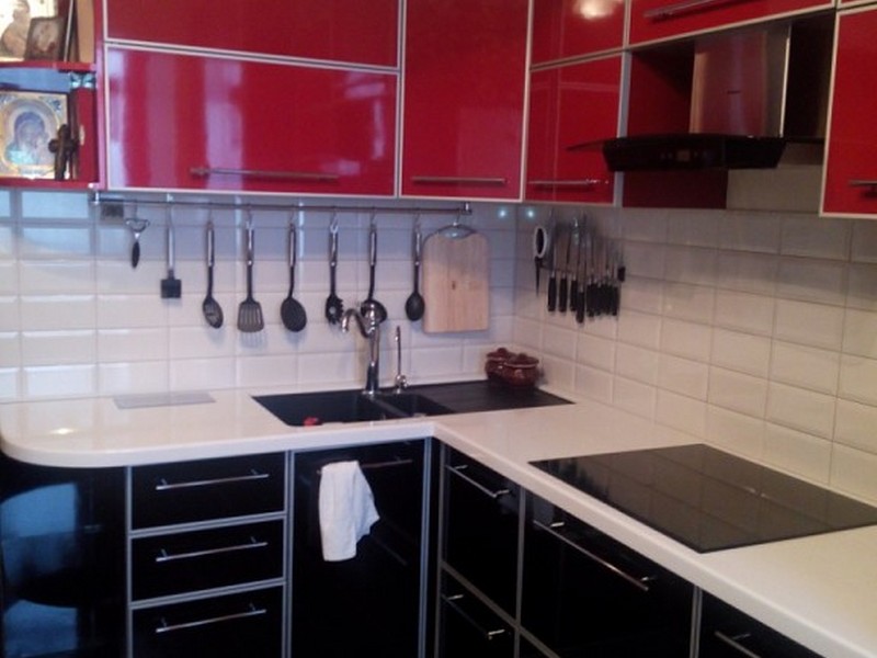
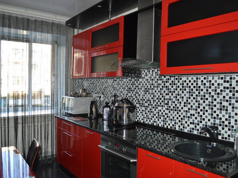
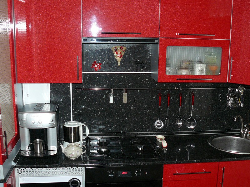
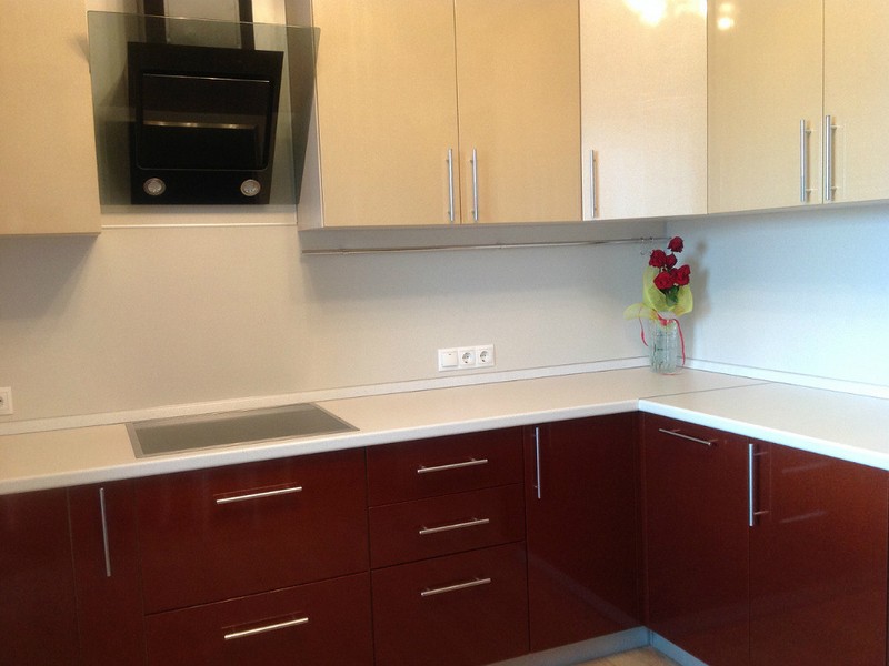
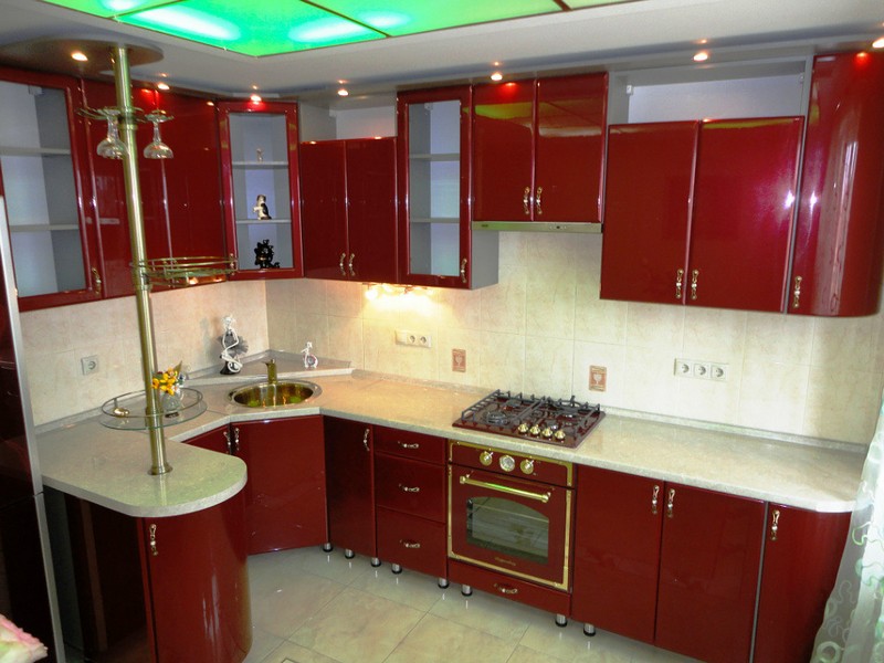
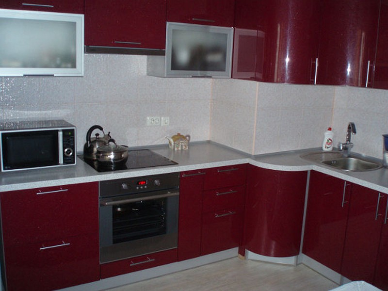
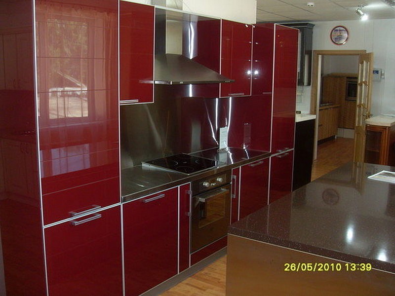
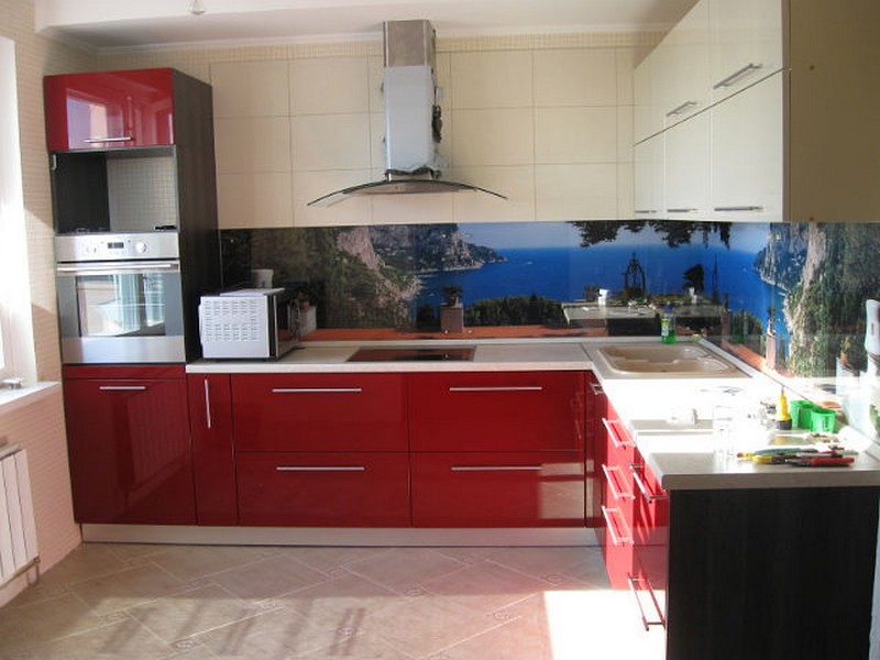
Burgundy and black
You need to be careful with the combination of black and burgundy. If you combine these two colors as the main colors, you can make your kitchen look gloomy and uninviting, and it will also look much less spacious than it really is.
In this case, you can go another way. Take burgundy and white as the base shades, and let the black details act as accents. The result will be quite elegant and surprisingly luxurious.
Without a light color in the set, it is better not to use black and burgundy together for any room.
Burgundy and gray
Gray and burgundy are an elegant and aristocratic combination. If you want to use these two colors as your main colors, keep the gray very light, almost white. And other light details will not hurt in this case.
Dark gray color should be used according to the same principle as black - dilute with gray details a combination of burgundy and some of the light shades.
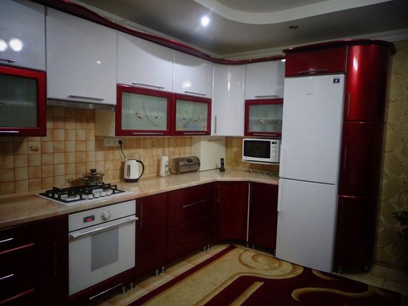
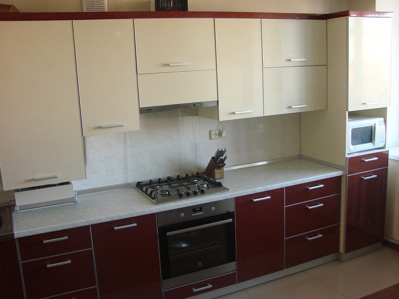
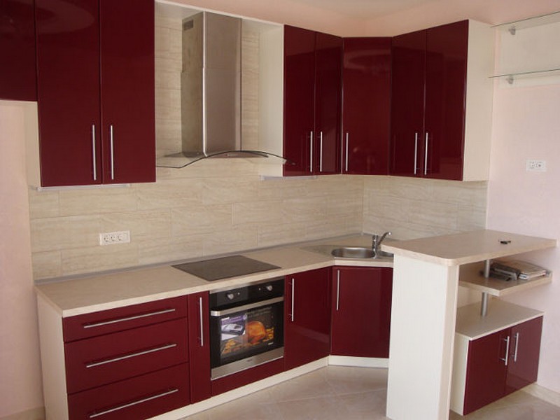
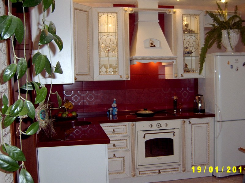
Burgundy and beige
The combination of burgundy and beige will look very gentle and warm. You can safely use these two colors as the main ones, and if you wish, add a little more detail in some bright colors.
If we talk about others color combinations, you need to highlight soft and light shades of green, for example, the color of green tea or muted olive. This combination looks calm and very original.
As a third color, take something as light as possible. When it comes to blue tones, caution is important. They can either make the interior brighter or drown out all the beauty of Bordeaux with their coldness.
The combination of burgundy with orange and coral is quite bold, and if used incorrectly it can look absolutely tasteless. But if you beat him successfully, you will get a stunning effect.
A good solution in this case is the following: combine white or beige with burgundy as the main ones, and use orange for several interior details - flower vases, dishware, cute kitchen towels, and so on.
Advice: Not the best pair for burgundy - pure red, pink, purple and other shades close to red. They will blend in with the burgundy, taking away its uniqueness and making it dull and unpleasant.
Exist general rules, which should be used in kitchen interior design if you have chosen a burgundy color for it. They will be as follows:
- It is important to dilute burgundy with delicate and light colors. You can use cream, milk, caramel. The right combination will make it possible to create incredible comfort in your home.
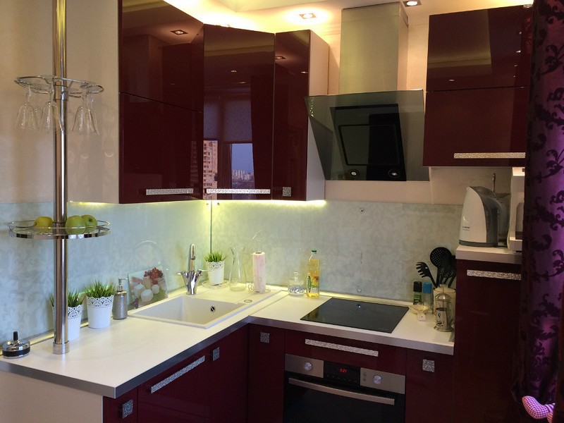
- The surface of kitchen facades can be either matte or glossy. In the first case, the interior will be more austere, in the second – more luxurious and solemn.
- Remember the curtains. This important element decor. Their shade should be in harmony with the color of the furniture. A good option - bright kitchen with accents in burgundy and the same color.
- Burgundy interiors look especially good with diffused lighting, which softens the brightness of the colors and does not strain the eyes.
- Do not combine burgundy kitchen with tones that can cause irritation - yellow, pink, bright green. In this case, they will take all the attention and distract from the deep luxury of Bordeaux.
Which style is best for a burgundy kitchen?
Can be decorated in burgundy color classic cuisine. In this case, furniture sets made of MDF or wood are suitable, which will look very good. This may not be the most classic solution, but it will make your kitchen very original.
This color fits into the art deco style. In this case, it is worth adding gilding and inlays to the interior. Those who love country style may think that burgundy is not the best solution.
But this is not true at all. If you choose furniture in this shade with an aged effect, and complement it with the right accessories and decorative elements, everything will be harmonious.
Details in the form of fabric bedspreads, tablecloths with cute prints, aprons and small arrangements of dried flowers are suitable for this style.
Styles such as hi-tech and minimalism can also benefit from using burgundy. In this case, you can replace matte textures with shiny ones, add steel and chrome, as well as the most modern and functional household appliances.
In fact, you can experiment with burgundy in any stylistic decision. It is only important to maintain a single concept thanks to the details.
Burgundy color leaves unlimited possibilities for experimentation. By using it wisely and successfully combining it with other tones, you will achieve a stunning effect, and your kitchen will no longer be just a kitchen.
Orange kitchens and kitchen furniture in the interior: made of plastic, with photo printing, with a wenge body 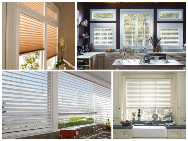 Blinds for the kitchen: types, color, material, advantages, photos