Violet, on the other hand, is a distant color in its meaning, divorced from everyday life. He is of heavenly origin. It is a complex and multifaceted color.
So how is it possible to connect such different colors in one set of clothes? And what, as a result, will it make on those around you?
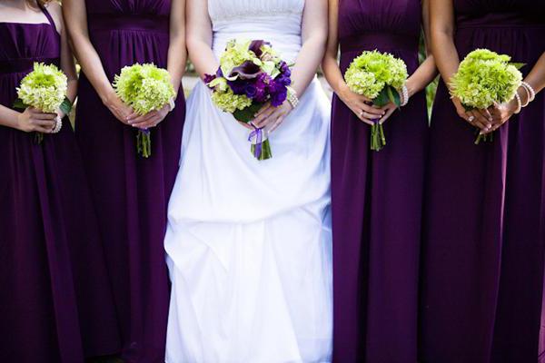
Pure purple is composed of red and blue flowers in equal proportion. By itself, it is quite versatile and goes well with different tones. But its shades are capricious, and when drawing up sets, you need to carefully select suitable combinations.
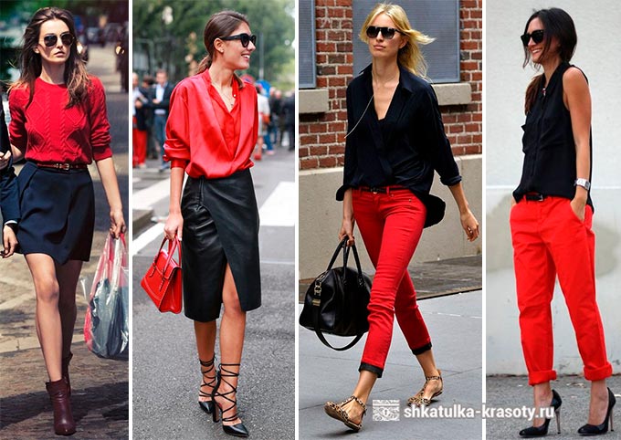
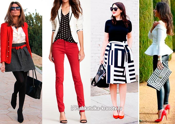
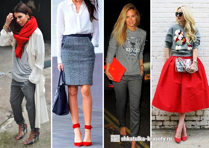
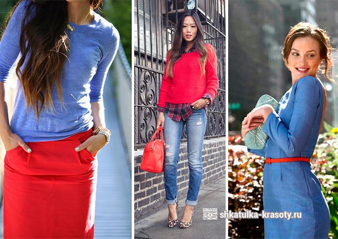
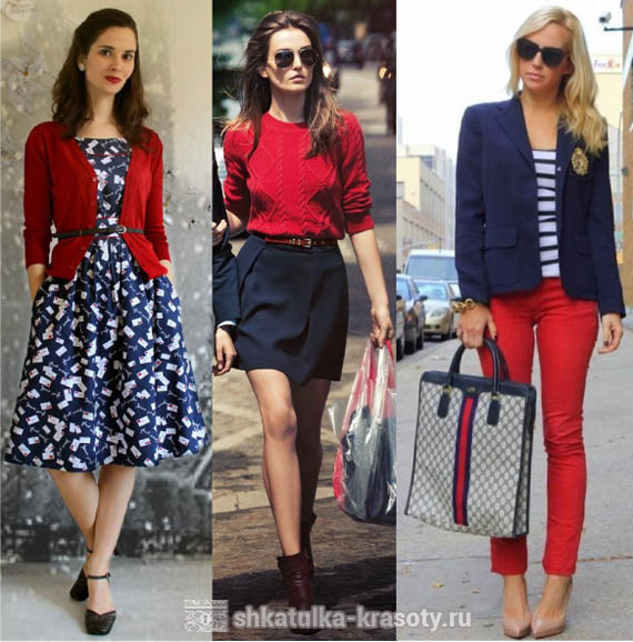
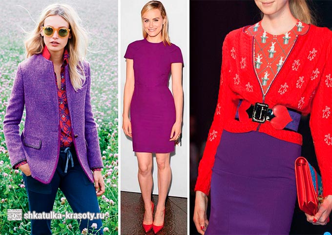
The combination of cool red with shades of purple is bright and unexpected. These are related colors, but at the same time create contrast. Together they evoke the feeling of something unusual, even mystical. And, oddly enough, such a tandem is very pleasing to the eye. Although with prolonged use it can tire the nervous system.
In general, red enhances the influence of lilac-violet shades as feminine and intimate. Pale purple, blue-lilac, violet, grape colors will look good next to red. Such combinations will look joyful and harmonious.
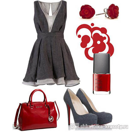
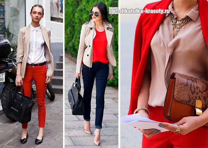
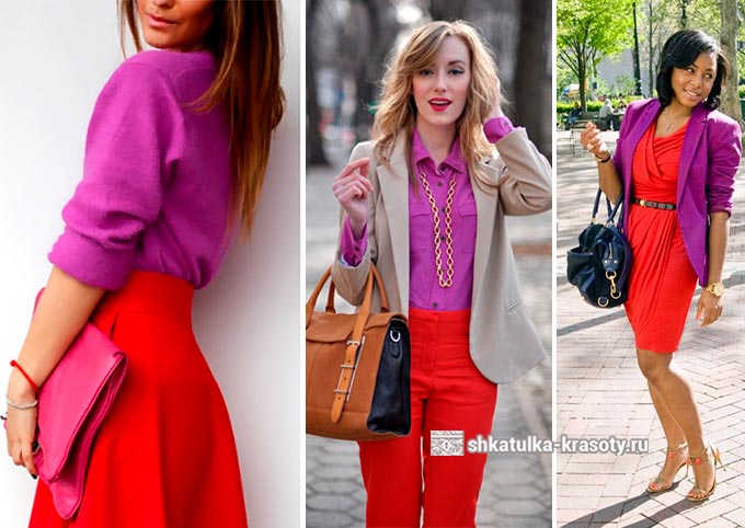
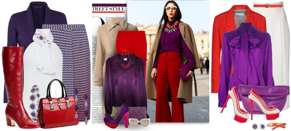
For everyday sets, it is good to introduce a third, neutral shade into such a combination. It can be white, beige, cream. They will refresh the image well. Universal black is fine too. Use them in accessories that will set off the main set in this way.
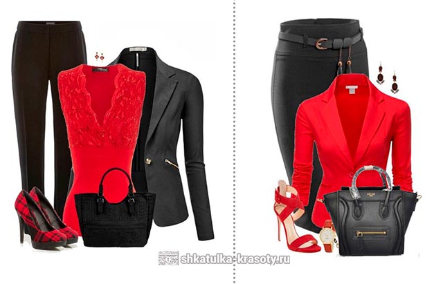
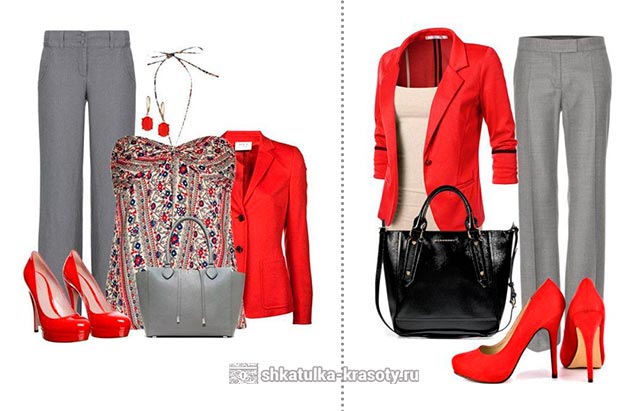
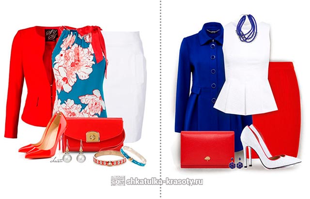
Many are likely to be afraid to use such a bright color duo in a business set. In order not to look too intrusive, you can always use a third, calmer shade. Or you can simply change the proportions of the combination.
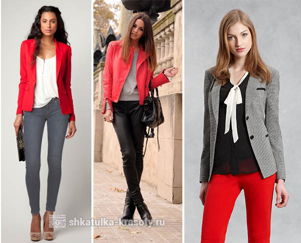
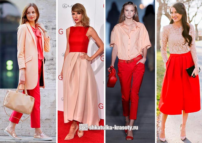
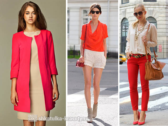
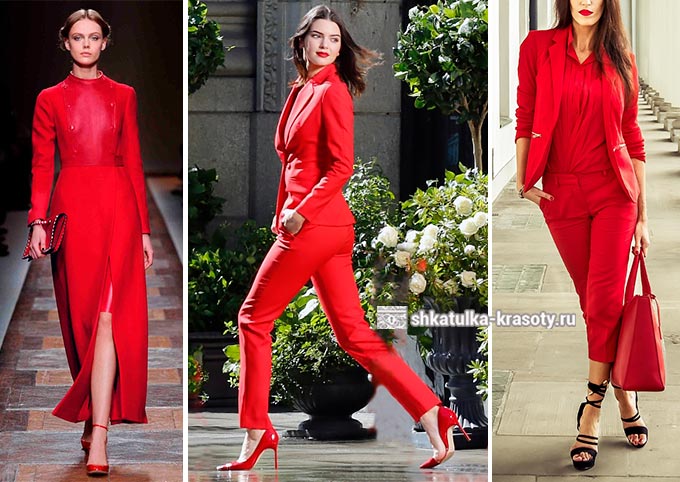
Choose, for example, scarlet shoes and a bag to complement a formal dress in a muted purple hue. The image will turn out to be dynamic, but not annoying. You can also choose products in purple shades for an office-style ensemble with high content red pigment. Then the overall contrast of the image will be reduced.
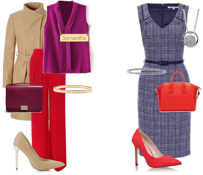
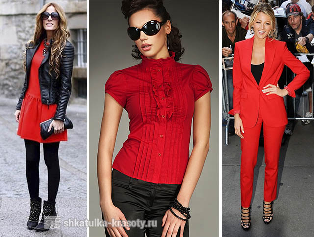
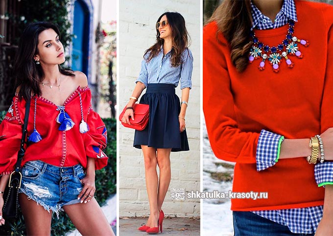
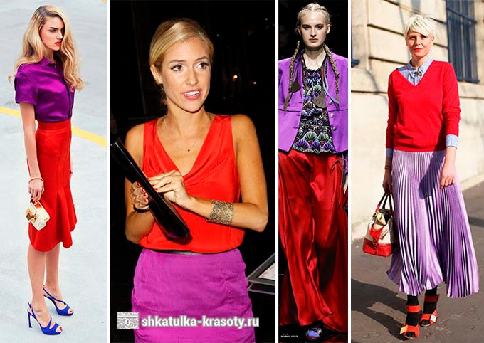
Romantic sets in red and purple tones are suitable for girls who want to draw attention to their originality. The image will turn out to be feminine and sexy. A great solution would be to add another color, more contrasting, to the main set.
Accessories in yellow-orange tones will look great. They will become an accent, but at the same time they will not stand out from the image. The result is a very harmonious and active combination. This set is ideal for a party or an evening with friends.
And here graceful dress muted red with perforation is very noticeable in itself. Purple in this set is present in small quantities - only in accessories. Yet he is quite active and attracts attention. The image turns out to be outstanding, but at the same time quite light.
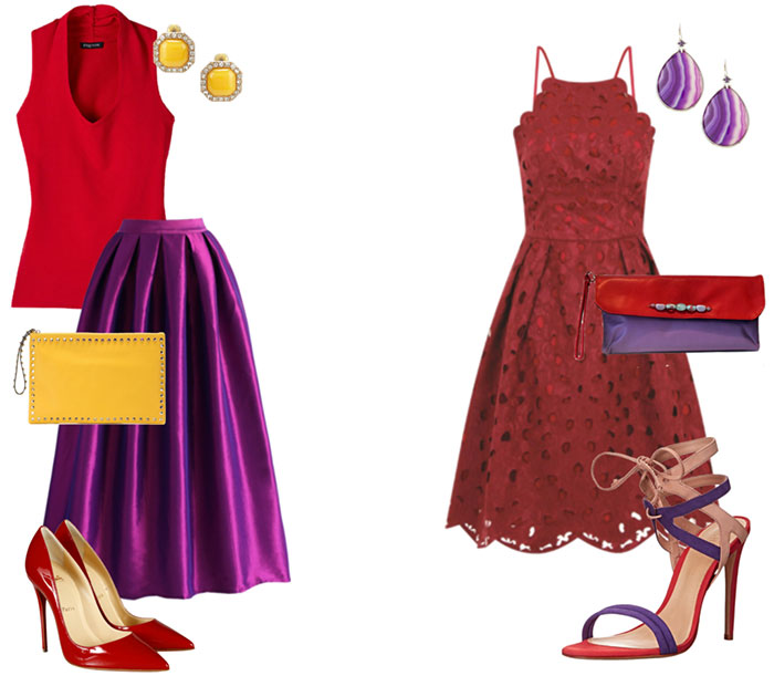
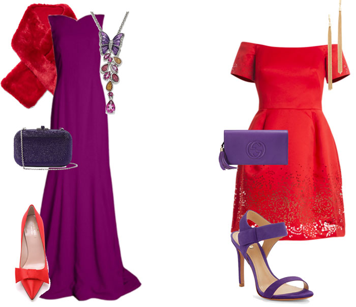
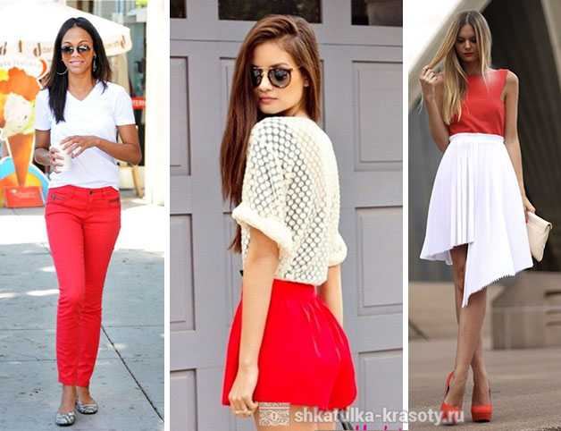
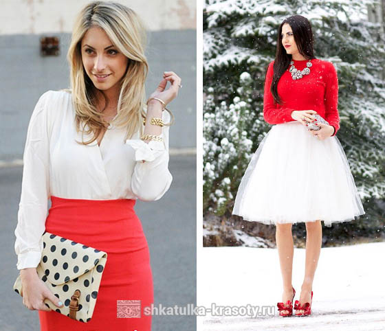
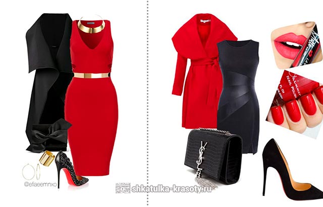
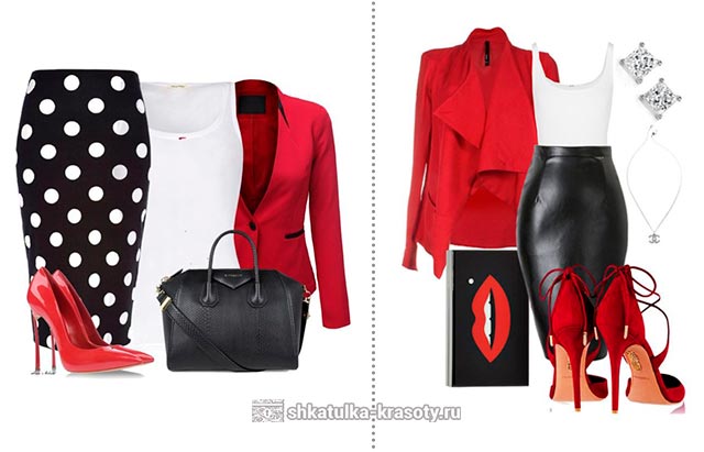
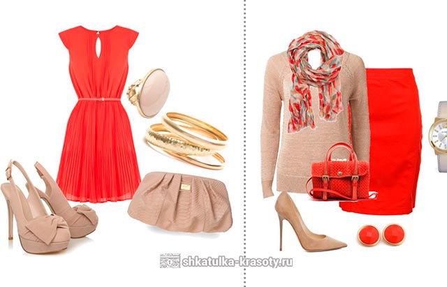
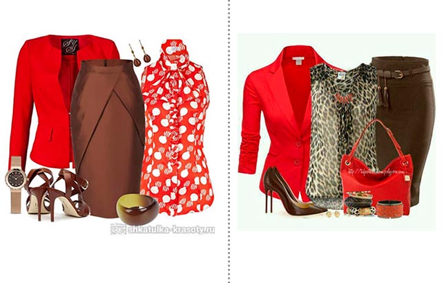
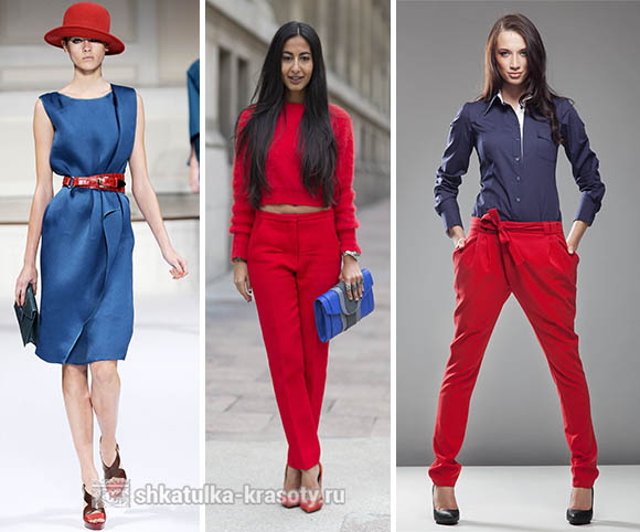
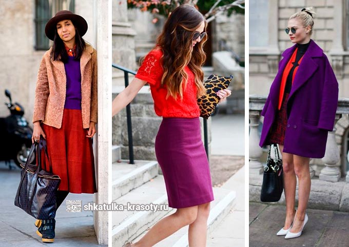
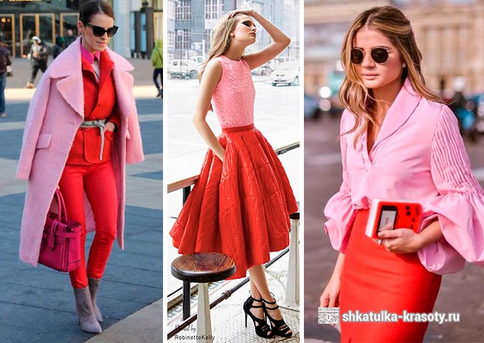
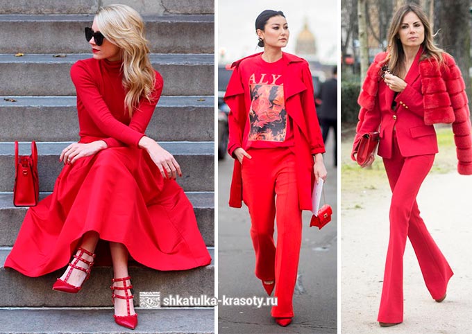
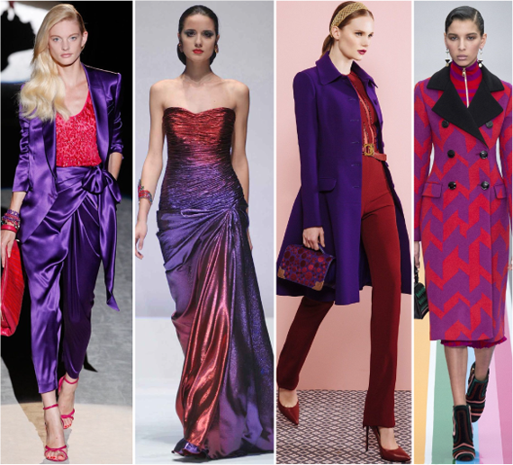
For special occasions, ensembles that combine red and purple shades are just perfect. Such images look rich. There is a touch of chic in them.
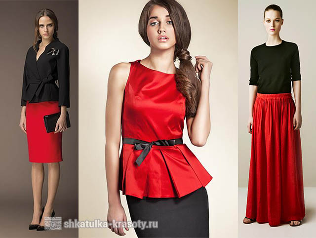
A gorgeous evening maxi dress in ripe grape color is set off by red shoes and a fur stole. The clutch is closer in tone to the color of the dress - dark purple. The decoration combines all the shades that are present in the image. And at the same time it acts as an accent. In general, the result is an outfit worthy of a noble lady.
An interesting look comes out with a scarlet dress and purple accessories. The style of the dress is rather unusual, therefore both the sandals and the clutch are selected in a more laconic form. Gold-colored jewelry is good for such a set.
In general, the combination of red and purple flowers unusual and memorable. Red is a related shade of purple. And yet their contrast, in relation to each other, is high. This means that in such an ensemble it is simply impossible to remain unnoticed. Take a closer look, perhaps you will discover this truly extraordinary tandem.
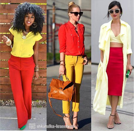
The most active, vibrant, intense, emotional and provocative and powerful color in the entire palette. How and with what to combine red.
He leaves no one indifferent. He, as a symbol of fire and movement, can evoke different sensations.
Psychologists say that red in clothes is preferred by people who are confident in themselves and their strengths, decisive, ready for action.
Red clothing is a great way to make yourself known. Things in its shades will help to attract the attention of others, make you more noticeable. And therefore, it is very important that your image is effective and competent. To do this, you need to compose your kit based on the basics of color combinations in clothes.
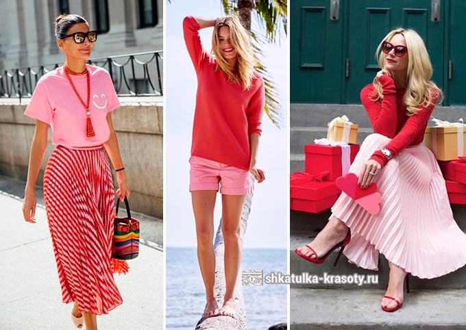
He is the most warm in color palette . Depending on the addition of other colors to the red in one proportion or another, many different shades of color can be obtained. We will take a look at the most popular shades.
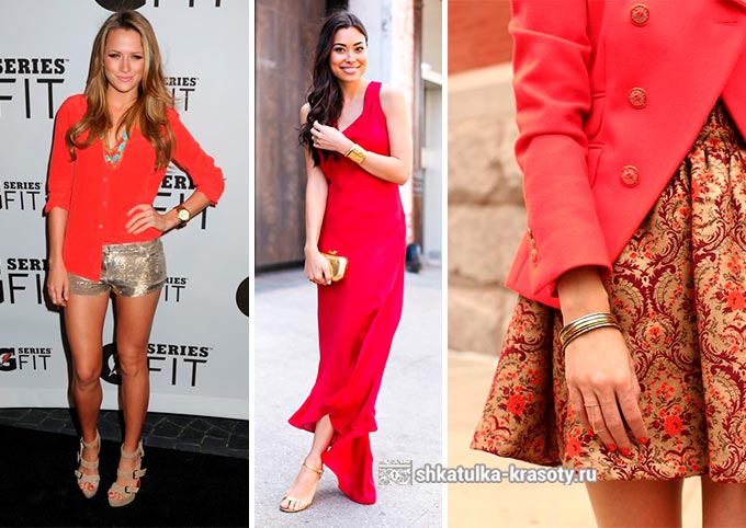
- Pink-orange - this shade contains a little white and yellow flowers... It is soft enough and suitable for both evening dress and for everyday kits.
- Raspberry - it is obtained by adding purple color, which partly gives it some of its qualities - depth, it is slightly colder than other shades, it goes well with brighter and warmer colors.
- Coral pink - in this shade there is a slight light orange tint. This made it possible to soften the color, make it softer, more delicate and romantic.
- Lilac pink - this shade with a touch of blue and white flowers slightly colder and more calm.
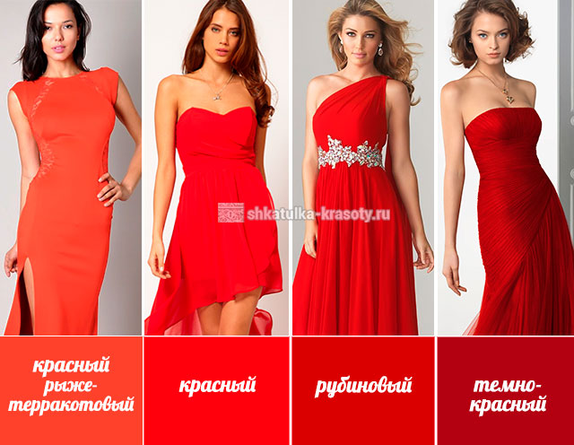
- Red-terracotta - to get it, you need to add orange to the red, as a result we get a shade that is in the middle between these two colors and has the qualities of both red and orange. It is warm, positive, very bright and intense.
- Red - it is a classic pure red color without impurities and additions of other tones.
- Ruby - a precious ruby shade looks very noble. A rich tone will give any outfit a more luxurious sound.
- Dark red - one of the deepest and most saturated shades of red, mysterious and mysterious.
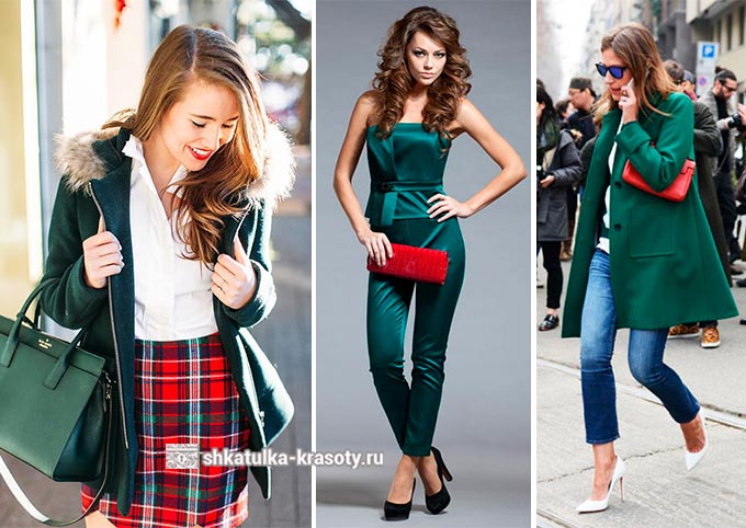
The combination of colors in clothes - RED
Of course, it is beautiful in itself, but in combination with other colors, it transforms, becomes even brighter and more expressive, or it can add a unique touch to your outfit, make your image more complete and memorable. 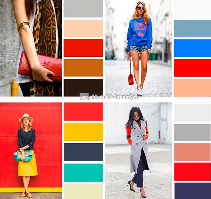
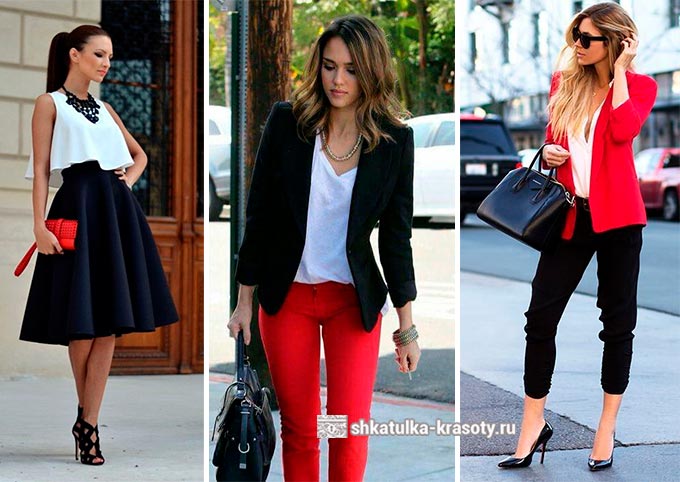
So, what colors does red match best in clothes? The variety of combinations pleasantly surprises and opens up the possibility for experimentation.
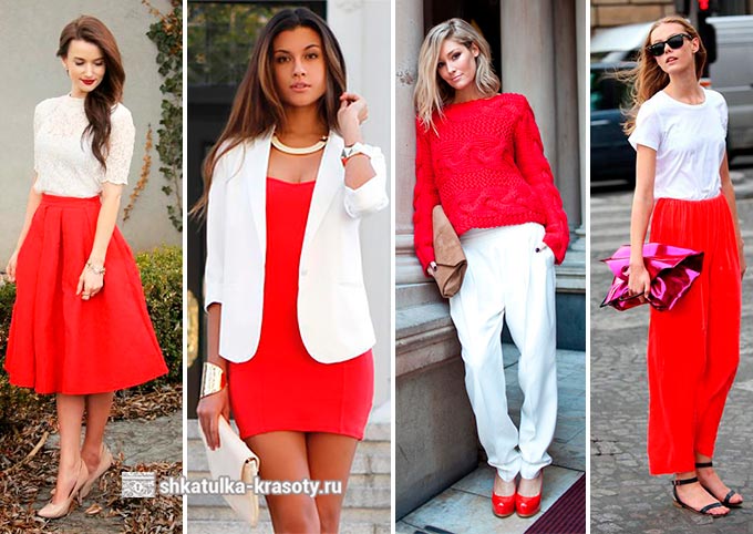
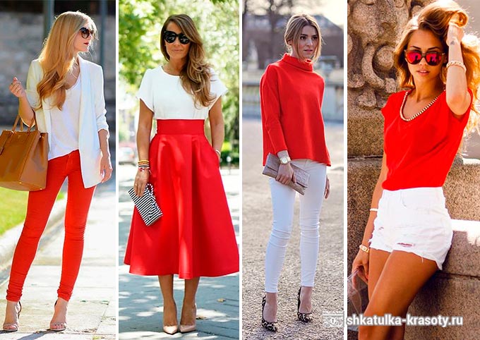
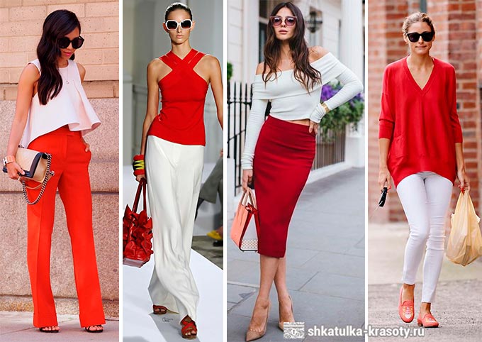
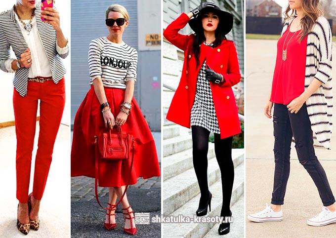
+ White
Everyone knows that white combines perfectly with all colors. However, it is the combination of red and white that is classic and most attractive. it a win-win in any variation: one of the shades of red can be chosen as the main one, and white will complement the color of several accessories, and vice versa - even one scarlet accessory in a white outfit will be the main accent of the whole set and emphasize your individuality.
+ Black
This is also a classic. However, in comparison with the previous version, this one looks heavier and a little tense. The red clothing gives the set a powerful and dynamic sound. Adding white will add freshness and lightness to your look. The combination of red and black can be used in both casual bows and festive outfits. 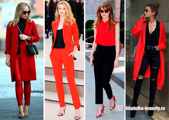
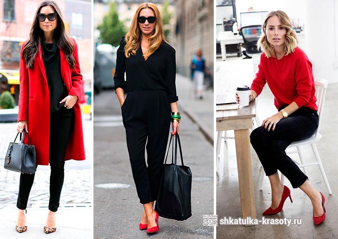

+ Black + White
You can "defuse" the red-black sets with the help of the white ones. This will help relieve eye strain from powerful contrasts, make the outfit more elegant, and the color dynamics will look more interesting.
You can use as solid color things like black jacket + red pants + white blouse (t-shirt), as well as things with black and white patterns, prints or drawings - this will also look interesting and set the style for the image.
A black and white stripe in this case is a win-win option.
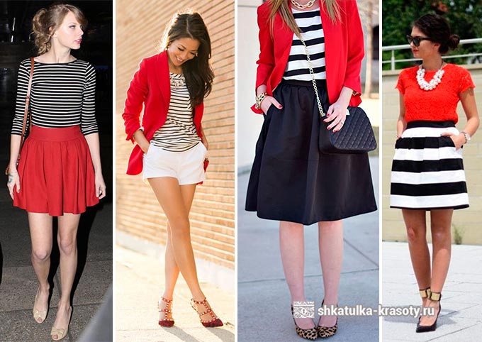
Prints and patterns - set the style.
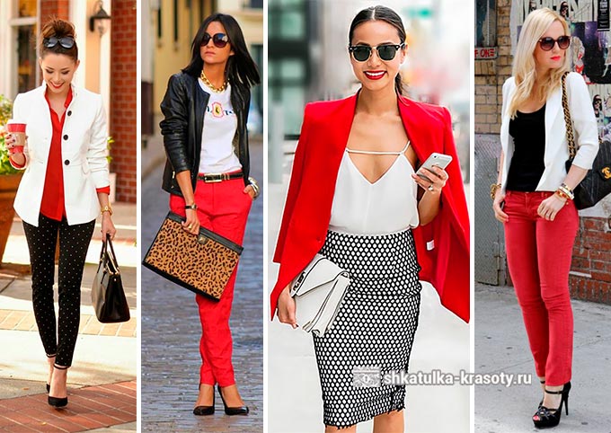
+ Gray
Designers call it one of the most elegant combinations in the fashion world and often use it in their collections.
However, combining these two colors is not as easy as it seems at first glance. The main rule: correct distribution. It is best if there is more in the outfit, and the red tint will only complement the outfit in the form of accessories (handbag or shoes).
Well, this pair will be complemented by a thing in white or black. 

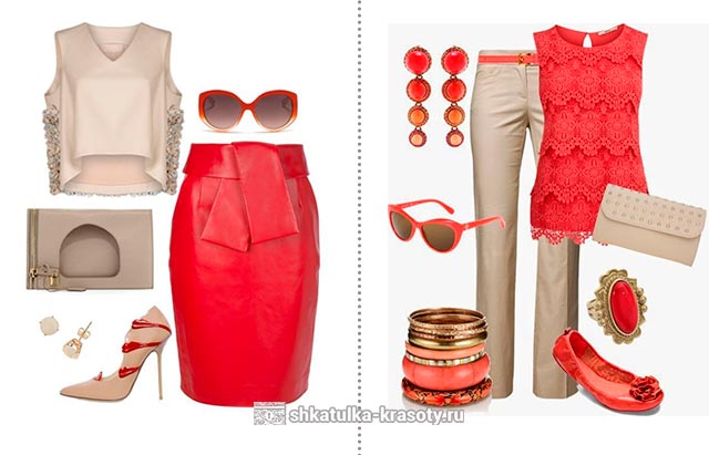
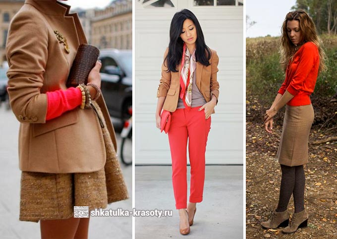
+ Beige
Soft and simply beautifully combined in one outfit with a dynamic and active red. Beige softens some aggressiveness of our color, and red adds brightness, spontaneity and positiveness to a set with beige things. 
![]()
Elegant sets for a special solemn occasion in this range will look original, in them you will look irresistible.
![]()
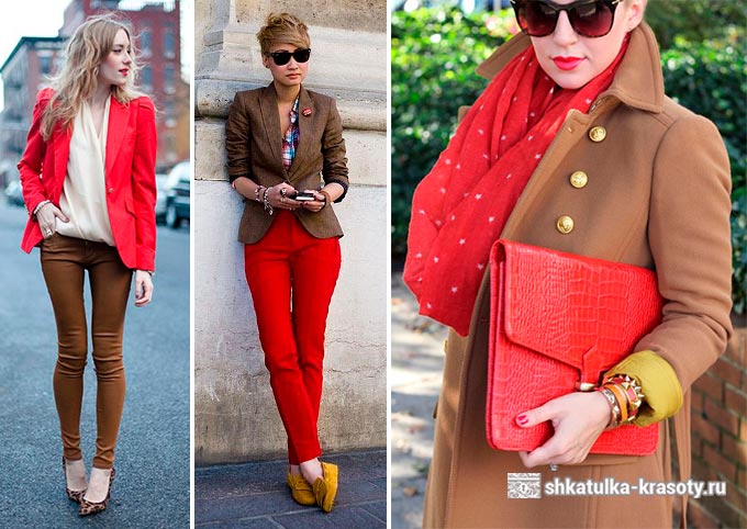
+ Brown
The color of the earth and the color of fire, meeting together in one ensemble, create a bright and unique image. Such a union looks bold and dynamic, it is a great option for everyday looks, but definitely not suitable for business office wear.
Looks great, for example, a brown dress with a red handbag and shoes or a red sweater or blouse with a brown skirt. Adding white as a complementary color will make your outfit even more interesting, add freshness and spontaneity to it.
![]()
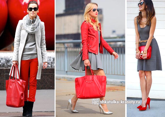
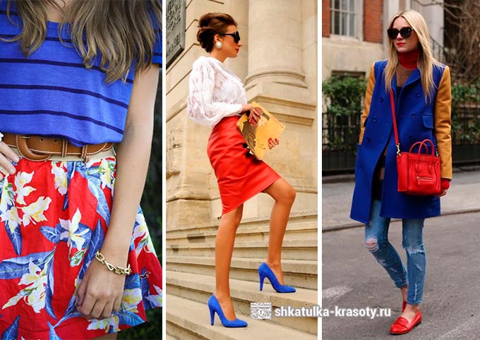
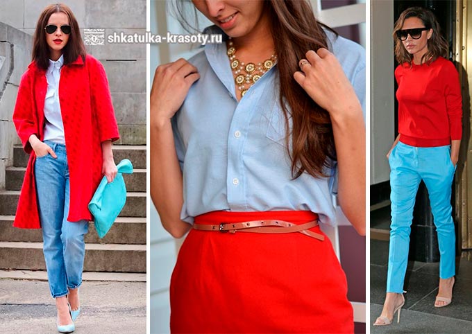
+ Blue
The combination of red and in one look creates a strong contrast, it is like a collision of ice and fire, so be careful when putting together a set in blue and red tones. The main rule: distribution. For a harmonious neighborhood of these two shades in clothes, you first need to decide which one will be the main one, and which one will be additional (which color will be more).
For example, if you chose blue as the main one, then the shade of red will only complement it in the form of accessories and vice versa: a blue handbag or shoes are perfect for an outfit in red. In general, such a kit looks dynamic and bright. You can get very unexpected options this way :)
White, black or gray in this combination will help relieve eye strain from the strong contrast of blue and red. 
+ Blue (Turquoise)
A softer blue or also looks good in combination with our bright shade... In this case, clothing in a cool blue hue will further enhance the saturation of the red. 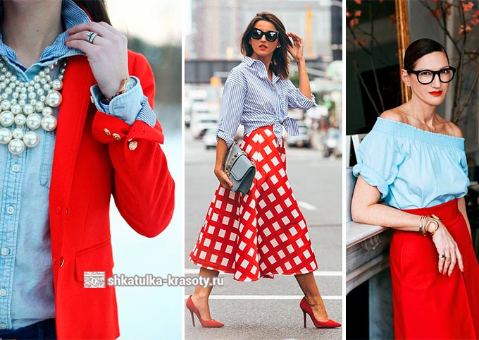
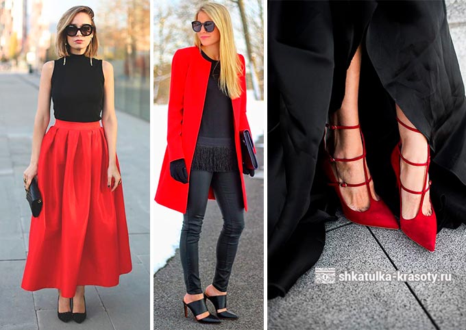
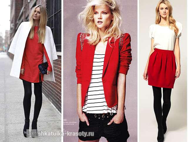
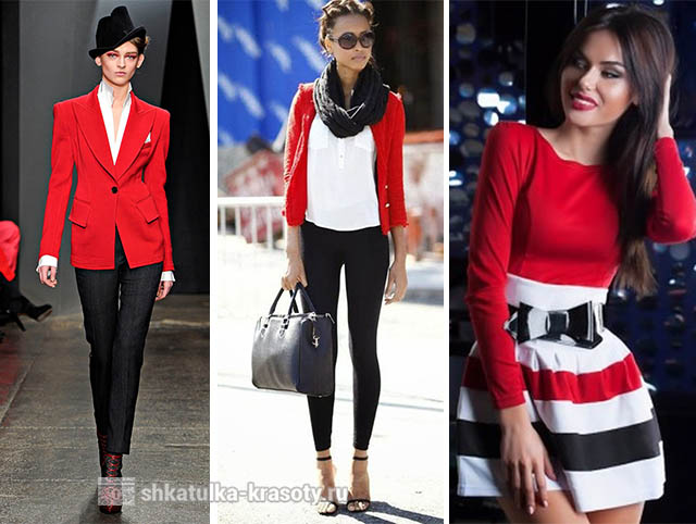
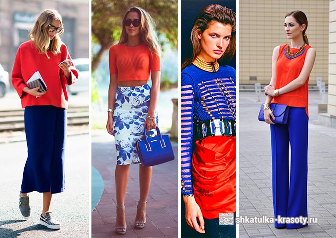
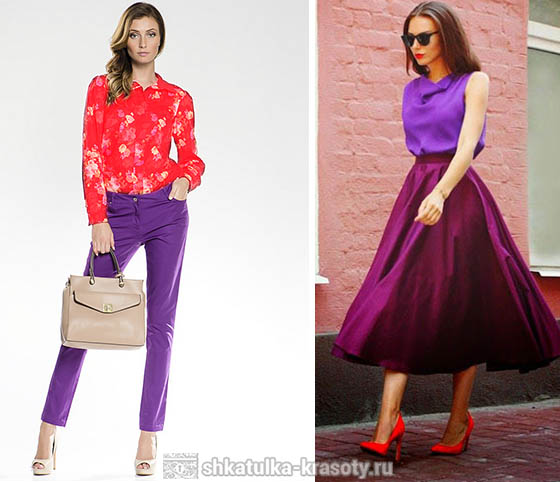
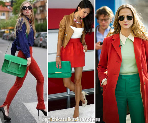
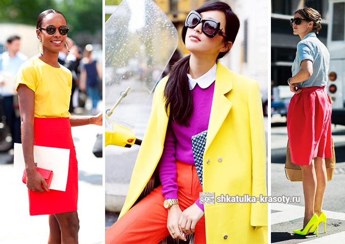
+ Purple (Lilac)
Another interesting option is the combination. Since purple is formed by mixing blue with red, this combination will be less visually stressful than the previous two.
The presence of blue in purple still retains some contrast between these shades, but still the combination of red and purple looks more harmonious and holistic. Violet acquires depth and saturation of color in it, and a bright fiery shade becomes warmer with an orange undertone.
In this case, it will serve as an excellent background for a brighter neighbor. 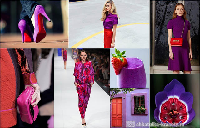
![]()
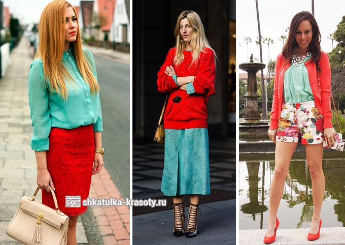
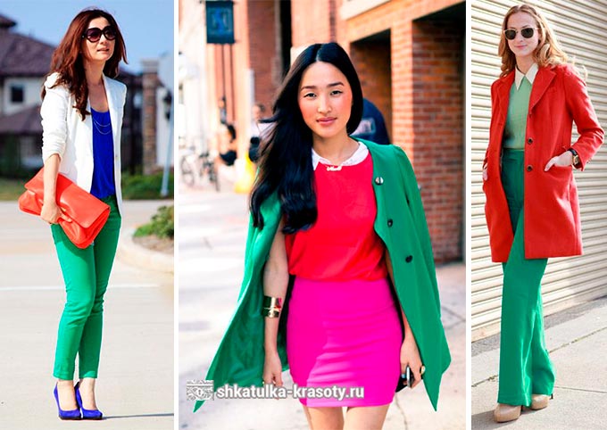
+ Green
The strongest contrast (besides blue) our color forms in combination. It is not recommended to combine these colors together if they are the same in brightness and saturation. Bright red will look best next to or deep. A lighter shade of green also works well with reds. If you still want to wear two together bright colors, then, as in the version with blue, make one the main, and the other additional (accessories).
Will not be superfluous in this color combination White and black colors. And if you add to red and green purple or Brown, you will get a very interesting outfit, for example, purple blouse + red pants + green handbag.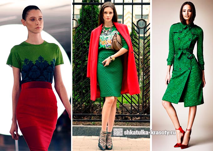
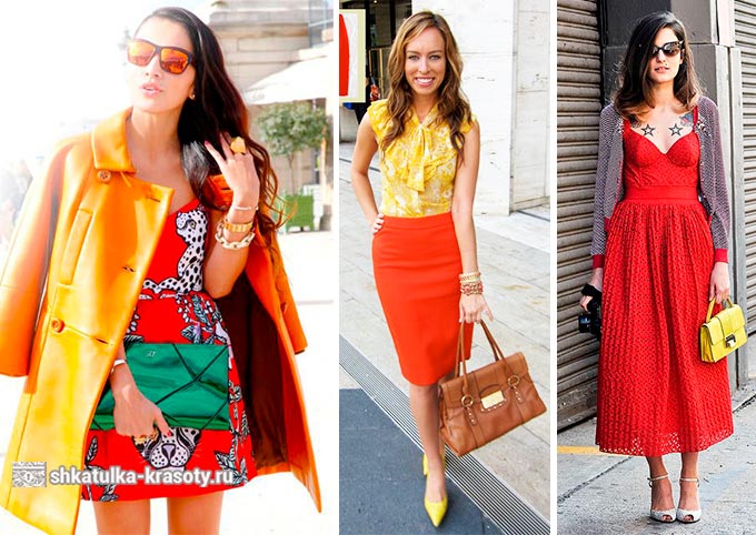
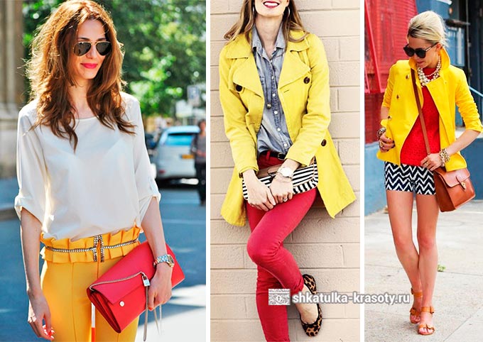
+ Orange (Yellow)
These warm colors together they form a very bright, juicy and truly summer color combination. They perfectly combine with each other and look very harmonious at the same time.
![]()
![]()
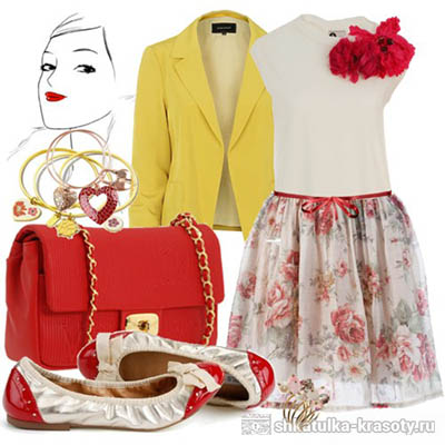
+ Gold
This truly royal combination really looks impressive. Naturally, things of a shade gold should be worn on certain occasions: to a party or some kind of celebration. However, if you only use small golden accessories, then in combination with red it will be a great option for walking with friends or going to the movies. 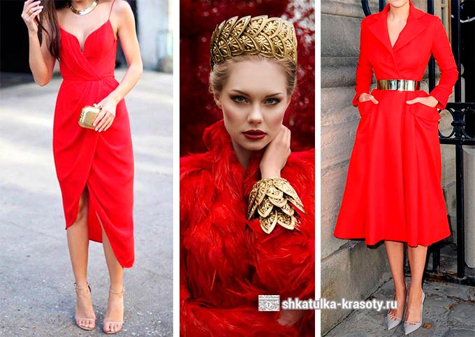

+ Pink
Just like purple, it is obtained on the basis of red. These colors blend well together, while looking very bright and self-sufficient.
By the way, small details of metallic shades (silver and gold) can complement your outfit and make it more festive.
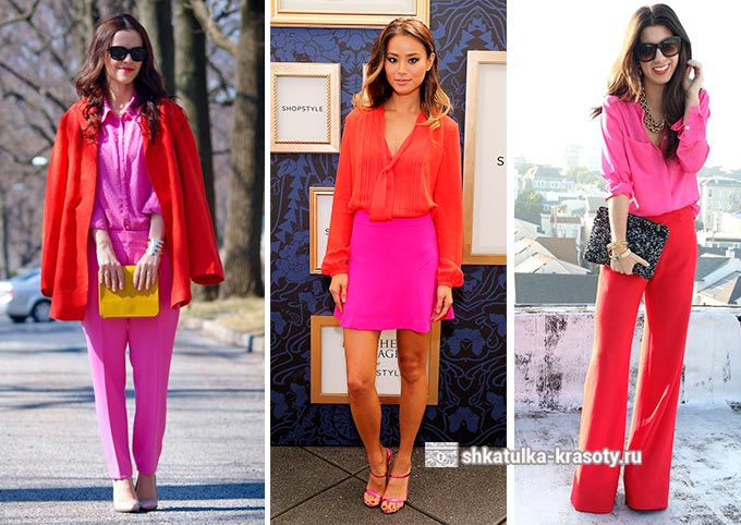
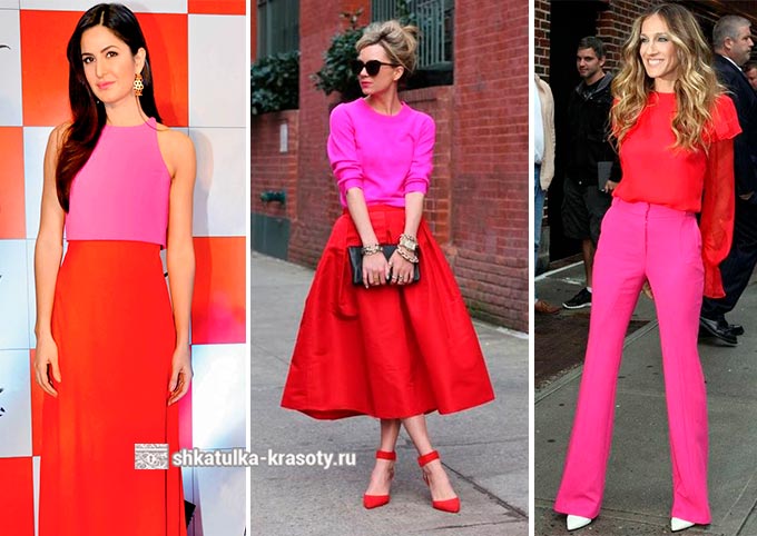
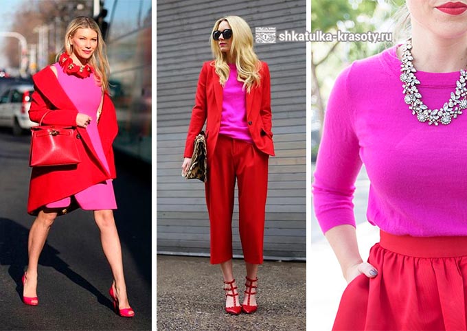
With delicate pink shades color combination will be softer.
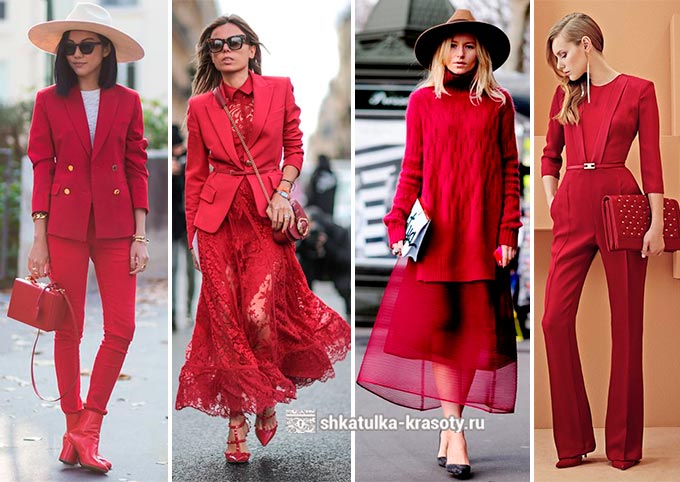
+ Red
A total look in red is a spectacular look that will definitely set you apart from the crowd. it bold decision but it also looks stylish. In this case, it is better not to interfere with several shades of red, but to choose one that will color your entire outfit with its own color.
![]()
Red is always great! He is bright, conspicuous, active and bold. Remember these simple options for combinations in clothes and you will always look irresistible.
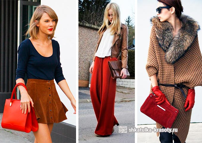
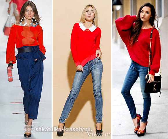
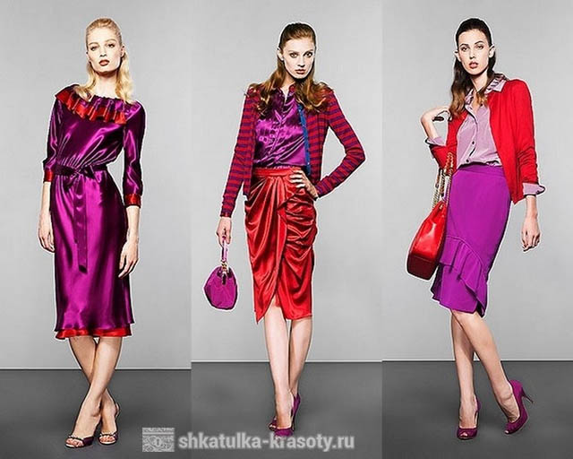
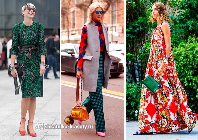
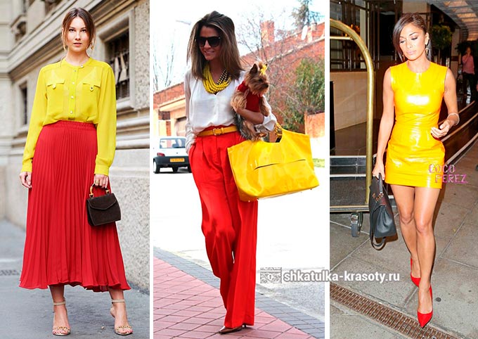
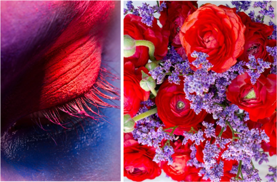
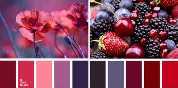
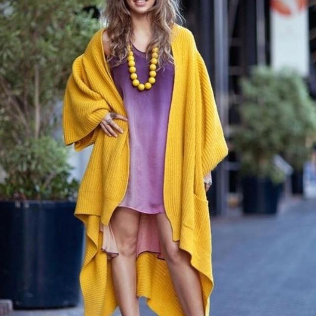
Red and purple are combined due to their relative origin. This is a very beautiful and unusual combination. Examples: photo.
The graceful combination of red and purple on the one hand is very unusual, but on the other - rich, emotional and inspiring. It is quite difficult to find it in nature, but if it still works out, then it is impossible to take your eyes off.
What is this combination?
The combination of this pair is based on kinship: purple is obtained by mixing red and blue, and the more the first subtone in the second, the more harmonious the pair as a whole. However, the darker shades of purple-violet, the more contrast it looks with its companion.
If you like the combination of these colors, then you are a versatile person. You have a craving for knowledge: both for lofty and transcendental matters, and for vital values.
One variation of this combination is a combination of medium red and. He, unlike the parent, is a symbol of power and wisdom, next to the color of blood, he strengthens his willpower and desire for power, thereby representing a symbol of the ruler.
The shades participating in the combination also differ in their subtones: from piercing scarlet to dark red and burgundy colors. Softer combinations are paired with cold wine colors, while warm tones create a brighter contrast.
Paints such as blue, orange, emerald, dark beige, sunny yellow, hot pink, white and black are often added to the main tandem.
How do you see this color? Click on the picture, you will go to the desired article.
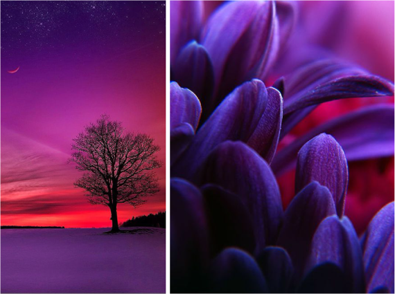
It is a symbol of the transcendent and transcendental. This is the color of space and space, distant worlds. it is an active life position, striving for self-affirmation, love. These tones are so far from each other that each of them emphasizes the dissimilarity of the other.
CHOOSE COMBINATIONS OF INTEREST FOR YOU
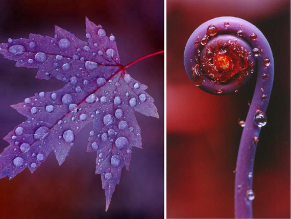
It is fraught with mystery and incredible charm. What do you imagine when you mention it? The endless lavender fields of Provence or the twilight sky colored by the rays of the sunset, or maybe the delicate petals of lilacs and orchids.
Shades of purple are very diverse, and many cannot at first glance determine their belonging. The combination of cold and warm ingredients adds depth, versatility and appeal to the purple tone. It was not for nothing that great monarchs and rulers, clergymen turned to him, choosing a color for festive vestments.
Classification of shades
According to the Panton Standardized Color Matching System, there are 196 shades of violet. And if you turn to the primary source, you can independently verify that, despite the absolute similarity at first glance, upon closer examination it becomes clear that they are all completely different. It should be noted the poetic names of the shades: lilac snow, lavender fog, ice orchid, cosmic sky, crocus, thistle inflorescence, etc.
For ease of perception, we offer you a classification, according to which all shades of purple are divided into 4 groups:
- rich and deep dark purple tones: purple eggplant, plum, dark silk, etc.
- Translucent, light shades: lilac, violet, thistle, pearl purple, amethyst, etc.
- Shades with a red undertone: fuchsia, purple, red-violet, lilac, fandango.
- Shades with blue undertones: electric violet, dark purple, blackcurrant, indigo, etc.
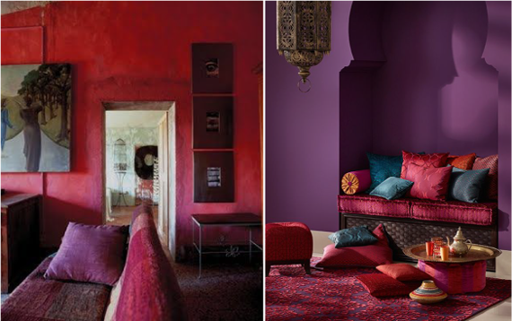
The first group of shades is the most mystical and attractive, their choice is the best way emphasize the aristocracy of the image or interior. If we dilute them a lot, then we get a second palette. It is democratic and easily complemented with other colors. The most capricious shades of purple with a red undertone are considered. They require a classic addition that is light and unobtrusive. We propose to consider in more detail the question of how purple is combined with other colors.
Shades of purple + white
This combination can rightly be called classic. Violet in the presence of white looks noble, catchy and refreshing. Depending on the tone of the first, the strength of contrast changes and, accordingly, the effect of it. It doesn't matter where such a combination is used (in clothing or interior design), believe me, it will be a win-win. Complement it with browns, blacks and grays.
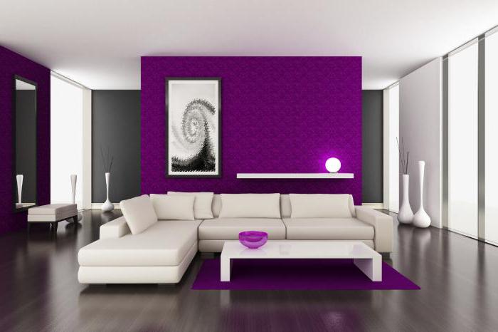
Shades of purple + black
Black, like white, is appropriate everywhere and always, it is universal, and therefore easily complemented by all possible shades. In this case, you need to be careful with purple. Refer to its light shades, especially those that have a red undertone, black will only emphasize their nobility, and do not use too saturated (plum, deep purple). Dilute the ensemble with white.
Purple + gray
This combination of colors is in no way inferior to the first in versatility. Shades of violet on a gray background look calm and comfortable for perception. In the interior, such an ensemble is especially good when decorating high-tech kitchens and living rooms. When choosing a combination of gray and purple in clothes, keep in mind that it works best for an office dress code. At the same time, the first color acts as an excellent base, and the shades of the second add variety.
Purple + yellow
Purple and yellow are a gorgeous and vibrant combination, inspired by nature itself. It is for this reason that it is so harmonious for our perception. Give preference to bright or delicate yellow shades, clean, without admixtures of gray and other colors. They will most successfully emphasize the depth of purple and its richness. In this case, there may be completely different proportions.
For interior decoration, a combination of purple and yellow is used, as a rule, when creating a retro style.
If we talk about clothes, then absolutely different proportions are used. For example, a purple dress and a yellow handbag. In the photo you see an almost equal presence of both colors, but at the same time one of them is inferior in saturation, and this is correct.
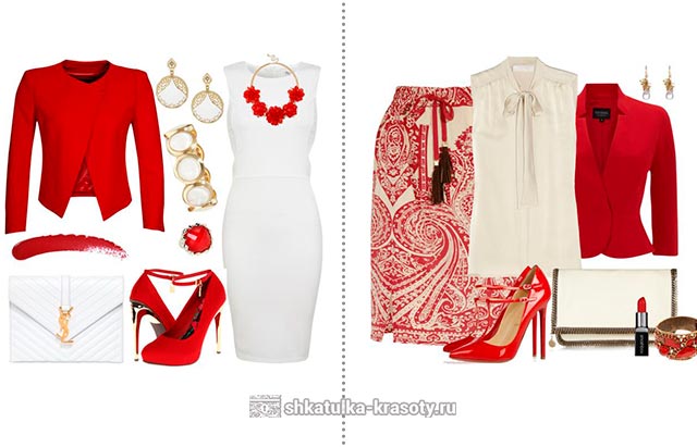
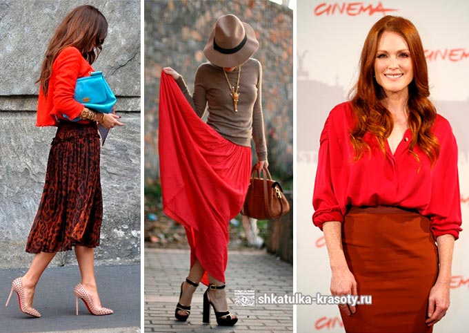
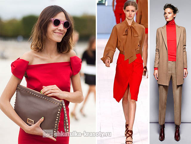
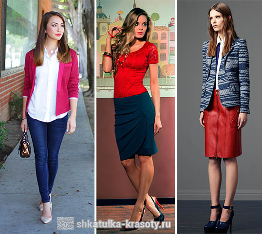
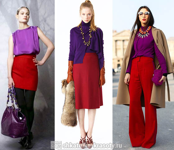
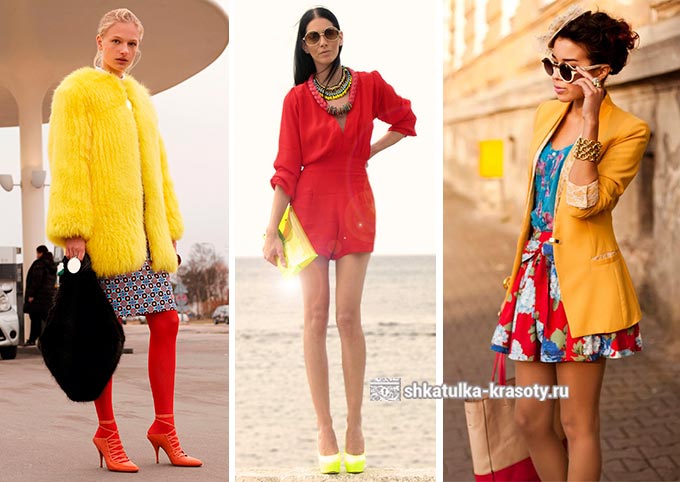
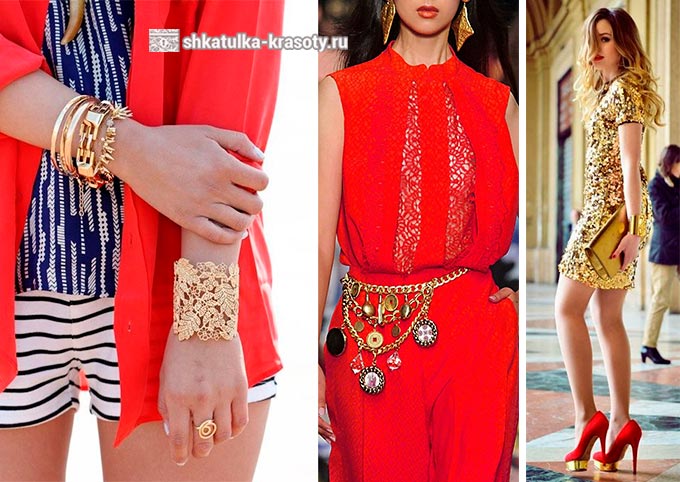
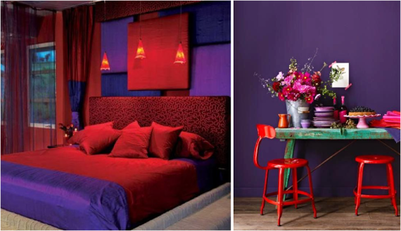
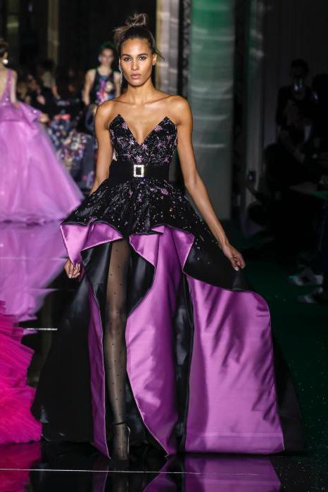
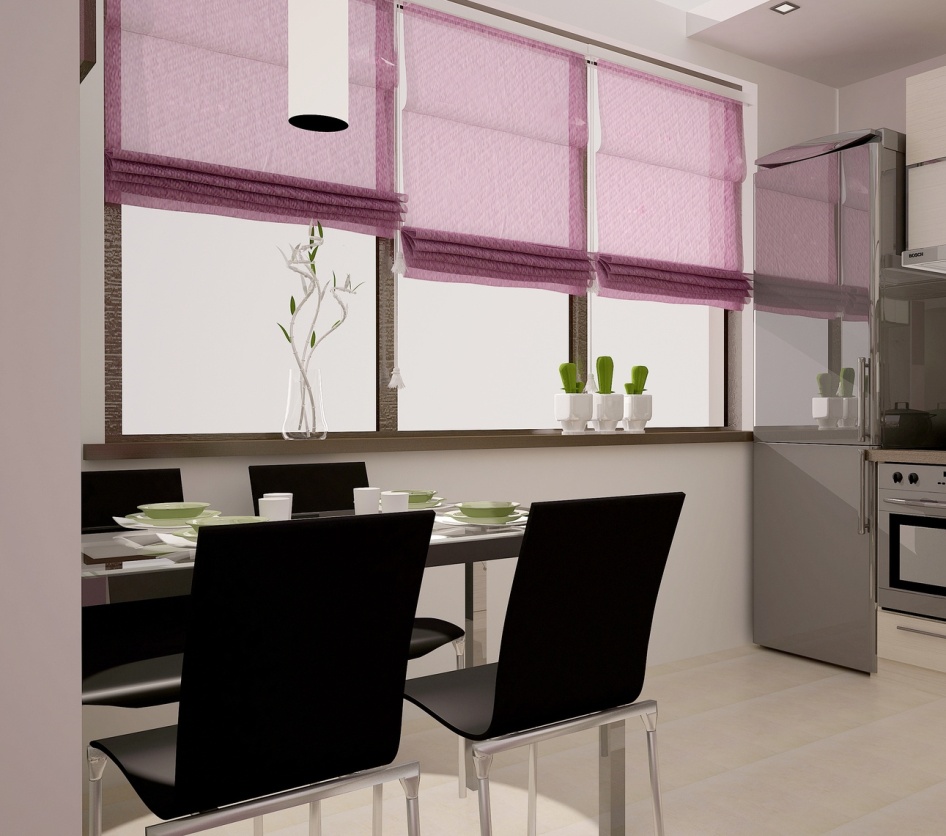
Purple + red
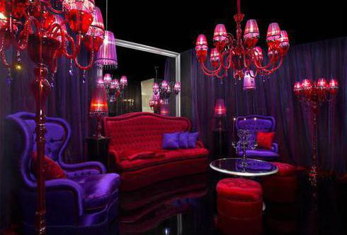
Using both red and purple colors at the same time is not just unusual, but rather an extravagant combination. At first glance, it may even seem aggressive and harsh. However, even such an unusual alliance can be successfully beaten. First, we recommend that you use a light purple (lavender, lavender, etc.) with the same strength of red. Secondly, dilute the combination with a neutral color - white or light beige.
Pay attention to the photo above. The violet-red interior looks very unusual, but at the same time it is incredibly attractive and atmospheric. It is more of a decoration for something than an everyday option.
Purple + pink
This combination can look vulgar, catchy and tasteless, or elegant, light and gentle. It all depends on what kind of shades of purple and pink you choose to complement each other. They are quite close in tonality, and therefore are perceived as something natural. Avoid "poisonous" pink when choosing colors. Give preference to pastel shades of this color, but purple can be rich, deep.
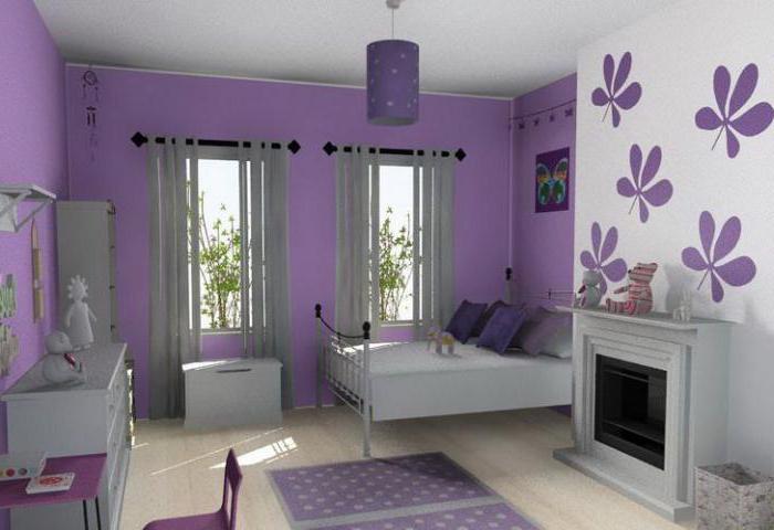
In the interior, this combination is most often used to decorate bedrooms. By choosing clothes in pink and purple, you can create a great summer outfit or even an office look. This combination is also relevant when creating evening make-up. Purple will accentuate green and brown eyes especially well.
Purple + beige and brown
The combination of purple and brown is a pleasant, unobtrusive, relaxing combination. When decorating the interior, it will be appropriate in any room (bedrooms, living rooms, kitchens). In addition, brown harmonizes the violet hue as well as possible in combination with other colors, literally "landing" bright design and making him more calm.
A similar duet is appropriate for clothing. The image looks especially beautiful, where the violet-gray color, or blueberry, is combined with shades of chocolate. Its combination with beige is no less attractive. Violet with such a "companion" becomes more balanced, delicate and light.
Purple + green
These two colors are contrasting and opposite. When they interact, they further enhance each other's beauty and brightness. This combination is more than common in nature. It will look good in any proportion: from rich and deep to delicate and pastel colors. In interiors, mint green and lilac, apple and purple are often used. A bedroom or living room decorated in this way looks stylish and original. But we do not recommend combining green and blue-violet, it is better to use pure shades, without undertones.
Purple + metal (gold, silver)
We have already mentioned that since ancient times, a rich purple color scheme was used for the clothes of emperors and kings. In this regard, the addition of all its shades with something metallic will be very important. These can be large accessories (bags, belts, belts, etc.), jewelry, shoes. The shine of silver and gold will accentuate the nobility of purple hues.
The combination of shades of purple with each other
A combination of shades within one colors is something that everyone can afford. At the same time, one simple rule should be remembered: do not combine cold and warm shades in one set. Well, then - everything is at your discretion.
A complete set in one tone is boring, so combine two or three tones of different saturation. For example, if you choose a deep blue-violet color as a base (suit, dress), then emphasize it with a lavender or lilac cardigan. A blueberry sweater will look great when paired with a light purple skirt or trousers.
There are quite a few classic color combinations in the interior, and most of them are stylistically universal: for example, a combination of white and blue, or green and beige, can be found in a variety of interiors. However, if traditional solutions seem boring to you, try to play with colors and pick up something unusual. Contrary to the stereotype, not all unconventional color combinations look too contrasting and bright, some of them are very delicate and soft. To inspire experimentation, consider some of the undeservedly forgotten color combinations in the interior.

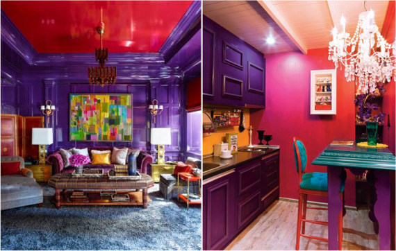
At first glance, the combination of red and purple may seem too aggressive and flashy, but it is not. It's all about the right combination of shades: firstly, purple should be relatively dim and match in warmth, and secondly, the combination should be diluted with a light shade - white or lilac.
For a bedroom or a nursery, the combination of purple and red runs the risk of being heavy, but in the living room and in the kitchen it will be quite appropriate.

This combination is considered a classic for retro design, in particular for pin-ups, but it is not very popular in Russia. And completely undeserved: the combination of and is one of the most positive and sunny. The secret of her success is the combination of a warm yellow and a colder and lighter pink tone. Depending on the brightness, the combination will look harmonious in almost any room, from the kitchen to the bedroom. If the combination seems too sugary and "candy", it can be easily balanced with silver gray or white.

The combination of these colors is usually considered more traditional for clothing than for interiors, although in fact it is one of the traditional options for the popular interior shabby chic style. Despite the fact that in the design of the walls, such a combination may seem too corny, in combination with neutral white or light beige, it will look very decorative. And brown-pink textiles - curtains, bed linen, blankets - will add warmth and comfort to the bedroom and nursery.

This combination is quite unusual: the combination of such dissimilar colors has the property of simultaneously soothing and refreshing. On the plus side, the combination is brown and quite versatile. For a strictly cabinet, a combination of dark brown and deep blue is suitable, for a living room in a neo-baroque style or in scandinavian style- chocolate and turquoise. The bedroom can be decorated in beige and sky blue colors.

The combination of these colors always looks bright in summer and reminds of the sea. Usually it is used in the design of children's rooms, however, even in "adult" rooms, this combination can look stylish and unusual. The living room can be decorated with a combination of turquoise, this will add freshness. A bedroom decorated in blue tones will be "warmed" by a pair of orange pillows or a bedspread. For a nursery, a juicy and at the same time not flashy combination of blue and orange will be ideal.
The combination of orange and blue is usually diluted with white or light pink.

This combination works best for a modern living room. Bright and juicy, it will create a spring mood and invigorate. For the bedroom, you can also use these colors, but in a softer version: both a combination of a background and bright details, as well as a light purple background with apple green, will be successful. The pastel version is also popular: pistachio and lilac with white.

The combination of both hot pink is very contrasting and bold. In the interior, even the most modern, it runs the risk of looking too defiant. However, if you take a light pink tone - pink and white or pastel pink - the combination will come out more restrained. It will decorate the living room in a retro style, and in combination with white, it will be suitable for the kitchen.

Combinations involving yellow color often overlooked, considering them too bright and defiant. There are especially many prejudices regarding the combination of green and yellow: these two colors are similar, and together they are drawn to merge into one, bright and indistinct. But this is easy to avoid: bright lime and light yellow will look quite contrasting and at the same time not as familiar as the combination of light green and white. This combination would be appropriate in a minimalistic and futuristic design.

This combination is similar in spirit to the combination of brown and blue, but looks even calmer and deeper. For the bedroom and nursery, it may be too dark, but for the living room, kitchen or study in classic style will fit perfectly. In order to visually expand the space, the combination of brown and purple can be diluted with beige.

Another combination that is considered to be too bright and contrasting. However, if you take a darker tone of red and a light tone of blue, the excess brightness will go away. This combination will be appropriate both in the minimalistic design of the living room, and in a spacious bathroom and even in the kitchen. Unless in the bedroom, instead of red, it is better to choose dark pink.
Of course, there are much more unusual and original combinations than ten, which leaves unlimited opportunities for experimentation, not forgetting that the color scheme should also be in harmony with the chosen interior style!