The combination of red with other colors to achieve harmonious compositions largely depends on the shades of this tone: mainly on the subtone and darkening of the color.
If you imagine red as, then you can understand how its shades are built. Pure red is bright and warm, however, an admixture of magenta (or lack of yellow) tilts it towards raspberry, due to which its intensity decreases, but an intricate zest appears. The pink undertone is fully revealed with the darkening of pink-red - coral-red, ruby, carmine and darker cherry and wine tones. You can consider this group of red shades - cold in relation to scarlet and red-orange.
In this article we will defuse the combination with 4 red shades:
Red royal - this is a classic shade of red, where the definition of "royal" - as clear and pronounced. The color has a medium balance between magenta and yellow.
Bright red - the tone, slightly lighter than the classic one, has an internal "glow" with a slight preponderance to the pink side. The scarlet color will be just as bright.
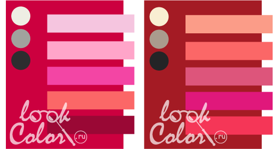
Rose red - refers to subtle, cold shades of red with a raspberry undertone.
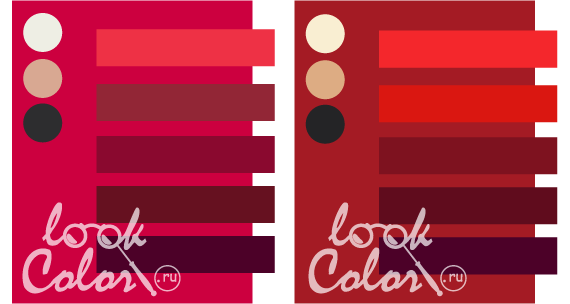
Dark red - this is a classic tone with the addition of black, which slightly disturbs the brightness of the shade, but adds grace and restraint.
Royal red is suitable for the "spring" color, as a rich warm color.
A bright tone, of course, for the "winter" color type, especially with a cold bias.
Crimson undertones in red are suitable for representatives of the "summer" color type.
"Autumn" girls are more suited to dark red.
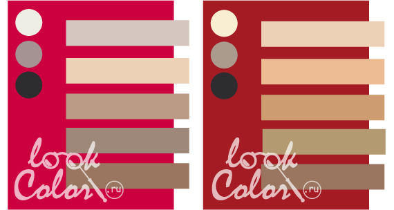
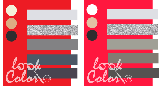
How is the red combination diagram drawn up?
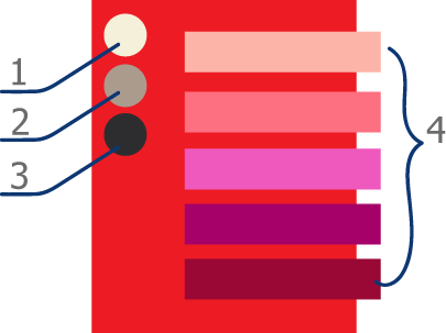
The background of the combination is the selected shade of red. On the left in the form of circles under No. 1, 2, 3 -base (primary or neutral) colors. It is (1) a shade of white, (2) a shade of gray or beige, (3) a shade of dark gray or black. Base shades enhance contrast and maintain color in a flattering bow. Right (4) a palette of shades with which to match given tone red.
The combination of red
The combination of red is built on a slight dimming of the pair's shade, however, the purity of the tone within the main color must be respected.
In general, the most beneficial base tone companion is white, beige, gray, brown and black. Sufficiently discreet for color spot contrast and suitable for light resonance.
If cold colors, for example, blue, tend to thermal contrast, then red prefers colors that are similar in temperature. So, with orange, yellow, gold, warm green - red looks more attractive.
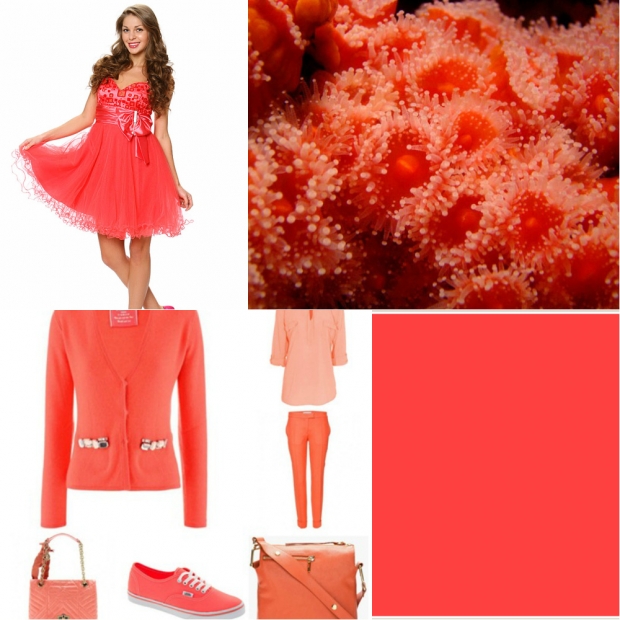
Red + pink, coral
The combination of colors: red and pink can be called scandalous. Some shades of pink are lighter shades of red, others are derived from reddish orange and purple. If you follow the trend, then, similar to the range of fiery and fuchsia, they will look with red - a daring, defiant combination. A combination with warm tones of pink will be softer and more contrasting. But both these and these palettes are more for the catwalk than for everyday use.
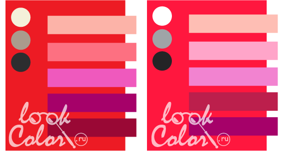
Royal red is combined with pink:
shrimp, sunset, ultra-pink, purple-pink, raspberry. Basic range: creamy, gray-beige, wet asphalt.
Bright red matches pink:
cloudy pink, sakura, royal pink, amaranth, purplish pink. Neutral palette: snow white, steel, black and gray.
Rose red matches pink:
white and purple, carnation, barbie, coral, crimson. Base: egret, silver, wet asphalt
Dark red matches pink:
orange-pink, coral-pink, clover, magenta, red-pink. Supporting tones: cream, gray-beige, black-gray.
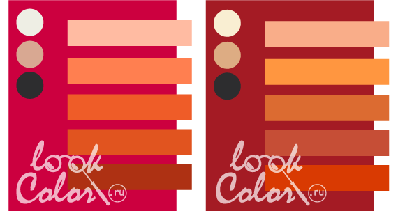
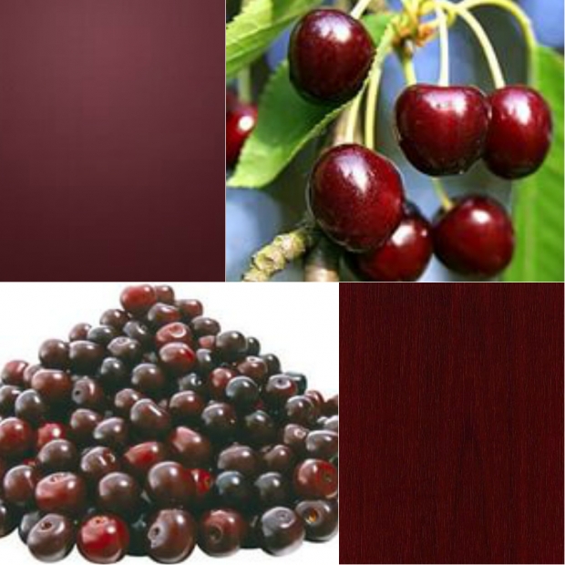
Red + red, burgundy
Red is combined with other shades in its range to create a “lively” gradient with transitions from light to dark, like a play of light and shadow. In order to accentuate the basic tone, the complementary shades of red and burgundy should be made more elaborate.

Royal red is combined with red:
scarlet, coral red, coral burgundy, port wine, maroon. Base: creamy, medium peach-beige, black-gray.
Bright red combined with red:
light red coral, crimson coral, carmine, ruby burgundy, wine. Basic: snow-white, light brown-beige, dark black.
Rose red is combined with red:
light red, pink-burgundy, ruby, ruby-burgundy, wine. Neutral: heron, medium peach beige, wet asphalt.
Dark red matches red:
pomegranate, Chinese red, Bismork Furioso, bright burgundy, wine. Base: creamy, light beige, anthracite.
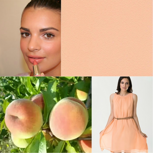
Red + orange, peach
The combination of colors: red and orange, deepen the base color by adding intricate shades, the play of light and shadow, thereby increasing the saturation of the overall gamut.
To combine these tones, the shades of orange must be sufficiently saturated, but at the same time they can be both darker and lighter than the main color.
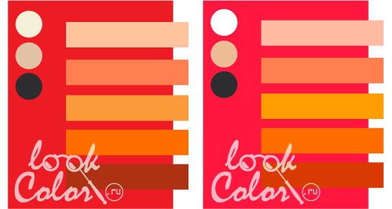
Royal red is combined with orange:
light peach, coral orange, manga, fiery, red. Neutral range: creamy, light peach-beige, wet asphalt.
Bright red matches orange:
peach, orange-coral, yellow-orange, bright orange, red-orange. Basic: snow-white, light orange-beige, wet asphalt.
Rose red matches orange:
peach, orange-coral, carrot, pumpkin, red. Base: heron color, medium pink-beige, wet asphalt.
Dark red matches orange:
coral-yellow, jaccot's last breath, copper-gold, red-orange. Base: cream, medium orange-beige, wet asphalt.
Red + yellow, gold
The combination of red and yellow is one of the brightest and hottest. Warm shades of red are best combined with tones of yellow without an admixture of blue (): from saturated to pale, it is desirable that the color of the pair contains an admixture of red. Cool shades of reds (with pink undertones) will work with soft cool yellow undertones.
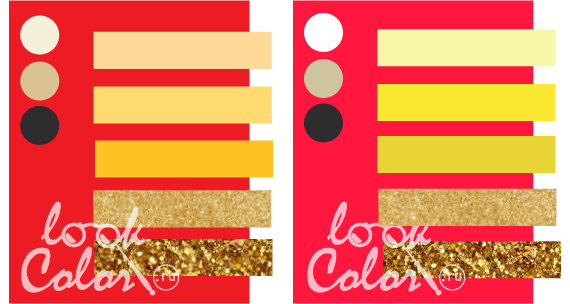
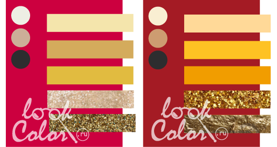
Royal red is combined with yellow:
apricot, sunny yellow, corn, yellow gold, bright gold. Basic tones: creamy, medium yellow-beige, wet asphalt.
Bright red combined with yellow:
pale yellow, lemon, pear, yellow gold, bright gold. Base: pure white, medium green-beige, wet asphalt
Rose red combined with yellow:
champagne, wheat, honey, pale gold, old gold. Neutral shades: egret, medium brown beige, wet asphalt.
Dark red combined with yellow:
sunny, corn, amber, bright yellow, dark yellow, cream. Basic: medium orange-beige, wet asphalt.
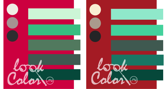
Red + warm green
Red is combined with warm green - a natural, contrasting combination based on complementary colors. For contrast, muted shades of green with a brown undertone or pale light are used.
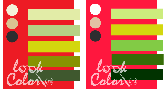

Royal red is combined with warm green:
pale green green peas, chartreuse, olive, leafy green. Base: creamy, medium yellow-beige, wet asphalt
Bright red matches warm green:
light green, chartreuse, light green, greens, dark green. Basis: snow-white, medium peach-beige, wet asphalt.
Rose red matches warm green:
avocado, olive green, olive, marsh, brownish green. Neutral shades: egret, medium pink beige, wet asphalt.
Dark red matches warm green:
green peas, a fainting frog, khaki, marsh green, brownish green. Basic: cream, medium orange-beige, black-gray.
Red + cool green
Color combination: red and green (cool) based on. Cool green is a color close to complementary, therefore, its combination with the main tone should be harmonious. Soft mint and menthol tones paired with red are quite common because of their attractiveness.
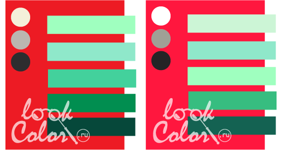
Royal red is combined with cold green:
neon green, menthol, jade, emerald green, malachite. Basic tones: creamy, platinum, wet asphalt.
Bright red combined with cool green:
green water color, menthol, neon green, mint, emerald. Base: snow white, yellowish gray, black gray.
Rose red matches cool green:
the color of green water, mint, wormwood, gray-green, malachite. Neutral shades: white stork, gray-purple, wet asphalt.
Dark red combined with cool green:
menthol, jade, gray-green, patina, malachite. Basic: cream, gray-beige, black-gray.
Red + blue, light blue
The combination of red and blue is one of the most powerful in the color palette. The colder the blue and the warmer the red, the more flashy the combination. they look more harmoniously paired with the main color, and blue ones allow the red to fully unfold, enhance its flaming soda, without oppressing it.

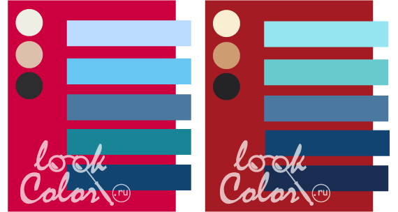
Royal red is combined with blue:
color of blue water, turquoise, dark turquoise, Prussian blue, thunderstorm. Base: creamy, light orange-yellow, wet asphalt.
Bright red matches blue:
aquamarine, sky blue, dark blue, royal blue, sapphire. Base: snow-white, light peach-beige, black-gray.
Rose red matches blue:
pale blue, topaz, denim, blue-green, Prussian blue. Neutrals: egret, light pink beige, wet asphalt.
Dark red matches blue:
blue water color, thrush egg color, denim, Prussian blue, dark blue. Basic: cream, medium orange-beige, black-gray.
Red + purple, purple, lilac
The combination of colors: red and purple - juicy, sophisticated, mysterious. Violet shades are akin to red, flow harmoniously into each other, but at the same time, a temperature contrast is created, which maintains the unreality of the gamut.

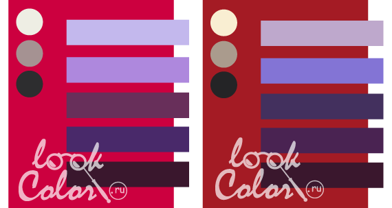
Royal red is combined with purple:
thistle, lavender, purple, grape, eggplant. Base: creamy, yellowish gray, wet asphalt.
Bright red combined with purple:
blue-violet, lilac, purple, grape, violet. Basic: white, platinum, black and gray.
Rose red is combined with purple:
white-lilac, thistle, blackberry, red-violet, eggplant Neutral: white stork, gray-purple, wet asphalt.
Dark red combined with purple:
lilac-purple, lavender, charoite, grape, eggplant. Base: cream, gray-beige, black-gray.
Red + brown
Red is combined with brown for a discreet and juicy combination. Brown is also related to red, but warm and almost neutral. This allows the basic tone to be fully revealed without losing its warm color.

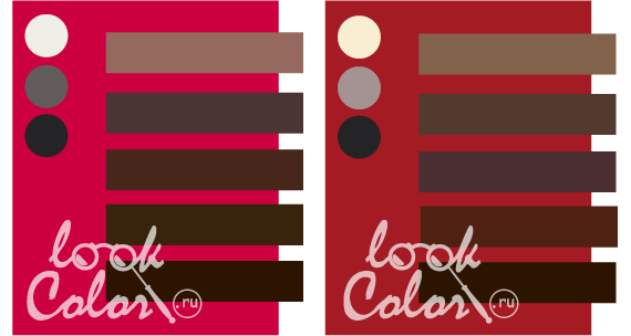
Royal red is combined with brown:
beige-brown, cappuccino, coffee beans, chocolate, coffee. Neutrals: creamy, silver, black-gray.
Bright red matches brown:
cocoa color with milk, pale brown, sepia, chocolate, dark chocolate. Basic: white, platinum, black and gray.
Rose red matches brown:
cocoa color, sepia, chocolate, coffee, dark brown. Basic: white stork, mouse, black and gray.
Dark red matches brown:
coffee with milk, milk chocolate, brown-violet, chestnut, dark chestnut. Base: cream, gray-lilac, black-gray.
Red + beige
The combination of red and beige is one of the most popular and beneficial for this shade. Tones of beige are chosen as medium saturated: not too warm, but not gray either. It is they that allow you to balance the obsessive red, leaving concentration on it. The combination is similar to a fire in a fireplace, where the stone (under the warm light of the fire turns from gray to beige) controls the flame making it attractive and safe for us.
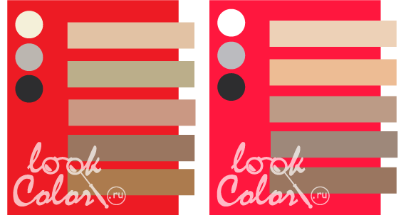
Royal red is combined with beige:
light peach beige, medium green beige, medium pink beige, dark brown beige, dark orange beige. Base: creamy, platinum, wet asphalt
Bright red is combined with beige:
light peach beige, light orange beige, medium brown beige, dark neutral beige, dark brown beige. Base: snow-white, light gray, wet asphalt.
Rose red is combined with beige:
light gray beige, light peach beige, medium brown beige, dark neutral beige, dark brown beige. Neutral: white stork, gray-lilac, wet asphalt.
Dark red is combined with beige:
light peach beige, light orange beige, medium orange beige, medium yellow beige, dark brown beige. Basic: cream, gray-beige, wet asphalt.
Red + gray, silver
The combination of red and gray, like the previous one, seeks to reason with the main color, but here a simultaneous contrast comes into effect: when the eye tries to complete in a gray tone an additional shade to red - green. In such a context, the result of the combination will be the opposite: the bright tone will intensify, and the gray will become colored. Therefore, in order for this not to happen, the shade of gray must have a warm or cold undertone, which neutralizes this effect.

Royal red is combined with gray:
white-gray, silver, steel, marengo, anthracite. Base: creamy, medium orange-beige, wet asphalt.
Bright red combined with gray:
white-gray, silver, yellowish-gray, gray wood, asphalt color. Neutral: pure white, medium peach beige, wet asphalt.
Rose red combined with gray:
silver, gray-lilac, old wood, graphite, anthracite. Base: white stork, medium brown beige, wet asphalt.
Dark red matches gray:
platinum, silver, old wood, graphite, anthracite. Basic: cream, medium orange-beige, wet asphalt.
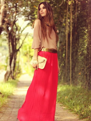
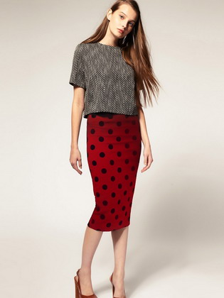
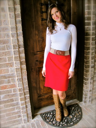
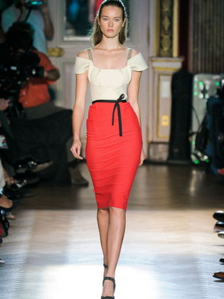
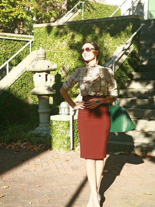
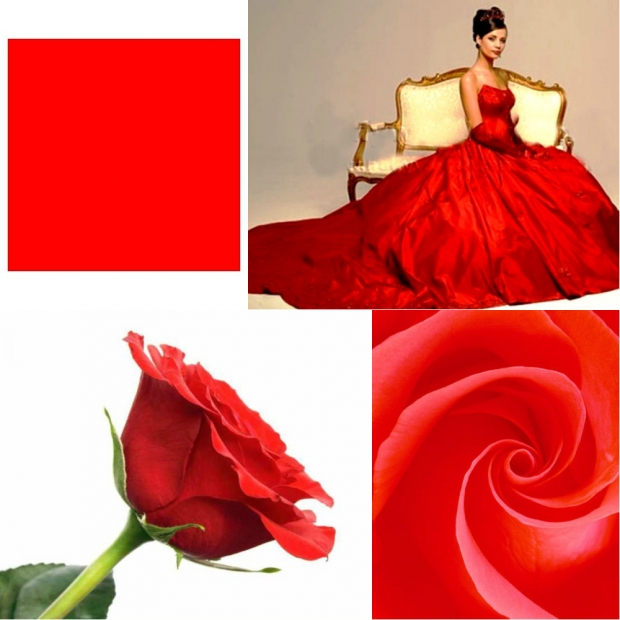
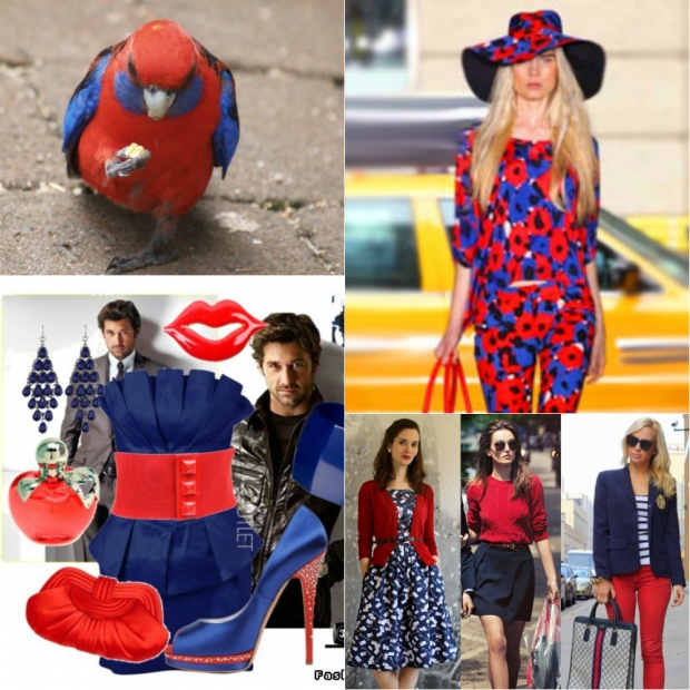
The name of the song Lady in Red, performed 30 years ago by Chris de Burgh, has long become a household name: indeed, women in red look extremely sexy and attractive. The combination of red in clothes creates the image of a strong, independent lady, capable of taking the most decisive steps. Sets with other shades of red are no less beautiful. For example, a skillful combination burgundy in clothes, purple, scarlet or wine makes it possible to create bright, memorable images.
The combination of red with black, beige and other colors in clothes
Red is a vibrant and rich color. The combination of red with other colors in clothes is usually used when wearing elegant sports uniforms during the summer season. Seductive shades will catch the eyes of those around you and give you a sophisticated look. Bright red is considered the most daring color, therefore it is suitable for young people.
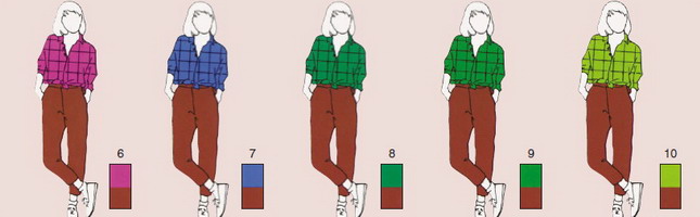
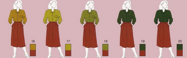
As you can see in the photo, the combination of red in sports-style clothing is very welcome:
1-15 - a bright range of various shades that best match this color. There should be no special difficulty in combining purple-red in clothes. In any case, the main goal here is bright and even a little defiant. appearance.

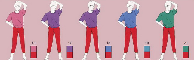
1-5 - great tones for the most active ladies who prefer to stay in high spirits in any situation. Short tees make this outfit perfect for sunbathing.


6-10 are the most interesting shades of green, giving the outfit a particularly strong contrast. The best choice for a casual summer outfit.

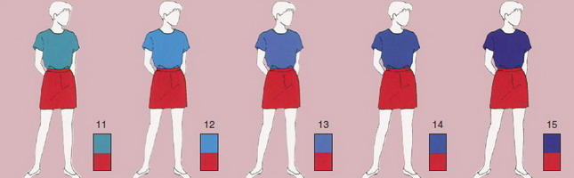
11-15 represent a range of dark blue shades. With the help of them, you will be able to stand out well from those around you. Convenient for sports. You can add variety with a graceful wristwatch.

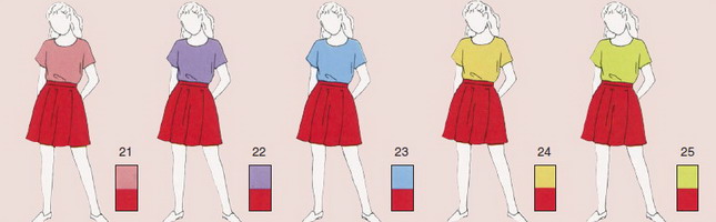
16-25 - various combinations of pastel shades.

26 - Choose a light white blouse for a sleek and discreet look. 27-30 - shades of beige that go well with the red bottom. Add a gold chain or ivory jewelry to complete your look.
How to combine red in casual clothes? Greyish green or will give you a friendly and open look.

31-35 - expressive combinations of gray shades will give you a little austerity and are perfect as a casual outfit, especially if you add various decorations.

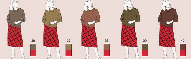
36-40 - shades from beige to brown will help you create a calm and open look. You can use striped skirts.


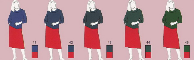
41-43 - a variety of dark blue shades. This option may be suitable for the fall season. Jumper with similar color palette combined with a black bottom will help change your image. The combination of red and black in clothes will significantly rejuvenate and give a spectacular look. You can also choose options 44 and 45.


46-50 - short khaki t-shirts will look great on a clear summer day and at an evening dinner, choose clothes made of cotton. Very good color scheme for compatibility.

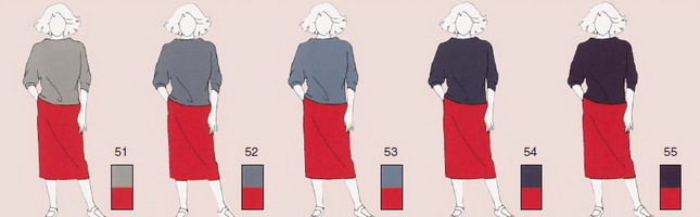
51-52 - elegant and chic beige color fits the red bottom perfectly. Such combinations of red and beige in clothes will warm you in cool weather and delight the eyes of others. 53, 54 are the main shades that you should pay attention to. 55 is purple for a shiny look.

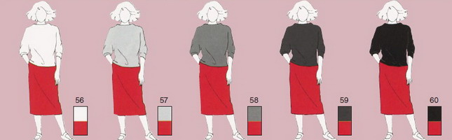
56-60 - gamma with a transition from white and gray to black. 56 - bright white upwards will be suitable for both winter and summer seasons. 57-59 - You can try pairing a linen skirt with a wool sweater for cool weather, or a sexy silk blouse for your daily wear. 60 - the combination of red and black remains universal at all times.
As you can see in the photo, the combination of red in clothes of less intense and less bright shades are suitable for creating a strict and business image:

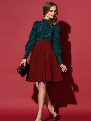
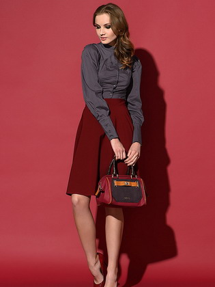
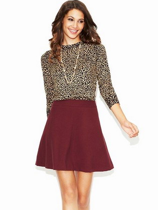
Successful combinations of burgundy color in clothes
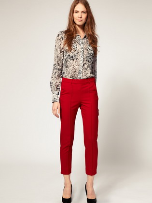
This darker shade of red allows you to add more passion to your look. The combination of burgundy in clothing provides a fit, healthy and athletic look. Most good shades beige, navy and gray will become a combination - with them you will create the most harmonious and elegant appearance. A lot of variety is easy to achieve thanks to dark red dresses and skirts.

1-10 is a classic line of pastel shades that bring naturalness to any setting. The intensity of the transitions between top and bottom can be adjusted by choosing shades of different brightness. When combining burgundy color in clothes, you can use things with a discreet pattern or texture. 1, 9, 10 - will make you feel a little eccentric. This is undoubtedly a very good choice. 2, 3, 6 - red-orange shades popular among young people. 5.7 - add more contrast. 8 is an attractive and light bright green shade.
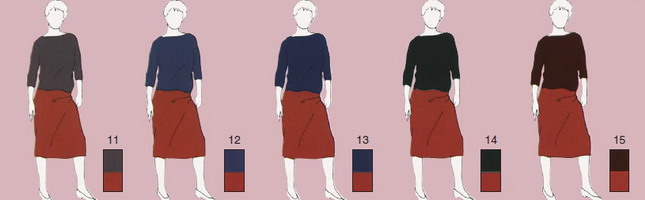
11-15 - are the main dark shades, the best choice for an elegant everyday outfit. 11, 15 - contrasting gray-brown shades. 12, 13 - allow you to create a solid appearance and leave a sublime impression. 14 - black for a unique, austere style.
Red is the most active and strongest color in terms of the degree of emotional impact on the human psyche. In European culture, it is symbolized with blood and flesh, therefore it carries a tinge of aggression. This is the male YAN energy that gives rise to life. It is not for nothing that everything related to sex, procreation and sensual pleasures is associated with red. The red color symbolizes temperament, passion and emancipation in clothes.
A guaranteed option for a woman to attract attention is to wear a red suit or a red dress. Red in clothes is greatness and power (remember that clothes of this color were worn by kings and kings), passion and struggle. The girl, putting on a scarlet dress, immediately turns from a Turgenev young lady into a lady vamp.
Different shades of red affect the psyche in different ways. Bright scarlet is similar to the color of blood, so it is not recommended to use it in the interior as a background tone. Since the pure scarlet color is too bright, fashion designers and designers came up with darkened and diluted shades of red: cherry, wine, coral, crimson, etc. They all refer to different shades of red with the presence of a different tone. And each of them is beautiful in its own way, and is able to emphasize a certain color type of appearance.
In many respects, the overall favorable perception of the thing depends on the correct combination of red clothing with other shades. Sometimes even a primitive cut of a dress, which is harmoniously combined with the skin tone of its owner, is able to transform a woman better than any diamonds.
How to choose a shade of red for your color type
Read a detailed article about the color types of women.
Winter color type- this is perhaps the most striking type of appearance, which is characterized by the following features:
- high contrast of natural colors (white skin, dark hair)
- cold eye tint (candy blue, piercing blue, sparkling gray, dark brown)
- very white skin with a bluish tint
- lack of blush on the cheeks
- tanning lays down poorly, often there is an allergy to the sun
- dark expressive eyebrows
- a noticeable contrast between the iris of the eyes and the whites
- eye color is bright and rich
Representatives of this color type are Brooke Shields, Salma Hayek, Dita von Teese,
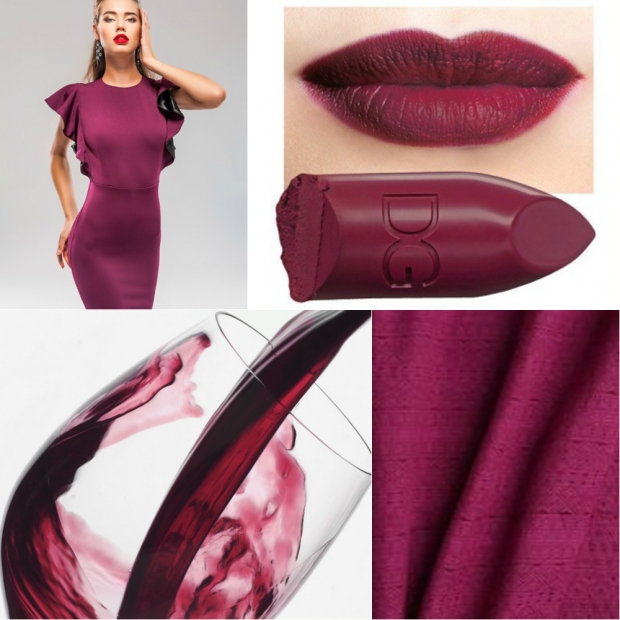
Liv Tyler. Only a "winter" woman can withstand the most bright shades red. Especially cool shades are suitable for her, such as magenta, a fuchsia shade similar to it, a luxurious and rich wine tone. Any warm shades of red should be avoided: mountain ash, peach, brick.

Summer color type- this is also a cold type of appearance, however, unlike "winter", "summer" is characterized by less saturated shades. It is characterized by:
Blue-gray, greenish-gray, or bluish-green eyes
- light brown or ash hair color
- olive or pinkish skin
- the presence of blush on the cheeks
- eyebrows are not very saturated color, sometimes they are ashy
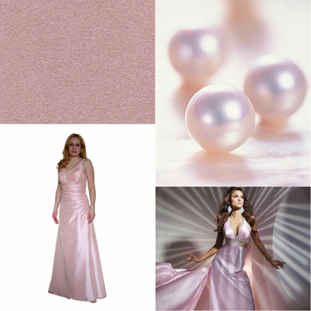
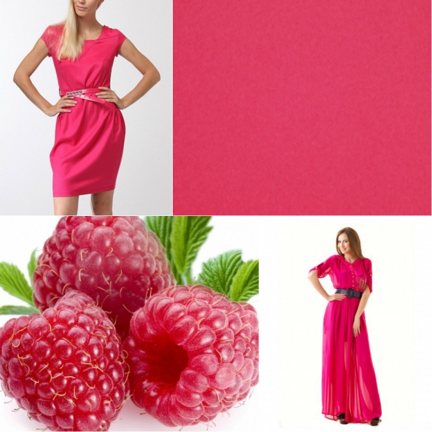
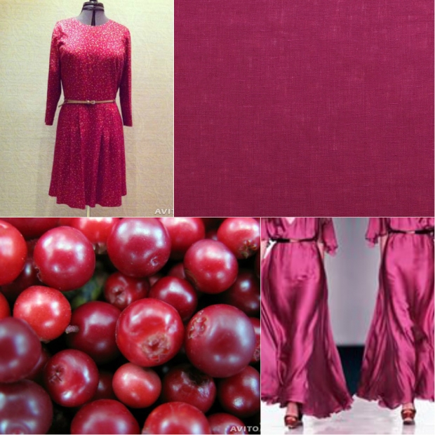
Summer color type is typical for Slavic women. These include Natalia Vodianova, Mila Jovovich, Scarlett Johansson, Sarah Jessica Parker. If you also recognized yourself by description, then you better choose pastel cold shades that will make their delicate complexion shine, and their light eyes - radiant and bright. Avoid warm colors, and don't overload sophisticated looks with overly saturated winter colors. For summer girls, the shade of pink pearls, juicy raspberry, and cheerful lingonberry can be considered ideal.
Autumn color type belongs to the category of warm, and it is characterized by the following:
The skin can be either pale or dark, but characteristic feature is the presence of expressive freckles
- the hair of the "autumn" girl has a reddish tint, and in the sun they acquire a golden sheen
- the eyes of autumn girls are extraordinary: they can be the color of cognac, amber, green and even blue, but they will contain golden or brownish blotches
- the eyebrows of autumn women are almost colorless, but you need to adjust them very carefully with a pencil, otherwise they will look caricature
- peach blush and red hair color are ideal for such persons
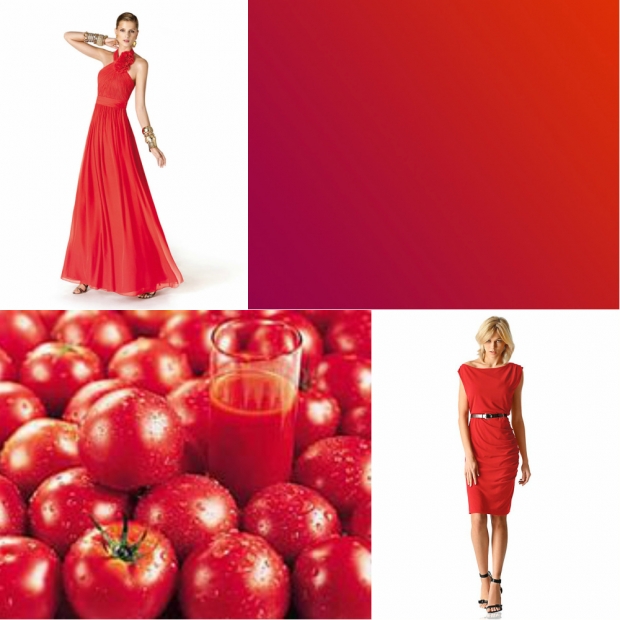
Women of the autumn type include the "beauty" Julia Roberts, Lindsay Lohan, Juliana Moore, Julia Savicheva, Vera Sotnikova. If you belong to the same color type, you should avoid bright cold shades such as fuchsia, wine, mandjent, but you can safely give preference to carrot, tomato, rowan, brick or coral shades of red.


Spring color type characterized by golden caramel tones. This is also a type of appearance common among Slavs, and the following is characteristic of it:
Skin color can be light, but at the same time have a yellowish tint, although it often has a peach undertone
- often these girls have a gentle blush, and the forehead and cheekbones can turn pink
- freckles, if there are, then a blurry golden color
- the shade of the hair does not contrast with the skin tone
- there are many natural blondes among spring girls
- their eyebrows are golden or reddish, but, unlike "autumn", they are almost identical to hair color
- the eyes have no contrast between the base color and the iris
- eye color is rarely monochromatic, and in most cases it has two light shades: yellow and green, golden brown, gray and green
The spring color type includes the beauty of Anna Kournikova, Gwyneth Paltrow, Claudia Schiffer, Kim Cattrall (Samantha from "sex in big city"). Such women should avoid colors suitable for "winter". However, even half-tones of "summer" can ruin the brightness of spring beauty. Give preference to peach, cherry, scarlet.
Combination of red with other colors
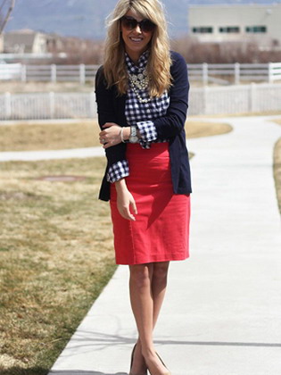
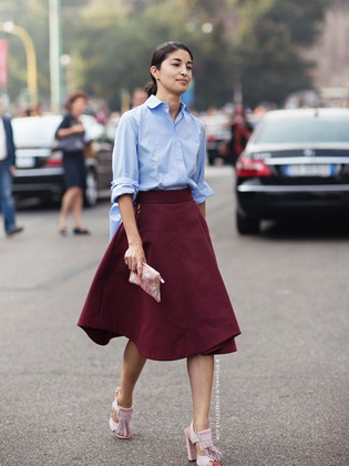
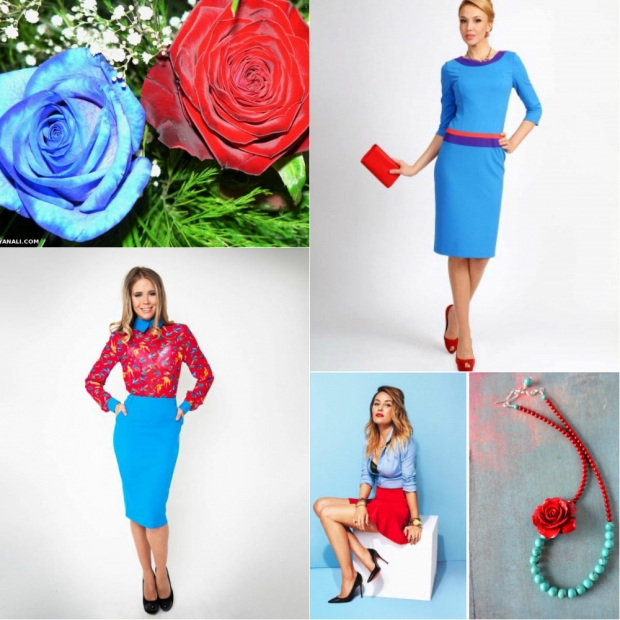
The combination of red and blue in clothes
Physically, red and blue color but have the same light wavelength, therefore, in terms of saturation, they are perceived by the eye in the same way. In fact, they compete with each other, but their tandem is saved by the different effects of color on the human psyche. The blue color calms, relaxes, tune in to reflection, and red acts excitingly, prompts you to do something. Both colors are active, so it is best to dilute them with something neutral, such as white. It is such a trio that occurs most often, and it is called " nautical style". You can also choose black as a thinner color, but in any case, the thing will look very bright, and it should be worn by girls of the "winter" color type. The rest of the beauties will be "killed" by such an incredible combination.
The combination of red and blue in clothes
A blue tint is the same blue color diluted with a white tone. It carries less meaning, is not so active, is more restrained and "cold", therefore, in combination with red, a harmonious tandem is obtained. Any shades of blue (turquoise, aqua) give a signal to the psyche about relaxation and tranquility, and red will be associated with the sun and warmth. A turquoise dress with a red belt and a small scarlet clutch will bring you back to your vacation period and remind you of wonderful evenings on the seashore. Here is such a magical effect on the psyche is provided by a combination of a cold shade with a red color dominant. On a blue background, a red accessory can make a bright accent, and blue elements on a red background can give the product restraint and elegant chic. The duo of red and blue is a classic that will never go out of style and will never leave the world catwalks.
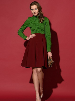
The combination of red and green in clothes
In nature, a combination of red and green flowers can be seen anywhere, but in clothes such a duet will be considered the height of bad taste. Perhaps we are talking only about classic tones, which are antagonistic in their visual perception. But don't be upset: it all depends on the shade of green. For example, a deep emerald shade in combination with red will look rich and harmonious, and for a dress of young foliage, a red belt will become a bright accessory, and an image using pastel shades will not bore you. The main thing is to choose cool shades of green so that hot red looks harmonious with them.

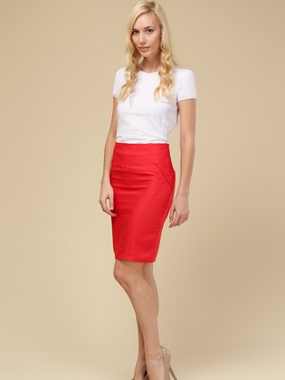
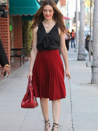
The combination of red and black in clothes
The combination of red and black is a glamorous classic and, depending on the proportions, can be perceived as depressive or sexy. This combination speaks of external restraint and internal passion of nature, conservatism and love of creativity. In any case, this combination will never go unnoticed. Eye makeup using black shadows and scarlet lips is the sexiest and most provocative, it suits all color types and gives a signal to others "I want love and passion." You can wear black closed dress and add a brooch in the form of a scarlet poppy, and you will immediately become the object of everyone's attention.

If you do not crave so much bright effect, you can dilute this tandem with white or gray... White, black and red are the three whales that support the rest of the palette of shades. Black skirt, white shirt and red jacket - and from a vamp woman you turn into an office manager. Black dress with a red stole and a gray clutch will make you an intelligent woman with good taste. No subtext, challenge or provocation. These are the wonders of active colors, diluted with something neutral.
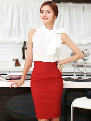
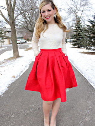
The combination of red and white in clothes
Red color in clothes goes well with white - this is a very bright duet. Moreover, this tandem must be matched precisely to its color type. Cold winter and summer beauties can be preferred rich wine, burgundy shades, and for “warm” girls of spring and autumn, we suggest paying attention to a cream tone or shades of “champagne” and “ivory” instead of the classic white.
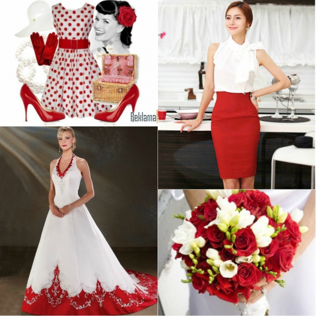
In any case, a white and red dress will look elegant, and even brides choose this combination. If an official event involves solemn moments, you can choose a red one instead of the usual black skirt, and you will be the queen.
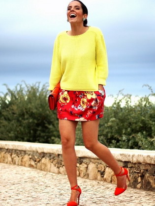
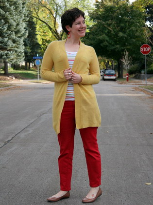
The combination of red and yellow in clothes
Red and yellow are two cheerful warm colors, the combination of which is associated with childhood and carelessness. In clothing, these two shades are used to create fun summer outfits with non-binding dresses and suits. This combination is considered "frivolous", so you will not find them in classic costumes. It is best to use a tandem of yellow and red in a summer wardrobe, and a good mood for you and the people around you is guaranteed.